Scoring genre clarity...

The Greys: Human Abductions capsule

The Greys: Human Abductions

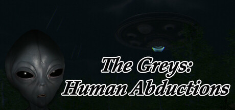
In The Greys: Human Abductions, you discover top-secret documents and unsettling alien evidence. As you explore, encounter strange noises, bizarre events, and the chilling possibility of abduction. Will you uncover the truth or become the next victim?

$7.99Mostly Positive(11)
HorrorAliensFirst-Person
Branislav BanikOct 1, 2025

The Greys: Human Abductions scores 70/100 — better than 36% of Horror capsules (n=3,118).

Mostly Positive (11 reviews) · $7.99 · Released Oct 1, 2025 · By Branislav Banik

Quick text summary

The Greys: Human Abductions scored 70/100 on Steam Analyzer — Good for a Horror capsule. Top priority fix: [uniqueness_polish] Add a distinctive visual hook such as a custom alien design variant, glitch effect, or document/evidence element that signals the game's core mechanic beyond generic abduction imagery

Capsule scores by dimension

  • Genre Clarity: 8/10 — Alien horror adventure clearly communicated. The gray alien face is instantly recognizable and establishes sci-fi horror immediately. The UFO icon at top reinforces extraterrestrial abduction theme. At tiny size, the alien silhouette and UFO remain the dominant visual cues, successfully telegraphing the supernatural horror-adventure genre without ambiguity.
  • Title Readability: 7/10 — White italic text with readable hierarchy. Title uses white outlined italic serif font positioned center-left with strong contrast against the dark background. The main title 'The Greys' reads clearly at full size, though the subtitle 'Human Abductions' becomes slightly condensed at tiny size. At small size the title hierarchy works, but the italic style and outline thickness could be refined for extreme small sizes.
  • Contrast & Color: 8/10 — Strong value separation with dark palette. White outlined text and the pale gray alien face create clear separation from the very dark background. The UFO silhouette at top adds a bright accent point. Value contrast is excellent in grayscale; the subject reads distinctly even when squinting, though the overall palette relies heavily on near-black tones with limited color saturation.
  • Uniqueness & Polish: 6/10 — Competent but straightforward presentation. The alien face and UFO are classic abduction iconography with competent execution and clean italic typography. However, the composition feels relatively static and template-like compared to top-performing indie adventure capsules which often use more dynamic composition or unexpected visual hooks. The concept is clear but the visual treatment is functional rather than distinctive.
  • Brand Consistency: 6/10 — Generic alien abduction aesthetic. The gray alien face and UFO are universal symbols of the abduction genre with no custom branding or memorable identity markers. While internally cohesive with monochromatic styling and italic serif type, there are no distinctive visual signatures that would help this stand out as a specific game versus other alien-themed projects. The palette and iconography lack a signature motif or unique art direction cue.
  • Composition: 7/10 — Centered focal point with minor balance issues. The alien face anchors the left-center composition with the UFO accent positioned top-right, creating moderate depth layering. Title placement is readable and safe from cropping. However, the right side of the composition feels slightly empty, and at tiny size the UFO detail becomes too small to register meaningfully, creating an imbalanced visual weight distribution.

What works

  • Clear genre iconography. The gray alien face and UFO instantly communicate sci-fi horror-adventure without confusion, surviving well at all sizes including tiny.
  • Strong title contrast and hierarchy. White outlined italic serif text stands out decisively against dark background with clear main and subtitle separation that reads at small sizes.
  • Value-based contrast strategy. Monochromatic dark palette with high-value text ensures legibility in grayscale and maintains clarity under quick-scroll conditions.

What hurts the capsule

  • Generic visual treatment. The capsule relies entirely on stock abduction imagery without distinctive art direction or visual hooks that differentiate from similar indie horror titles.
  • Unbalanced composition at small sizes. The UFO detail becomes too small to register at tiny size, creating right-side visual emptiness that undermines composition strength.
  • Limited color palette engagement. Reliance on near-black and white creates functional contrast but lacks saturation or warm/cool push that would elevate polish versus top-performing comparables like DREDGE or Lethal Company.

Priority fixes

  1. [uniqueness_polish] Add a distinctive visual hook such as a custom alien design variant, glitch effect, or document/evidence element that signals the game's core mechanic beyond generic abduction imagery
  2. [composition] Increase UFO prominence or add supporting visual elements to the right side to balance composition and improve focal hierarchy at small and tiny sizes
  3. [contrast_color] Introduce a subtle warm or cool color accent (amber document glow, blue UFO energy) to add visual interest while maintaining legibility against dark background
  4. [brand_consistency] Develop a signature visual motif or iconography unique to The Greys that could anchor brand recognition across marketing materials and store screenshots

Store copy priority fixes

  1. [uniqueness] Add a specific hook that differentiates this title from other inherited-house horror games—e.g., a concrete gameplay or narrative system that only this game employs (e.g., 'Your choices determine whether you uncover the truth or remain trapped,' or 'Audio-only enemy encounters force you to navigate blind').
  2. [feature_communication] Reorganize the Features & Gameplay section into a clearer hierarchy: list core interactions first, then puzzles, then survival/escalation mechanics, removing the scattered explanatory sentences about audio design.
  3. [hook_strength] In the short description, replace or sharpen 'chilling possibility' with a more concrete threat verb: e.g., 'experience the same terror your brother did' or 'face the force that took him'.
  4. [genre_clarity] Add one explicit mechanical sentence clarifying this is a first-person exploration-puzzle game without combat, to prevent walking-simulator skeptics from bouncing at the short description level.

Related guides

Steam app ID: 3206550 · Tags: Horror, Aliens, First-Person, Exploration, Sci-fi