Scoring genre clarity...

Snails & Potions capsule

Snails & Potions

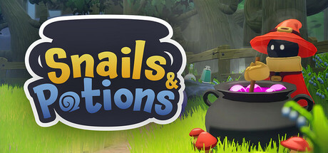
Dive into Snails & Potions, a fun-filled party game where you race snails against another player! Use your quick wit to brew potions that boost your snail or sabotage your rival's. There are no rules, just a rush to the finish line!

Free to Play4 user reviews
CookingMagicCombat Racing
Tijl Gommers, Adriaan Musschoot, Senne Bovee, Ward Vervoort, Luca Zulianello11 Nov, 2025

Snails & Potions scores 70/100 — better than 30% of Steam capsules we've analysed (n=22,658).

4 user reviews · Free to Play · Released 11 Nov, 2025 · By Tijl Gommers

Quick text summary

Snails & Potions scored 70/100 on Steam Analyzer — Good for a Steam capsule. Top priority fix: [genre_clarity] Add a small secondary visual cue such as a racing track or two competing snails in the background to immediately communicate the party racing mechanic at tiny size.

Capsule scores by dimension

  • Genre Clarity: 7/10 — Casual party game implied. The bubbly witch character stirring a cauldron alongside a large potion-labeled logo communicates a lighthearted, magical casual game. At small size the cauldron and bubbling potions hint at a crafting or brewing mechanic, though the racing/party game angle is not immediately obvious. At tiny size it reads as a cute indie casual game, which is close enough to the actual genre to avoid confusion.
  • Title Readability: 8/10 — Bold readable title at most sizes. The yellow and blue bubble-outlined font for 'Snails & Potions' is chunky and well-contrasted against the lighter background, reading clearly at full size. The clever use of a potion bottle as the 'o' in Potions is a nice touch that still parses at small size. At tiny size the letterforms begin to soften but the title remains legible due to the thick outlines and high contrast against the mid-tone background.
  • Contrast & Color: 7/10 — Warm palette pops adequately. The bright yellow title text and vibrant magenta potion bubbles create good value contrast against the soft green forest background, and the overall image reads well against Steam's dark #1b2838 background. The cute character in dark silhouette against the lighter backdrop provides reasonable separation. In grayscale the title and cauldron remain readable, though the mid-tone greens in the background could create slight merging at tiny size.
  • Uniqueness & Polish: 6/10 — Competent but genre-generic look. The 3D art style is clean and the witch character has charm, but the overall composition feels like a familiar casual indie title without a strong distinctive hook. Compared to top-performing peers like Balatro or DAVE THE DIVER, this capsule lacks a bold visual statement or unique selling-point moment that makes you stop scrolling. The craft is competent and consistent but does not elevate beyond a functional free-to-play indie aesthetic.
  • Brand Consistency: 7/10 — Cohesive style and palette. The soft rounded 3D style, bright saturated palette, and cute character design all align well internally, suggesting a consistent art direction across the game. The logo's bubbly font matches the playful tone of the character and the potion aesthetic reinforces the game's theme. The signature dark-faced character with red witch hat has enough distinctiveness to serve as a recognizable mascot if consistently used.
  • Composition: 7/10 — Clear focal split, title left-anchored. The title occupies the left half while the character and cauldron anchor the right, creating a clean two-zone layout with no wasted space. The cauldron sits centrally at the bottom edge, acting as a visual anchor tying both halves together, and the glowing magenta bubbles draw the eye effectively. At small and tiny sizes the title and cauldron remain within safe margins, though the character is slightly edge-hugged on the right and may be partially cropped on some Steam display formats.

What works

  • Readable chunky title. The bold outlined bubble font for 'Snails & Potions' retains legibility down to small capsule size due to thick letterforms and strong yellow-on-soft-background contrast.
  • Charming mascot character. The dark-faced witch character is visually distinctive and cute, giving the game a potential recognizable identity symbol.
  • Vibrant potion bubbles. The bright magenta bubbling cauldron creates a high-saturation accent that draws the eye and pops against the muted green background.
  • Logo integrates gameplay theme. Using a potion bottle as the letter 'o' in Potions cleverly reinforces the game's core mechanic within the logo itself.

What hurts the capsule

  • Genre ambiguity at tiny size. The racing/party game mechanic is not communicated visually; at tiny size it reads as a generic casual crafting or puzzle game.
  • Midtone background reduces edge contrast. The soft green forest background has limited dark values, which weakens silhouette separation from Steam's dark UI when viewed at small sizes.
  • Generic indie casual aesthetic. The overall composition and art style are competent but do not stand out meaningfully against other free-to-play casual titles in Steam browsing.
  • Character slightly edge-crowded. The witch character is pushed close to the right edge, risking crop on certain Steam capsule display formats and reducing compositional breathing room.

Priority fixes

  1. [genre_clarity] Add a small secondary visual cue such as a racing track or two competing snails in the background to immediately communicate the party racing mechanic at tiny size.
  2. [contrast_color] Darken the background gradient toward the edges to increase silhouette separation and improve contrast against Steam's #1b2838 dark background.
  3. [uniqueness_polish] Introduce a more distinctive visual storytelling moment — such as two snails mid-race with potions flying — to differentiate from generic casual indie capsules.
  4. [composition] Shift the character slightly inward from the right edge to prevent potential cropping and give the layout more balanced breathing room.

Store copy priority fixes

  1. [uniqueness] Replace 'no rules' with a specific mechanic or rule set that makes this game distinct—e.g., 'dynamic potion effects that chain unpredictably' or 'your snail's speed depends on potion combinations you craft.'
  2. [feature_communication] Add 2–3 concrete examples of potion effects (e.g., 'Speed Serum grants +50% movement, Sticky Sludge slows rivals by half') to demonstrate tactical depth and variety.
  3. [hook_strength] Replace 'fun-filled party game' with a stronger opening verb or emotional payoff—e.g., 'Outsmart your rival in a chaotic race where sabotage and strategy decide the winner.'
  4. [audience_targeting] Clarify multiplayer scope: explicitly state if this supports online play or is local co-op only, given Remote Play Together tag.

Related guides

Steam app ID: 3224810