Scoring genre clarity...

Deadzone: Rogue capsule

Deadzone: Rogue

Deadzone: Rogue is a roguelite FPS set in space. Blast through swarms of hostile machines, combine powerful augments and elements to forge your build, and grow stronger with each run — solo or in co-op.

HK$ 78.00Very Positive(365)
RoguelikeFPSOnline Co-Op
Prophecy Games11 Aug, 2025

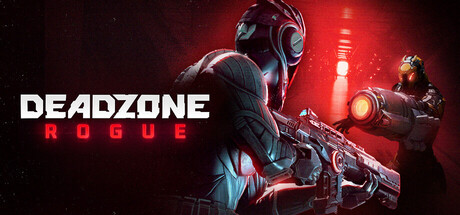
Deadzone: Rogue scores 82/100 — better than 94% of Roguelike capsules (n=2,506).

Very Positive (365 reviews) · HK$ 78.00 · Released 11 Aug, 2025 · By Prophecy Games

Quick text summary

Deadzone: Rogue scored 82/100 on Steam Analyzer — Good for a Roguelike capsule. Top priority fix: [genre_clarity] Add a subtle visual element that implies roguelite progression or build variety—such as glowing augment icons, element symbols, or a run counter—to differentiate from generic sci-fi shooters.

Capsule scores by dimension

  • Genre Clarity: 8/10 — Clear sci-fi shooter with roguelite cues. The armored protagonist with prominent energy weapon and the red sci-fi aesthetic immediately signal a space-based action shooter. The futuristic soldier pose and glowing weapon effects telegraph FPS combat clearly even at tiny size. At TINY size, the silhouette and weapon are recognizable enough to identify the action-shooter genre, though the roguelite mechanics are not visually obvious from the capsule alone.
  • Title Readability: 9/10 — Excellent contrast and placement. DEADZONE in large, bold white sans-serif sits in the upper left with strong separation from the background, while ROGUE in red sits directly below, creating a clean two-line hierarchy. The title remains fully legible at SMALL (231×87) and TINY (120×45) sizes due to high contrast white-on-dark and the substantial letterform weight. Strategic placement on a relatively clear background region away from busy character detail ensures consistent readability across all viewing conditions.
  • Contrast & Color: 9/10 — Strong value separation with dramatic lighting. The red-hot energy lighting on the right side creates excellent value contrast against the dark background (#1b2838), while the protagonist's metallic armor picks up secondary highlights that read clearly. The glowing weapon effect and warm red ambient light form a natural focal point that pops in both color and brightness. Even in grayscale or at tiny size, the silhouettes maintain clean separation from the background with strong edge definition.
  • Uniqueness & Polish: 8/10 — Polished sci-fi aesthetic with premium craft. The image demonstrates high-quality 3D rendering with deliberate lighting design—red energy effects, metallic reflections, and atmospheric particle work feel intentional and cohesive rather than templated. The dynamic pose of the armored figure and the secondary soldier on the right add visual storytelling depth and hint at co-op gameplay, elevating it beyond a static character showcase. While the sci-fi soldier archetype is familiar, the execution quality and dramatic lighting choices place it in the upper tier of sci-fi action capsules.
  • Brand Consistency: 7/10 — Coherent sci-fi palette with strong identity. The red-and-blue color scheme, metallic armor, energy weapon design, and dystopian sci-fi aesthetic form a cohesive internal brand language that could be recognized across marketing materials. The typography pairing—bold sans-serif for DEADZONE and red caps for ROGUE—establishes a recognizable house style. However, without access to the full brand library, the identity signals feel competent but not uniquely iconic; the visual approach is solid sci-fi convention rather than a standout signature motif.
  • Composition: 8/10 — Clear focal point with balanced layering. The primary armored soldier occupies center-left and commands attention through scale and lighting, while the secondary figure on the right provides depth and compositional balance without competing. The title text sits safely in the upper region with margin from edges, and the red energy element in the center creates a natural flow downward to the weapons. At SMALL and TINY sizes, the focal hierarchy remains clear—the protagonist and weapon dominate, supporting elements recede—with no dangerous edge cropping or dead space.

What works

  • Title dominates with white-red contrast. DEADZONE and ROGUE are legible at all sizes due to bold weight, high contrast, and clean placement away from busy character detail.
  • Dramatic red lighting creates visual pop. The warm energy effects and red ambient lighting separate strongly from the dark background and instantly convey sci-fi intensity.
  • Balanced composition with depth layering. Foreground armor, midground weapons, and secondary soldier in background create visual hierarchy that reads well at tiny size.
  • High production render quality. Metallic reflections, particle effects, and lighting are polished and intentional, signaling premium AAA craft rather than asset-flip feel.

What hurts the capsule

  • Roguelite mechanics not visually evident. The capsule reads as a straightforward sci-fi shooter; nothing in the imagery hints at roguelite progression, build combinatorics, or run-based gameplay loops.
  • Generic sci-fi soldier archetype. While well-executed, the armored protagonist with energy rifle is a familiar trope; the capsule does not communicate what makes Deadzone: Rogue unique from other space shooters.
  • Co-op signal is subtle. The secondary soldier on the right hints at multiplayer but is not prominent enough to clearly advertise the co-op mechanic as a key selling point.

Priority fixes

  1. [genre_clarity] Add a subtle visual element that implies roguelite progression or build variety—such as glowing augment icons, element symbols, or a run counter—to differentiate from generic sci-fi shooters.
  2. [uniqueness_polish] Emphasize the co-op aspect with closer framing of both soldiers or a visual indicator (split-screen, linked energy beams, synchronized poses) to highlight this as a core differentiator.
  3. [brand_consistency] Develop an iconic motif or symbol (augment icon, rogue insignia, elemental mark) that could become a recognizable brand signature across all marketing materials.

Store copy priority fixes

  1. [hook_strength] Rewrite the short description to lead with a visceral action verb and unique mechanic: 'Shred your way through a space station overrun by killer machines, unlock game-changing augments to reshape your build, and tackle nightmare difficulty with friends.'
  2. [uniqueness] Add a differentiator sentence in the detailed description's first paragraph that signals what makes Deadzone: Rogue distinct—e.g., 'Unlike standard roguelikes, every elemental augment combination unlocks new synergy effects, rewarding creative build experimentation.'
  3. [audience_targeting] Explicitly clarify the intended audience depth: add a sentence such as 'Built for co-op crews seeking tactical depth and solo players chasing build mastery' to segment expectations.
  4. [tone_match] Replace corporate phrasing like 'reshape yourself into a killing machine' with more player-first language: 'Turn yourself into the ultimate drone-killer with permanent upgrades that actually feel powerful.'

Related guides

Steam app ID: 3228590 · Tags: Roguelike, FPS, Online Co-Op, PvE, Roguelite