Scoring genre clarity...

King of Tokyo - Richard Garfield capsule

King of Tokyo - Richard Garfield

Play as a kaiju as you destroy everything in your path in this board game! Roll the dice and make the best possible combinations to heal yourself, attack, buy cards or win Victory Points.

$13.99Mixed(14)
Board GameCard BattlerTabletop
BreakfirstMay 21, 2026

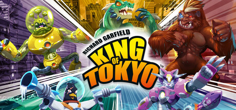
King of Tokyo - Richard Garfield scores 72/100 — better than 44% of Steam capsules we've analysed (n=22,659).

Mixed (14 reviews) · $13.99 · Released May 21, 2026 · By Breakfirst

Quick text summary

King of Tokyo - Richard Garfield scored 72/100 on Steam Analyzer — Good for a Steam capsule. Top priority fix: [composition] Establish a single dominant hero kaiju in the foreground center and push secondary monsters to the sides or background to create a clear focal hierarchy at tiny size.

Capsule scores by dimension

  • Genre Clarity: 8/10 — Kaiju brawler board game clear. The giant monsters clashing in a comic-book style city setting immediately communicates a monster-fighting theme, and the dice-game board-game origin is implied by the cartoony stylization. At tiny size the large colorful kaiju silhouettes still read as a fighting/strategy game with monster characters. The 'Richard Garfield' credit and board game aesthetic subtly hint at tabletop origins for those familiar, though genre nuance is slightly lost at the smallest sizes.
  • Title Readability: 7/10 — Bold title reads at small size. The 'KING OF TOKYO' lettering is large, bold, and centered with a strong yellow-outlined style that reads well at full and small capsule sizes. The 'Richard Garfield' credit above it is noticeably smaller and becomes unreadable at tiny size. At 120x45 the main title 'KING OF TOKYO' remains legible as the dominant text element due to its scale and contrast against the comic-panel background lines.
  • Contrast & Color: 7/10 — Vibrant palette pops on dark background. The bright yellows, greens, oranges, and purples of the kaiju characters contrast well against the lighter comic-book city background and hold their own against Steam's dark #1b2838 UI. The white/cream comic panel background separates the capsule clearly from the dark Steam chrome. In grayscale, the monster silhouettes maintain decent separation from each other and the background, though some mid-tone areas on the robot characters blend slightly.
  • Uniqueness & Polish: 7/10 — Comic book kaiju style stands out. The comic-book panel aesthetic with speed lines and bold outlines is a strong and coherent stylistic choice that differentiates it from generic strategy game capsules. The ensemble cast of colorful kaiju characters gives it energy and visual interest. However, compared to top-tier capsules like Balatro, it feels slightly busy without a single iconic focal point, and the overall craft sits at competent-to-good rather than exceptional.
  • Brand Consistency: 8/10 — Strong coherent monster brawler identity. The comic-book art style, bold outlined typography, and ensemble of distinctive kaiju characters create a recognizable and internally consistent visual identity that matches the board game's known branding. The color palette is vibrant and consistent across all characters, and the speed-line background reinforces the kinetic monster-battle theme throughout. This capsule would be recognizable in a lineup due to its distinctive character roster and art direction.
  • Composition: 6/10 — Busy ensemble with centered title. The composition places the title centrally and features kaiju characters spread across the full width, which creates energy but also some visual clutter with five large characters competing for attention simultaneously. At small size the title remains the clear hierarchy anchor, but the surrounding monsters create noise that makes it hard to identify a single primary focal point. The center-left area where monsters cluster is slightly cramped, and at tiny size the design reads as a busy colorful blob with the text remaining the clearest element.

What works

  • Bold recognizable title treatment. The large yellow-outlined 'KING OF TOKYO' lettering holds legibility down to small capsule sizes due to its scale and strong contrast.
  • Comic-book art style is distinctive. The speed lines, bold outlines, and bright kaiju colors create a genre-appropriate visual style that stands out on the Steam storefront.
  • Strong character variety communicates multiplayer. Five distinct monster designs communicate player choice and a multiplayer brawler feel immediately.
  • Clear separation from Steam background. The light comic-panel background acts as a natural frame that pops cleanly against Steam's dark #1b2838 UI chrome.

What hurts the capsule

  • No clear single focal point. Five equally-sized kaiju across the full width prevents the eye from settling on one hero character, weakening impact at tiny size.
  • Richard Garfield credit unreadable at tiny size. The small-font creator credit above the title disappears completely at 120x45 and adds visual noise at small sizes.
  • Background city detail adds mid-tone clutter. The illustrated cityscape behind the characters creates a busy mid-zone that competes with character silhouettes in quick-scroll conditions.
  • Composition collapses at tiny size into color noise. At 120x45 the ensemble layout becomes an indistinct mass of color blobs with only the title text providing readable structure.

Priority fixes

  1. [composition] Establish a single dominant hero kaiju in the foreground center and push secondary monsters to the sides or background to create a clear focal hierarchy at tiny size.
  2. [title_readability] Remove or significantly reduce the 'Richard Garfield' credit line, or integrate it into the logo lockup so it does not fragment the title area at small sizes.
  3. [contrast_color] Darken or desaturate the city background layer to increase value separation between the background and the foreground monster characters.
  4. [uniqueness_polish] Consider spotlighting one iconic character silhouette as a breakout element that extends beyond the panel frame to add depth and a memorable visual hook.

Store copy priority fixes

  1. [hook_strength] Eliminate the redundant opening in the detailed description and replace the short description's opening with the dual win condition: 'Become the King of Tokyo by scoring 20 Victory Points—or be the last kaiju standing.'
  2. [uniqueness] Add a sentence after the art style paragraph emphasizing what the digital adaptation uniquely enables: 'Play online, skip setup, and experience rapid-fire rounds at your own pace.'
  3. [uniqueness] Reposition or call out the dual win condition in the 'Build your strategy' section to highlight it as a core mechanical differentiator that changes how players approach each turn.

Related guides

Steam app ID: 3232870