Scoring genre clarity...
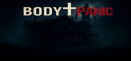
In BodyPanic, survive in an abandoned house with friends or alone. Every night you will be attacked by unique monsters and you will have to find different strategies to fight them. Learn from mistakes, adapt to situations and immerse yourself in the creepy atmosphere.
$5.996 user reviews
HorrorSurvival HorrorMultiplayer
MDJun 8, 2025