Scoring genre clarity...

Ells Tales: Chairbound capsule

Ells Tales: Chairbound

You wake up tied to an office chair in the middle of an empty room. A mysterious device with a 10-minute timer is attached to you. Explore the office floors, try not to tip over, and find a way to escape!

$1.49Very Positive(260)
Survival HorrorRetroPhysics
Ells&PillsAug 1, 2025

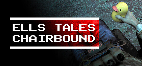
Ells Tales: Chairbound scores 62/100 — better than 4% of Survival Horror capsules (n=1,176).

Very Positive (260 reviews) · $1.49 · Released Aug 1, 2025 · By Ells&Pills

Quick text summary

Ells Tales: Chairbound scored 62/100 on Steam Analyzer — Solid for a Survival Horror capsule. Top priority fix: [genre_clarity] Add a visible gameplay affordance or UI element (timer display, chair control indicator, or environmental clue) to communicate simulation/puzzle mechanics at small size.

Capsule scores by dimension

  • Genre Clarity: 5/10 — Ambiguous genre signals present. The capsule shows a character bound to an office chair with mechanical/device elements, which hints at an unusual premise but does not clearly communicate simulation gameplay. At tiny size, the chair and character silhouette read as a person in distress rather than a simulation mechanic, and the genre identity collapses into 'puzzle' or 'adventure' rather than simulation.
  • Title Readability: 7/10 — Strong contrast, minor sizing issues. The title 'ELLS TALES CHAIRBOUND' uses bold white sans-serif text with red accent bar, which reads clearly at full and small sizes against the dark background. At tiny size, the three-line layout compresses slightly but remains legible, though the thin horizontal lines flanking the text become harder to resolve.
  • Contrast & Color: 8/10 — Excellent value separation achieved. White title text and the pale yellow duck/device character pop strongly against the dark teal and black background, creating clear silhouette separation. The red accent bar adds secondary contrast and guides the eye; in grayscale, the value difference between foreground elements and background remains distinct even at tiny size.
  • Uniqueness & Polish: 6/10 — Competent but generic execution. The image shows a quirky premise (bound to chair with timer device) that is visually interesting, but the capsule presentation relies on a straightforward photograph-style composition without distinctive art direction or stylistic polish. The rendering feels functional and competent but lacks the visual storytelling or signature art style that would elevate it above baseline.
  • Brand Consistency: 5/10 — Limited identity signals visible. The pale duck-like creature and office environment are specific to the game, but without access to the 7 store screenshots, no recurring motif, signature palette, or iconic character identity is evident from this capsule alone. The dark teal and red color scheme feels more like a generic dark theme than a branded visual identity.
  • Composition: 6/10 — Balanced layout with centered focus. The title occupies the top third with clear separation from the character and chair below, creating readable hierarchy. The character in the chair is centered, which provides visual stability but reduces compositional tension; at small size the layout remains clear, though the three-line title and multi-element character field compete for attention without a single dominant focal point.

What works

  • White text contrast. The title text uses bold white lettering that stands out clearly against the dark background at all viewing sizes, including tiny thumbnail view.
  • Distinctive premise visual. The tied-to-chair scenario with the quirky pale creature and device creates a memorable and unusual hook that hints at the game's unconventional premise.
  • Clear title hierarchy. Three-line layout with red accent bar separates the title zone cleanly from the character composition below, maintaining legibility across sizes.

What hurts the capsule

  • Simulation genre unclear. The visual reads as adventure or puzzle rather than simulation; at tiny size there is no clear mechanic hint that this is a management or simulation-driven experience.
  • Generic dark background. The dark teal and black background lacks branded identity or thematic connection; it reads as a default dark theme rather than intentional art direction.
  • Competing focal points. The character, chair, device, and title elements all carry similar visual weight, creating scattered attention rather than a single clear primary subject that reads instantly at small size.

Priority fixes

  1. [genre_clarity] Add a visible gameplay affordance or UI element (timer display, chair control indicator, or environmental clue) to communicate simulation/puzzle mechanics at small size.
  2. [brand_consistency] Introduce a signature color accent or repeating motif (e.g., consistent timer design, chair style detail, or creature palette) that will be recognizable across other promotional materials.
  3. [uniqueness_polish] Refine lighting or apply a cohesive art filter (hand-drawn, isometric, retro CRT effect) that elevates the capsule beyond straightforward photography and signals a distinctive game style.
  4. [composition] Consider moving the title to the side or bottom to allow the character and chair to dominate the visual field as the single focal point, improving clarity at tiny sizes.

Store copy priority fixes

  1. [hook_strength] Strengthen the opening by adding a sensory or emotional hook: 'You wake up bound to an office chair. A device counting down from 10 minutes is locked to your body. Something is very wrong.' to heighten the horror atmosphere.
  2. [tone_match] Rewrite the 'FEATURES' section to match the dark, awkward tone suggested by the tags—shift from clinical description to unsettling language that reflects the survival-horror experience.
  3. [feature_communication] Add 1–2 concrete examples for 'separate hand control': 'Control each hand independently to manipulate objects, steady yourself during tips, or interact with the environment asymmetrically.'
  4. [audience_targeting] Include a sentence clarifying playstyle expectations: 'A challenging physics puzzle for players who enjoy experimentation and unconventional controls' or 'A surreal one-shot experience for players seeking strange, unsettling exploration.'

Related guides

Steam app ID: 3281410 · Tags: Survival Horror, Retro, Physics, Intentionally Awkward Controls, Dark