Scoring genre clarity...
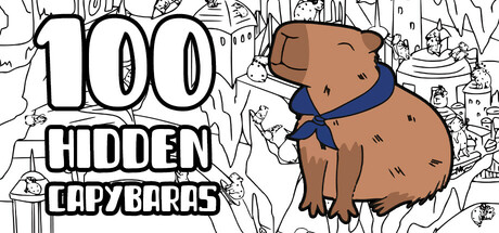
It is a hidden object game with hand-drawn graphics. Find one by one 100 unique capybaras in different, colorful settings while listening to calm music. Find, click, find another one, and enjoy the painted picture.
$1.99Mixed(15)
Hidden ObjectCapybarasPoint & Click
Bulat GaineevJul 15, 2025