Scoring genre clarity...

Static Dread: The Lighthouse capsule

Static Dread: The Lighthouse

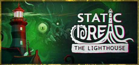
Lovecraft meets Papers, Please. Play as a lighthouse keeper and guide ships safely into the harbor using your radio. Survive the presence of something impossible, and don’t let the shadows consume you!

$6.54Very Positive(46)
PsychologicalIndieHorror
solarsuit.gamesAug 6, 2025

Static Dread: The Lighthouse scores 73/100 — better than 56% of Steam capsules we've analysed (n=22,658).

Very Positive (46 reviews) · $6.54 · Released Aug 6, 2025 · By solarsuit.games

Quick text summary

Static Dread: The Lighthouse scored 73/100 on Steam Analyzer — Good for a Steam capsule. Top priority fix: [genre_clarity] Add a subtle visual hint of the radio or maritime UI element to communicate the simulation/management gameplay layer alongside the horror atmosphere.

Capsule scores by dimension

  • Genre Clarity: 7/10 — Atmospheric horror with clear setting. The lighthouse is an immediately recognizable iconic anchor that signals isolation and maritime mystery. The green supernatural glow and creeping shadow tendrils clearly communicate horror/dread atmosphere over pure action. At tiny size, the lighthouse silhouette and eerie color palette remain readable, though the connection to "Papers, Please" simulation mechanics is not visually apparent from the capsule alone.
  • Title Readability: 8/10 — Strong legibility with clear hierarchy. The title "STATIC DREAD" uses a bold, clean sans-serif font with excellent contrast against the dark background, and "THE LIGHTHOUSE" sits on a white banner for maximum readability. At small and tiny sizes, both lines remain crisp and identifiable, though the banner background helps the secondary title stand out. The logo treatment is professional and doesn't collapse under compression.
  • Contrast & Color: 8/10 — Vibrant green with strong value separation. The neon green supernatural aura creates excellent value separation from the dark green/black background, making the central elements pop distinctly at all sizes. The red lighthouse provides warm accent contrast and the white title banner cuts through cleanly. In grayscale stress test, the lighthouse and central glow maintain clear silhouette definition against the background gradient.
  • Uniqueness & Polish: 7/10 — Polished aesthetic with recognizable craft. The capsule demonstrates intentional visual storytelling with the lighthouse, supernatural glow, and tentacular shadows creating a cohesive Lovecraftian tone. The color palette and effects feel deliberately chosen rather than generic, and the combination of maritime setting with cosmic horror is distinctive. However, the composition relies somewhat on familiar horror genre visual language without a singular breakthrough visual hook unique to Static Dread specifically.
  • Brand Consistency: 7/10 — Coherent supernatural maritime theme. The capsule establishes a consistent internal art direction with the lighthouse as a recognizable symbol, the green supernatural palette, and the cosmic tentacle motif. These elements create a memorable identity that could be recognized again, though without knowing the game's other screenshots, visual motifs like the eye symbol and shadow creatures appear intentional to the brand. The red-and-white lighthouse is a strong iconic anchor for future recognition.
  • Composition: 7/10 — Clear focal hierarchy with good depth. The lighthouse occupies strong left-of-center position as primary focal point, with the title cleanly positioned on the right side, creating good balance and natural reading flow. The supernatural glow and shadows in the background provide depth layering without competing for attention. At tiny size, the composition maintains readability with the lighthouse anchoring the left and title on the right, though the scattered tentacles in the background could read as minor clutter at smallest sizes.

What works

  • Distinctive atmospheric premise. The lighthouse keeper concept combined with Lovecraftian horror creates an immediately memorable and unusual hook that stands out from typical action or adventure game visuals.
  • Excellent title contrast and placement. The white banner treatment and bold sans-serif typography ensure the game title remains fully readable even at tiny sizes with crisp edges.
  • Strong color palette hierarchy. The neon green supernatural effects and red lighthouse accent create vibrant, separated visual elements that pop against the dark Steam background without muddy mid-tones.

What hurts the capsule

  • Simulation mechanics not visually telegraphed. The capsule conveys horror-adventure but completely obscures the "Papers, Please"-style gameplay loop central to the core experience, missing an opportunity to visually hint at the unique mechanic.
  • Background tentacle detail loses clarity at tiny sizes. The supernatural shadow creatures and ethereal elements in the background become muddled and indistinct when the capsule is compressed, reducing the atmospheric impact.
  • Limited visual uniqueness vs. established peers. While polished, the capsule relies on conventional Lovecraftian visual language that shares similar aesthetic DNA with games like DREDGE, without a distinctive visual signature that uniquely identifies Static Dread.

Priority fixes

  1. [genre_clarity] Add a subtle visual hint of the radio or maritime UI element to communicate the simulation/management gameplay layer alongside the horror atmosphere.
  2. [composition] Simplify or strengthen the background tentacle and shadow elements to maintain atmospheric depth without creating visual noise that collapses at tiny sizes.
  3. [uniqueness_polish] Introduce a signature visual motif or color accent unique to Static Dread's identity that couldn't be mistaken for other cosmic horror titles.

Store copy priority fixes

  1. [feature_communication] Add 1-2 sentences to the detailed description explaining the nightly radio mechanic: specifically, what types of ships the player guides, what information they receive, and what mistakes or successes entail (e.g., 'Each night, you listen to distressed mariners on the radio, deciding which ships to guide through treacherous waters—but every call brings you closer to something listening on your frequency.').
  2. [audience_targeting] Include a sentence signaling pacing and playstyle expectations (e.g., 'A text-driven, choice-driven experience with minimal combat, heavy on atmosphere and narrative tension') to clarify whether this appeals to strategy players, narrative completionists, or both.
  3. [feature_communication] Briefly list the types of choices available (e.g., 'Do you trust the mariners' reports? Protect your crew or obey distant authorities? Investigate the island's rituals?') to make 'Choices Matter' tangible and differentiate from purely narrative-driven titles.

Related guides

Steam app ID: 3298940