Scoring genre clarity...

Calame capsule

Calame

In this turn-based tactical RPG, renown can change the course of a war. Lead Kenmare and the Panthers against the King of Light, shape the Chronicle through your choices, and wield the Legend to turn battles around.

Turn-Based TacticsTurn-Based StrategyTactical RPG
Nextale Games2026

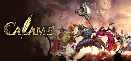
Calame scores 70/100 — better than 28% of Turn-Based Tactics capsules (n=1,228).

Released 2026 · By Nextale Games

Quick text summary

Calame scored 70/100 on Steam Analyzer — Good for a Turn-Based Tactics capsule. Top priority fix: [title_readability] Add a stronger dark outline or soft shadow behind the CALAME logo to ensure letterforms survive at tiny thumbnail size without requiring high attention.

Capsule scores by dimension

  • Genre Clarity: 8/10 — Tactical RPG party battle clear. A diverse ensemble of fantasy warriors in dynamic combat poses alongside a large axe-wielding central figure immediately reads as a party-based RPG or tactical RPG. The dragon silhouette in the upper left and the glowing divine sphere in the upper right reinforce a high-fantasy conflict narrative. At tiny size the group-of-characters-versus-epic-threat composition still implies a team-based RPG, though the tactical layer is lost.
  • Title Readability: 7/10 — Readable at full, shaky at tiny. At full size the gold serif-stylized 'CALAME' logo in the upper left is legible with decent contrast against the relatively dark cloud background, and the stylized A-slash motif is distinctive. At small capsule size the letterforms still resolve, but the decorative slash through the A and the lighter gold tone start to merge into the background. At tiny thumbnail size the title becomes difficult to confirm, dropping to borderline illegibility without a strong outline or shadow to anchor the letterforms.
  • Contrast & Color: 6/10 — Mid-range contrast, murky midtones. The warm orange-red cloud base provides separation from the Steam dark background, and the bright divine orb in the upper right creates a light anchor. However, the character group occupies a mid-value zone with complex costume colors that compete rather than separate cleanly, and in a grayscale test many figures blend into the reddish-brown cloud mass behind them. The silhouette of the party at small and tiny sizes becomes indistinct and muddy rather than punchy.
  • Uniqueness & Polish: 7/10 — Stylish anime craft, somewhat familiar. The hand-drawn anime art style with detailed character designs and a dramatic battlefield composition gives the capsule genuine polish and energy above a template asset feel. The reality-bending Calame concept is not visually communicated beyond standard fantasy epic imagery, missing an opportunity to show something distinctive. Compared to genre leaders like Metaphor: ReFantazio or Sea of Stars, the capsule feels competent and attractive but does not deliver a singular visual hook that sets it apart.
  • Brand Consistency: 7/10 — Cohesive anime fantasy palette and style. The warm reddish-orange cloud palette, the stylized gold title treatment, and the detailed anime character rendering style form a coherent internal identity. The A-slash logo motif in the title is a distinguishable brand element that could carry recognition across assets. The composition of diverse heroes confronting a divine and monstrous threat is consistent with tactical RPG brand language, though the Calame magic concept has no unique visual signature to differentiate it further.
  • Composition: 7/10 — Strong diagonal energy, crowded center. The diagonal sweep from lower left heroes through the central axe figure to the upper right orb creates good visual flow and implied scale. The title is safely placed in the upper left with breathing room, avoiding the main character cluster. At small size the center becomes congested with overlapping character silhouettes and the large axe pole, making it hard to identify a single clear focal point. The dragon upper left and orb upper right bookend the scene effectively but add competing focal pulls at tiny size.

What works

  • Dynamic ensemble composition. The diagonal arrangement of multiple distinct heroes with a central dominant figure communicates party-based scale and action effectively at full size.
  • Warm dramatic color palette. The orange-red cloud battlefield base pops against Steam's dark navy background and gives the capsule immediate warmth and urgency.
  • Distinctive title logo motif. The gold serif 'CALAME' with the stylized slash-A is a recognizable brand element that differentiates the logo from generic fantasy type treatments.
  • Polished anime art quality. The hand-drawn character designs and detailed rendering style communicate a premium, developer-invested product above a generic asset store look.

What hurts the capsule

  • Silhouette collapses at tiny size. The character group merges into the warm mid-tone cloud background at tiny thumbnail size, losing individual figure clarity and reducing visual impact.
  • No unique Calame magic visual hook. The reality-bending core mechanic and the word-as-power concept are not visualized, making the capsule indistinguishable from generic high-fantasy RPG imagery.
  • Title contrast insufficient at tiny size. The gold logo lacks a strong dark outline or drop shadow, causing letterforms to partially dissolve against the light cloud area at small and tiny sizes.
  • Crowded center competes for focus. Multiple overlapping characters of similar visual weight create a busy center mass with no single clear hero or focal face to anchor the viewer's eye quickly.

Priority fixes

  1. [title_readability] Add a stronger dark outline or soft shadow behind the CALAME logo to ensure letterforms survive at tiny thumbnail size without requiring high attention.
  2. [contrast_color] Darken or desaturate the mid-tone cloud layer immediately behind the character group to create a cleaner value separation and sharper silhouette at small sizes.
  3. [uniqueness_polish] Introduce a visual cue referencing the Calame word-magic concept, such as glowing rune text or reality-fracturing typography, to differentiate from generic fantasy RPG capsules.
  4. [composition] Reduce the number of equally prominent figures in the center cluster or darken supporting characters so one hero reads as the clear primary subject at small and tiny sizes.

Store copy priority fixes

  1. [hook_strength] Rewrite the short description to lead with 'Lead a rebellion to rewrite reality itself using the Calame, a power that transforms words into truth' – foregrounding player agency and the unique mechanic before the antagonist.
  2. [feature_communication] Add a single-sentence summary of the Calame mechanic in the opening paragraph, e.g., 'Harness the Calame to rewrite battle events in real-time—collapse bridges, trigger environmental hazards, or alter the story itself to turn the tide of war.' This frontloads clarity before detailed examples.
  3. [tone_match] Proofread and fix grammatical errors: complete the sentence 'a powerful and unyielding,' correct 'ennemis' to 'enemies,' and rephrase 'Participate into intense battles' to 'Engage in intense battles.' These corrections elevate polish and match the epic tone.
  4. [uniqueness] Explain the GOTTARAN and DEIMONARAN alignment system upfront with their thematic meaning, e.g., 'Choose between the GOTTARAN path (protective, constructive) and DEIMONARAN path (aggressive, destructive) as your moral code shapes both your abilities and the story's ending.'

Related guides

Steam app ID: 3299450 · Tags: Turn-Based Tactics, Turn-Based Strategy, Tactical RPG, Turn-Based Combat, Multiple Endings