Scoring genre clarity...

Gretel & Hansel capsule

Gretel & Hansel

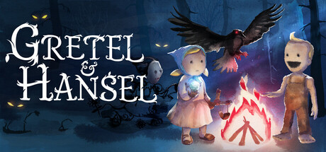
Gretel & Hansel is a delightfully twisted exploration-adventure crafted entirely by hand in watercolor. Abandoned in a cursed forest, you play as Gretel, guiding her brother home while outwitting deadly traps, unraveling sinister puzzles, and escaping the clutches of a ravenous witch.

Point & ClickHorrorPuzzle
Spider HouseComing soon

Gretel & Hansel scores 73/100 — better than 56% of Steam capsules we've analysed (n=22,658).

Released Coming soon · By Spider House

Quick text summary

Gretel & Hansel scored 73/100 on Steam Analyzer — Good for a Steam capsule. Top priority fix: [title_readability] Add a subtle dark vignette or semi-opaque backing behind the title text to improve separation from the forest background at tiny size.

Capsule scores by dimension

  • Genre Clarity: 7/10 — Dark fairy tale adventure clear. The campfire scene with doll-like children figures, a looming crow, and glowing eyes in a dark forest immediately suggests a dark fairy tale or storybook adventure. At small size the campfire warmth against the cold blue forest provides enough genre signaling for mystery or narrative adventure. At tiny size the specific fairy tale subgenre is harder to confirm but the eerie mood still communicates indie narrative adventure.
  • Title Readability: 7/10 — Readable full, strains at tiny. The serif title 'Gretel & Hansel' uses a decorative gothic-influenced font in white/cream with good contrast against the dark upper background area at full size. At small size the letterforms remain legible though the ampersand detail compresses. At tiny size the title begins to compress and the decorative serifs cause some collapse, making it harder to parse quickly, though the two-word structure helps retention.
  • Contrast & Color: 7/10 — Warm campfire against cold blue. The warm orange campfire glow creates strong temperature contrast against the cool desaturated blue-grey forest background, giving the capsule a clear focal anchor. The character silhouettes benefit from the rim lighting of the campfire but the doll-like figures are somewhat low contrast against the midground. In grayscale the campfire still reads as the primary light source and separates the foreground from background effectively, though the crow at the top merges with the dark sky at tiny size.
  • Uniqueness & Polish: 8/10 — Distinctive handcrafted doll aesthetic. The handcrafted doll-puppet visual style for the characters is genuinely distinctive and immediately sets this apart from typical indie adventure capsules in the genre. The watercolor-inspired painted forest background combined with the tactile fabric-like character designs communicates the game's unique handmade art direction clearly. Compared to genre benchmarks like Slay the Princess or Harold Halibut, this occupies a confident niche visual identity that feels intentional and premium rather than template-generated.
  • Brand Consistency: 8/10 — Cohesive dark storybook identity. The capsule maintains strong internal cohesion with the blue-grey palette, the handcrafted puppet character aesthetic, the painted forest environment, and the fairy tale iconography all working together. The title font reinforces the storybook tone and the glowing eyes in the background add a horror layer consistent with the game's twisted fairy tale pitch. This visual language would be recognizable in subsequent brand touchpoints, establishing a clear identity signature.
  • Composition: 7/10 — Clear focal campfire, some clutter. The campfire acts as a strong compositional anchor in the lower center with the characters arranged around it in a natural grouping that creates a readable foreground subject. The crow in the upper center adds threat and vertical interest without fully competing with the main group. At small size the title in the upper left and the character grouping around the campfire create a reasonable split of attention, though at tiny size the composition compresses and the crow can cause the upper region to feel busy against the title text.

What works

  • Distinctive puppet doll art style. The handcrafted fabric-textured character designs are immediately visually unique and set the game apart from generic indie adventure capsules at a glance.
  • Strong temperature contrast. The warm orange campfire glow against the cold blue forest creates an effective and memorable color dynamic that pops against Steam's dark background.
  • Clear fairy tale narrative signaling. The crow, glowing eyes, campfire, and child figures together communicate a dark fairy tale premise without requiring text to support it.
  • Cohesive art direction. Font choice, character style, background painting, and color palette all feel unified under one consistent visual identity.

What hurts the capsule

  • Title collapses at tiny size. The decorative serif letterforms in the title compress at tiny thumbnail size, reducing readability during quick Steam browsing scrolls.
  • Crow merges with dark sky at tiny. The black crow against the dark blue-grey upper background loses silhouette separation at small and tiny sizes, weakening its intended menace.
  • Character contrast is moderate. The doll figures are somewhat mid-toned and do not fully pop against the background in grayscale, reducing silhouette clarity at reduced sizes.
  • Upper composition feels split. The title top-left and the crow top-center create a divided upper region that can feel visually competitive rather than hierarchically clear at small sizes.

Priority fixes

  1. [title_readability] Add a subtle dark vignette or semi-opaque backing behind the title text to improve separation from the forest background at tiny size.
  2. [contrast_color] Increase the brightness or edge lighting on the character figures so they separate more clearly from the midground forest in both color and grayscale.
  3. [composition] Reduce the crow's visual weight or reposition it slightly so it does not bisect the upper third between the title and sky at small viewing sizes.
  4. [genre_clarity] Consider adding a very subtle warm glow or magical particle effect around the central glowing orb held by Gretel to reinforce the adventure-mystery tone at tiny size.

Store copy priority fixes

  1. [feature_communication] Add 1-2 specific puzzle examples (e.g., 'use Gretel's slingshot to topple a chandelier blocking your path' or 'decode witch runes to unlock hidden doors') to demonstrate puzzle depth beyond vague 'sinister puzzles.'
  2. [feature_communication] Clarify the role of costumes and tokens with concrete impact: do costumes grant new abilities that unlock areas, or are they cosmetic? Do tokens unlock story segments or optional challenges?
  3. [audience_targeting] Add an explicit audience signal early in the detailed description, such as 'Perfect for players who love hand-crafted puzzle adventures with dark humor' or 'Built for explorers who appreciate art and experimentation over combat,' to help the right player self-identify.
  4. [genre_clarity] Strengthen the psychological horror angle by adding 1-2 sentences about the witch as an active threat or the forest's menacing atmosphere, since 'psychological horror' is tagged but barely present in the copy.

Related guides

Steam app ID: 3299820