Scoring genre clarity...
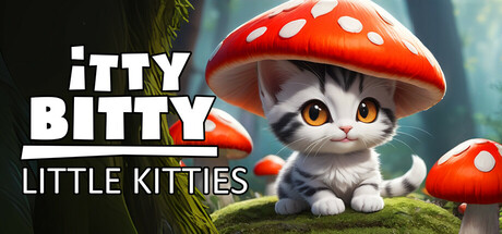
Discover tiny little kittens hidden throughout magical forest scenes while enjoying relaxing music in a calming, zen-like atmosphere. Some are easy to find, but others can be real little devils, so be warned! For cat lovers and hidden object game enthusiasts alike ♡♡♡
$4.994 user reviews
CatsCuteCasual
Willow BitsJun 17, 2025