Scoring genre clarity...
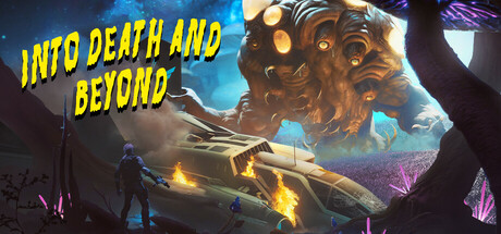
Into Death and Beyond is a gripping first-person survival horror game set on the hostile planet XB32-ENT. As bounty hunter Mark Helkins, scavenge for resources, solve puzzles, and confront terrifying mutants. Unravel dark secrets and capture a rogue alien before it hunts you down. Will you survive?
$9.993 user reviews
HorrorSurvival HorrorSci-fi
Dolores EntertainmentMar 7, 2025