Scoring genre clarity...

The Confinement capsule

The Confinement

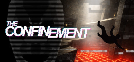
The Confinement is a game that puts your skills to the test. Master precise movements, strategic dashes, and challenging courses. Face more than 30 intense levels, improve your times, and compete for positions in a competitive global ranking. Perfect for players seeking speed and precision.

$6.499 user reviews
Precision PlatformerParkourTime Attack
Mr. Dev StudioApr 9, 2026

The Confinement scores 63/100 — better than 6% of Steam capsules we've analysed (n=22,658).

9 user reviews · $6.49 · Released Apr 9, 2026 · By Mr. Dev Studio

Quick text summary

The Confinement scored 63/100 on Steam Analyzer — Solid for a Steam capsule. Top priority fix: [title_readability] Remove or reduce chromatic aberration glitch effect and increase letter spacing to maintain clarity at tiny size; consider solid white or white with thin outline instead.

Capsule scores by dimension

  • Genre Clarity: 7/10 — Action platformer implied by silhouette. The falling figure in mid-air against a geometric red floor grid clearly signals action and movement-based gameplay. At tiny size, the dynamic pose and stark environment read as action-oriented, though the precision platformer angle is not immediately obvious without context. The architectural containment setting supports the action genre expectation.
  • Title Readability: 6/10 — Title readable at full, struggles at tiny. THE CONFINEMENT uses a bold, blocky sans-serif with slight glitch effects in white with purple/magenta fringing, positioned upper left. At full size it reads clearly, but at tiny size (120x45) the text becomes compressed and the glitch effect creates artifacting that reduces legibility. The title does not sit on a fully isolated background, competing slightly with the horizontal scan-line texture.
  • Contrast & Color: 7/10 — Strong value separation, bold red accent. The composition uses sharp value contrast with bright white title text, dark charcoal architectural geometry, and a vivid red grid floor that pops distinctly against the Steam dark background. The silhouette of the falling figure reads well in grayscale due to dark clothing against lighter background zones. The red grid provides excellent local contrast but creates some visual busyness that slightly dilutes focal point clarity at small sizes.
  • Uniqueness & Polish: 6/10 — Competent sci-fi aesthetic, generic execution. The design uses familiar sci-fi containment chamber tropes—grid floor, stark geometry, confined space—without a distinctive visual hook that sets it apart from similar precision platformers. The glitch effect on the title feels trendy rather than integral to brand identity. While technically sound, the overall presentation lacks a memorable or unique selling point beyond standard action platformer iconography.
  • Brand Consistency: 5/10 — Minimal distinctive identity signals. The capsule relies on generic sci-fi aesthetic cues (grid floor, contained architecture, glitch text) that do not establish a recognizable brand signature. No iconic character, logo motif, or color palette emerges that would distinguish The Confinement from other puzzle-platformers in a lineup. The visual language is functional but forgettable, offering little internal consistency signal beyond the sci-fi theme.
  • Composition: 7/10 — Clear focal point, good depth layering. The falling figure commands center-right attention with the bright red grid anchoring the lower third, creating clear foreground-midground-background separation. The title occupies safe upper-left territory away from critical edges. At small size, the composition remains readable with the figure and grid as clear visual anchors. The scan-line texture in the upper portion adds depth but introduces slight visual noise that competes for attention at tiny sizes.

What works

  • Strong value contrast. White text, dark geometry, and bright red grid create clear separation that reads well at all sizes and pops against the Steam dark background.
  • Dynamic focal point. The falling figure creates an immediate sense of action and movement, clearly signaling gameplay intensity and urgency.
  • Clear spatial composition. The layering of background texture, architectural forms, and foreground grid creates satisfying depth without cluttering the primary subject.

What hurts the capsule

  • Generic sci-fi aesthetic. The grid floor and containment chamber design lack distinctive identity or memorable visual hook compared to top-tier action game capsules.
  • Glitch effect undermines legibility. The purple-magenta chromatic aberration on the title text degrades clarity at small and tiny sizes where precision matters most.
  • No brand signature elements. Lacks iconic character, symbol, or signature palette that would enable instant recognition in a crowded storefront or recommendation list.
  • Background texture competes for attention. The horizontal scan-line pattern in the upper portion adds visual noise that slightly dilutes focal point hierarchy, especially at compressed sizes.

Priority fixes

  1. [title_readability] Remove or reduce chromatic aberration glitch effect and increase letter spacing to maintain clarity at tiny size; consider solid white or white with thin outline instead.
  2. [uniqueness_polish] Introduce a signature visual motif or unique character silhouette that distinguishes this from generic containment aesthetics and builds brand memory.
  3. [brand_consistency] Establish a consistent color palette and visual signature across marketing—add a recognizable icon or symbol that appears on all materials for instant identification.
  4. [composition] Simplify the background texture or reduce scan-line intensity in upper region to allow the falling figure and title to command full attention without competing visual noise.

Store copy priority fixes

  1. [hook_strength] Rewrite the short description to lead with the core action: 'First-person parkour where every dash counts—master brutal precision platforming across brutalist neon levels and compete for global leaderboard dominance.' This immediately communicates FP parkour identity and competitive draw.
  2. [feature_communication] Clarify whether Dash is a character or mechanic by revising to 'Precise dashing and movement mechanics are key' or by explicitly naming a character if one exists; remove the narrative ambiguity that undermines clarity.
  3. [uniqueness] Add a specific differentiator about the dash system or level design philosophy—e.g., 'Confinement's multi-directional dash variants create flow-state movement unlike traditional platformers' or similar distinction that explains why this game's mechanics feel fresh.
  4. [audience_targeting] Strengthen the speedrun community signal by adding language like 'Join thousands on the leaderboard' or 'Built for speed runners and precision enthusiasts' to more directly address the core demographic.

Related guides

Steam app ID: 3327590