Scoring genre clarity...
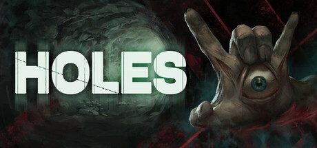
In this horror game, mysterious hands drag the hero underground, and the player's task is to get out to the surface to return to your usual work. All the action of the game takes place in dark and stuffy tunnels, in the absence of light.
$4.994 user reviews
Horror1990'sRetro
Waves GamesOct 21, 2025