Quick text summary
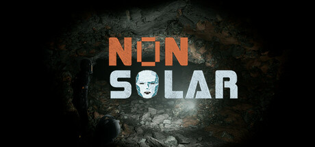
Nonsolar scored 72/100 on Steam Analyzer — Good for a Survival Horror capsule. Top priority fix: [uniqueness_polish] Enlarge and prominently feature the 8-bit computer character as a co-lead visual element (e.g., shoulder-level or integrated into title design more prominently) to immediately communicate the unique AI partnership mechanic.
Capsule scores by dimension
- Genre Clarity: 7/10 — Survival horror with sci-fi setting clear. The dark, weathered exoplanet texture, orange/industrial color palette, and stark lighting strongly suggest a hostile sci-fi survival environment. The 8-bit computer character is visible but small; at tiny size the genre reads as action-horror rather than the unique computer-partnership mechanic that defines the game. The overall aesthetic aligns with sci-fi survival expectations without fully telegraphing the 8-bit AI companion as a core mechanic.
- Title Readability: 8/10 — Bold, readable title with strong hierarchy. The title 'NEON SOLAR' uses clean, geometric sans-serif lettering in bright orange and white against a dark, textured background, ensuring strong contrast and legibility at all sizes. The split color treatment (orange 'NEON', white 'SOLAR') creates visual interest and remains readable even at tiny thumbnail size. The letterforms are thick enough to survive pixelation, though the tagline (if present) would be unreadable at tiny size.
- Contrast & Color: 8/10 — Excellent value separation, strong orange pop. The bright orange 'NEON' text and white 'SOLAR' lettering create excellent luminosity contrast against the dark, muted teal-gray weathered background. The silhouette of the character head in the 'O' maintains clear definition without blending. At tiny size, the orange neon glow effect reads clearly, and the overall value range (dark bg to bright foreground text) ensures the capsule stands out on the Steam dark background without muddiness.
- Uniqueness & Polish: 7/10 — Polished sci-fi aesthetic, limited distinctive hook. The design is clean and competent with intentional typography and a cohesive industrial sci-fi look, but the weathered metal texture and neon-lit title treatment feel familiar in the survival horror / sci-fi genre. The embedded 8-bit computer head is a unique visual twist but reads as small detail rather than a primary selling point at small sizes. The execution is premium—no cheap asset feel—but the core concept doesn't immediately communicate what makes Nonsolar distinct from other sci-fi survival games.
- Brand Consistency: 6/10 — Coherent sci-fi aesthetic, weak memorable identity. The internal cohesion is solid: the weathered metal texture, orange neon palette, and industrial lighting all align consistently. However, there are no obvious signature motifs, iconic symbols, or distinctive brand markers that would make Nonsolar instantly recognizable in a lineup. The 8-bit computer character could become an iconic brand element but is underutilized as a small detail rather than a primary identity anchor.
- Composition: 7/10 — Strong central focal point, balanced layout. The title is well-centered with the 8-bit character head integrated into the letter 'O', creating a natural focal point that guides the eye. The weathered texture fills the frame without overwhelming the text, and the composition maintains clear separation between foreground text and background detail. At small and tiny sizes, the title remains the primary focus and the character detail is visible but secondary, which is appropriate for quick recognition.
What works
- Readable title across all sizes. Orange and white lettering with geometric sans-serif design maintains legibility from full header down to tiny thumbnail without collapse or blur-out.
- Strong contrast against Steam background. Bright neon orange and white colors pop clearly against the dark teal-gray texture, ensuring the capsule stands out during quick scrolling.
- Cohesive sci-fi industrial aesthetic. Weathered metal texture, orange neon glow, and lighting direction create a unified, polished visual direction with no jarring tonal shifts.
What hurts the capsule
- 8-bit AI mechanic underemphasized. The computer character is integrated as a small detail in the 'O' rather than featured as a primary visual hook, failing to communicate the game's unique computer-partnership mechanic.
- Generic sci-fi survival presentation. The weathered metal, industrial aesthetic, and neon title treatment feel familiar across multiple survival horror games, offering limited distinctive identity signals that would aid brand recall.
- Limited visual storytelling of gameplay. The capsule communicates 'dark sci-fi' but doesn't hint at the survival, weapon systems, or exploration elements that differentiate Nonsolar from other sci-fi action titles.
Priority fixes
- [uniqueness_polish] Enlarge and prominently feature the 8-bit computer character as a co-lead visual element (e.g., shoulder-level or integrated into title design more prominently) to immediately communicate the unique AI partnership mechanic.
- [genre_clarity] Add a subtle weapon or equipment silhouette (unique to Nonsolar) or environment cue (hostile exoplanet detail) to reinforce the survival-action gameplay beyond generic sci-fi aesthetic.
- [brand_consistency] Develop a signature color or symbol (beyond neon orange) that becomes synonymous with Nonsolar and test it across the 10 available screenshots to build recognizable brand identity.
Store copy priority fixes
- [feature_communication] Expand the 2D visual interpretation mechanic with a concrete example: 'Translate the computer's 8-bit readouts into real-world decisions—read a pixelated heat map to detect enemy movement, or decode garbled environmental data to find safe passage.'
- [feature_communication] Replace 'unique weapons and equipment' with 1–2 specific examples that convey survival horror gameplay (e.g., 'craft defensive tools from alien materials' or 'equip scanning tools to identify threats').
- [genre_clarity] Clarify the action-to-exploration ratio in a single sentence, e.g., 'Defend yourself against the planet's creatures while solving environmental puzzles,' to resolve the implicit conflict between action and psychological horror pacing.
- [audience_targeting] Add a sentence signalling difficulty and player type, e.g., 'Best for players who value atmosphere and puzzle-solving over fast-paced combat' or 'challenging for experienced horror fans,' to set expectations.
Related guides
Steam app ID: 3338860 · Tags: Survival Horror, Horror, Psychological Horror, Adventure, Action