Jack Street scores 77/100 — better than 87% of Horror capsules (n=3,118).

Quick text summary

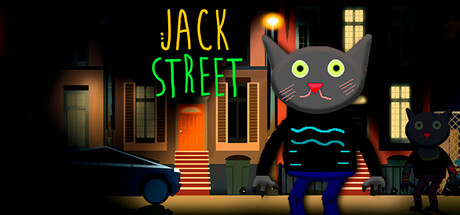
Jack Street scored 77/100 on Steam Analyzer — Good for a Horror capsule. Top priority fix: [title_readability] Unify the title into a single strong color (gold or bright neon) with a thin dark outline to improve contrast at tiny size and reduce color-transition softening.

Capsule scores by dimension

  • Genre Clarity: 8/10 — Dark platformer with horror charm. The stylized black cat character with glowing eyes and the creepy 90s cartoon aesthetic immediately signal a dark adventure platformer with horror elements. The decrepit house setting, warm orange lighting, and menacing cat silhouette reinforce the spooky-playful tone at full size. At tiny size, the cat and house remain recognizable enough to suggest the genre, though fine details like the cat's expression blur slightly.
  • Title Readability: 7/10 — Clear but color separation lacks punch. JACK in gold and STREET in neon green are positioned clearly at top-left in a readable sans-serif stack, with good spacing and no decorative complexity. The gold-to-green transition has decent contrast against the dark background at full size, but at tiny size the colors compress together and the transition becomes less distinct, making it harder to separate the two words at a quick glance. The title remains legible at small and tiny sizes due to size and placement, but lacks the punch of a single unified color approach.
  • Contrast & Color: 8/10 — Strong warm-cool dynamic with good silhouettes. The orange-amber house lighting creates warm value separation against the dark navy-black background, while the cat's gray silhouette with cyan-blue accents (eyes, mouth line) provides cool contrast that pops. At tiny size, the warm glow around the windows and the cat's bright yellow eyes maintain clear readability and silhouette separation. In grayscale, the values hold distinct edges between subject and background, supporting strong visual clarity.
  • Uniqueness & Polish: 7/10 — Charming retro aesthetic with cohesive craft. The 90s-inspired cartoon style with hand-drawn feeling architecture, expressive cat character design, and thoughtful color palette (warm wood tones, neon accents) communicates a specific creative vision distinct from generic horror platformers. The composition feels intentional and polished, with careful lighting and proportion work on the character and setting. While visually distinctive and well-executed, it relies on familiar retro-cartoon tropes and doesn't introduce a mechanics-forward visual hook that screams unique gameplay innovation.
  • Brand Consistency: 8/10 — Strong iconic cat motif and palette. The large expressive black cat with glowing eyes is a memorable character anchor that immediately becomes the face of Jack Street and should remain consistent across marketing and in-game visuals. The warm orange-amber house palette paired with cool cyan accents creates a recognizable color identity that feels cohesive and intentional. The retro cartoon rendering style is clean and consistent throughout, establishing a memorable brand identity that could be recognized in future promotional materials or sequel imagery.
  • Composition: 8/10 — Well-balanced focal point with clear hierarchy. The cat character occupies the right-center area as the primary focal point, drawing immediate attention with its size and distinctive design, while the house architecture frames it as a supporting secondary element. The title anchors top-left in a safe zone without competing for dominance, allowing the cat and environment to tell the story. At small and tiny sizes, the cat remains the clear hero and the composition holds strong; no important elements are cropped or lost, and the balanced spacing prevents clutter.

What works

  • Memorable character silhouette. The expressive black cat with glowing yellow eyes and cyan mouth is instantly iconic and readable at all sizes, serving as a strong visual anchor and brand identifier.
  • Atmospheric color grading. The warm orange-amber house lighting contrasts beautifully against the dark background and cool cyan accents, creating mood and depth that communicates the spooky-playful tone.
  • Clean hierarchy and focal point. The cat dominates the composition as the clear primary subject while the house provides context without visual competition, maintaining strong read at all viewing sizes.
  • Retro aesthetic authenticity. The 90s cartoon style feels genuinely crafted with intentional proportions, lighting, and line work rather than generic asset compilation.

What hurts the capsule

  • Title color separation softens at scale. The gold JACK transitioning to green STREET lacks a unified contrast anchor, and the colors compress visually at tiny size, reducing impact compared to a single strong color choice.
  • Generic horror-platformer visual tropes. While well-executed, the haunted house + creepy character formula is familiar in the indie horror space, lacking a distinctive mechanics-forward visual hook that sets gameplay expectations.
  • Limited sense of action or movement. The static composition and posed cat suggest atmosphere more than platformer gameplay, potentially missing the opportunity to visually communicate core action-adventure mechanics.

Priority fixes

  1. [title_readability] Unify the title into a single strong color (gold or bright neon) with a thin dark outline to improve contrast at tiny size and reduce color-transition softening.
  2. [composition] Consider adding a subtle dynamic pose or action element (cat mid-jump, or environment hint of danger) to better communicate the platformer action genre while maintaining atmosphere.
  3. [contrast_color] Increase the saturation or brightness of the cat's eye glow slightly to ensure they remain the brightest focal point and read clearly at tiny thumbnail size.

Store copy priority fixes

  1. [hook_strength] Lead with a specific mechanic or emotional conflict: instead of 'dark 2D platformer,' try 'Survive a town overrun by mutants while your brother profits from the chaos—a 2D platformer where trust is your deadliest enemy.'
  2. [uniqueness] Add a concrete unique selling point in the short description, such as 'Unlike typical platformers, Jack is a morally grey protagonist who'll do anything to escape,' to differentiate from genre competitors.
  3. [feature_communication] Expand the 'Fight different types of mutants and bosses' line with one sentence detailing combat mechanics, enemy variety, or progression (e.g., 'Master dynamic platforming and tactical combat against 8 mutant types and 5 boss encounters').
  4. [tone_match] Remove or reimagine the team credits section to preserve the atmospheric tone, or integrate it as character credits ('Meet the architects of Paintburgh: Daniil Veselov (world designer)...') rather than standard credits.

Related guides

Steam app ID: 3344270 · Tags: Horror, Atmospheric, Cartoony, Adventure, Platformer