Scoring genre clarity...

Bee Simulator: The Hive capsule

Bee Simulator: The Hive

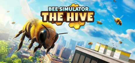
Live the epic adventure of a tiny bee in a vast world! Collect pollen, race through jet streams, and protect your hive from wasps. Now even bigger with The Hive expansion - gather resources, build and customize your very own beehive!

$14.99Mixed(25)
CasualSimulationArcade
VARSAV Game StudiosAug 4, 2025

Bee Simulator: The Hive scores 78/100 — better than 84% of Steam capsules we've analysed (n=22,658).

Mixed (25 reviews) · $14.99 · Released Aug 4, 2025 · By VARSAV Game Studios

Quick text summary

Bee Simulator: The Hive scored 78/100 on Steam Analyzer — Good for a Steam capsule. Top priority fix: [title_readability] Increase visual separation between 'BEE SIMULATOR' and 'THE HIVE' subtitle so both read as distinct text elements at small size, potentially enlarging 'THE HIVE' or adding a stronger drop shadow.

Capsule scores by dimension

  • Genre Clarity: 9/10 — Bee simulation instantly recognizable. The giant bee in the foreground against a sunny cityscape background immediately communicates a creature/life simulator where you play as a bee. Multiple bees visible in the background reinforce the swarm and hive management aspect. At tiny size the oversized bee silhouette against the bright sky remains unmistakable and the genre reads clearly as a casual nature simulator.
  • Title Readability: 8/10 — Bold title reads well at most sizes. The title 'BEE SIMULATOR THE HIVE' uses a chunky, outlined font with strong contrast sitting above the bee subject on a relatively clean sky area. 'THE HIVE' in particular benefits from the honeycomb hex badge behind it. At tiny size 'BEE SIMULATOR' collapses somewhat but the bold weight and yellow-orange coloring keeps it partially readable, while 'THE HIVE' may become difficult to parse as a distinct subtitle.
  • Contrast & Color: 8/10 — Warm palette pops on Steam dark UI. The warm golden-yellow bee and bright blue sky create strong contrast against Steam's #1b2838 dark background, making the capsule immediately noticeable in a browse list. The bee's fuzzy amber body has excellent silhouette separation from the sky. In grayscale the large foreground bee still reads cleanly, though the city midground and background bees blend into a slightly busy mid-value zone.
  • Uniqueness & Polish: 7/10 — Charming but follows simulator formula. The oversized creature-in-a-city composition is a well-established simulator trope seen in Goat Simulator and similar titles, which slightly reduces distinctiveness. The execution is clean and professional with good lighting on the bee, a convincing shallow depth of field, and cohesive sunny aesthetic. The honeycomb badge on the subtitle adds a nice genre-specific design touch, but the overall layout feels familiar rather than inventive.
  • Brand Consistency: 7/10 — Cohesive sunny bee identity. The warm yellow-amber palette, bright outdoor lighting, and realistic-yet-charming bee style form a recognizable internal identity. The honeycomb motif in the title badge is a strong recurring brand signal that could be carried across assets. The overall tone is consistently cheerful and family-friendly, though without seeing other brand assets the identity feels tied primarily to the subject matter rather than a distinctive artistic signature.
  • Composition: 8/10 — Clear focal hierarchy with good depth. The large close-up bee occupies the left foreground as an undeniable primary focal point, with background bees and the cityscape providing depth layers. The title sits in the upper center on clean sky, avoiding competition with the main subject. At small and tiny sizes the oversized bee dominates effectively and the composition crops well. The rooftop beehive in the lower right corner is a nice supporting detail but risks being cut in tighter crops.

What works

  • Unmistakable subject at all sizes. The giant foreground bee silhouette is immediately readable even at 120x45 pixels, ensuring genre recognition in quick scroll.
  • Strong warm-cool color contrast. The amber-yellow bee against a vivid blue sky creates natural complementary contrast that pops strongly against Steam's dark interface.
  • Honeycomb badge on subtitle. The hexagonal honeycomb graphic behind 'THE HIVE' adds a genre-specific design element that reinforces the bee theme without cluttering the layout.
  • Good depth layering. Foreground bee, mid-air background bees, and distant cityscape create three distinct depth layers that give the image a sense of scale and world.

What hurts the capsule

  • Subtitle legibility at tiny size. 'THE HIVE' as a distinct subtitle becomes very hard to read at 120x45 and may be perceived as title noise rather than informative branding.
  • Generic simulator composition trope. The oversized creature towering over a city is an overused visual shorthand in the simulator genre, reducing memorability compared to top-performing capsules.
  • Busy background bees compete at small size. The multiple background bees add visual noise that dilutes focus at small sizes, making the mid and background zone read as clutter rather than depth.
  • Lower right rooftop detail vulnerable to crop. The beehive rooftop scene in the bottom right corner sits near the edge and will be lost in tighter Steam capsule crop ratios.

Priority fixes

  1. [title_readability] Increase visual separation between 'BEE SIMULATOR' and 'THE HIVE' subtitle so both read as distinct text elements at small size, potentially enlarging 'THE HIVE' or adding a stronger drop shadow.
  2. [uniqueness_polish] Introduce a more distinctive compositional angle or unique visual hook beyond the standard oversized-creature-over-city format to differentiate from genre competitors.
  3. [contrast_color] Reduce the number of background bees or lower their opacity to decrease mid-zone visual noise and keep the eye focused on the primary foreground subject at small sizes.
  4. [composition] Shift the rooftop beehive detail inward or upward to ensure it survives Steam's various capsule crop ratios and remains a readable supporting element.

Store copy priority fixes

  1. [hook_strength] Replace 'epic adventure' with a more specific, concrete hook that highlights what makes a bee's perspective unique or fun—e.g., 'Control a bee in a vast open world where pollen is currency, wasps are enemies, and your hive is a city you build yourself.'
  2. [uniqueness] Add a clear differentiator: explain what The Hive expansion uniquely brings or how this game's building mechanics differ from other city builders (e.g., 'Build the only custom hive in real-time as you gather resources' or compare to a specific feature gap in competitors).
  3. [feature_communication] Expand explanations of 'bee dances' and 'jet streams' with concrete gameplay context: what do bee dances do mechanically, and how do jet streams function as a movement or speedrun mechanic?
  4. [tone_match] Revise the story paragraph ('diligent workers,' 'looming danger') to match the warmer, more playful tone of the short description and tag emphasis on 'memes' and 'family friendly.'

Related guides

Steam app ID: 3348910