Scoring genre clarity...

Valorborn capsule

Valorborn

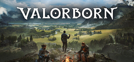
Dive into a living medieval fantasy sandbox RPG where the world moves with or without you and factions rise and fall. Become a thief, hunter, or sellsword, survive alone or with a party, and shape your story in a fully enterable world where every building, cave, and road hides opportunity or danger.

$19.99Mixed(29)
Early AccessRPGOpen World
Laps GamesApr 15, 2026

Valorborn scores 63/100 — better than 6% of Steam capsules we've analysed (n=22,658).

Mixed (29 reviews) · $19.99 · Released Apr 15, 2026 · By Laps Games

Quick text summary

Valorborn scored 63/100 on Steam Analyzer — Solid for a Steam capsule. Top priority fix: [contrast_color] Add a stronger rim light or value contrast boost to the central standing figure so the silhouette clearly separates from the background at small and tiny sizes.

Capsule scores by dimension

  • Genre Clarity: 6/10 — Medieval open world RPG implied. Three figures overlooking a vast medieval landscape with a campfire suggest an open-world RPG or adventure game, which aligns with the genre. However, at tiny size the pastoral valley scene loses specificity and could read as a generic fantasy or even strategy game overview. The axe-wielding central figure and companions hint at party-based RPG but the genre cues collapse at small sizes.
  • Title Readability: 7/10 — Clear title at full, shrinks small. VALORBORN is set in a clean, bold serif-style font with good letter spacing and sits against the lighter sky at the top center, giving reasonable contrast at full size. At small capsule size the title remains just readable due to its weight and simple letterforms. At tiny thumbnail size the title becomes difficult to confirm but the font weight keeps it marginally legible, though no outline or shadow reinforcement is visible to help at extreme reduction.
  • Contrast & Color: 6/10 — Moderate contrast, midtone heavy. The overall palette is dominated by cool greens, browns, and muted earth tones that sit close in value to Steam's dark navy background when viewed at a distance. The central standing figure has a slightly brighter silhouette against the valley but lacks a strong light-dark pop. In a grayscale mental test, the three characters blend into the rocky foreground, reducing silhouette clarity at small and tiny sizes.
  • Uniqueness & Polish: 6/10 — Competent but generic vista style. The three-figures-overlooking-a-landscape composition is a well-worn trope in open-world RPG marketing and does not differentiate Valorborn from dozens of similar games. The photo-real rendering is competent and the lighting on the valley is pleasant, but there is no distinctive visual hook, unusual art direction, or standout element that communicates the sandbox or faction-driven USP. Compared to benchmarks like Baldur's Gate 3 or Manor Lords this feels safe and template-like.
  • Brand Consistency: 6/10 — Coherent palette, no strong identity. The image maintains a consistent realistic medieval fantasy rendering style and a unified earthy color palette, suggesting internal cohesion. However, there is no iconic character, emblem, symbol, or signature motif that would make this capsule instantly recognizable as Valorborn in a later encounter. The campfire is a small identity cue but not distinctive enough to anchor brand recognition on its own.
  • Composition: 7/10 — Strong depth, crowded foreground base. The layered composition of rocky foreground with figures, mid-ground valley, and distant mountains creates good depth and a clear background-midground-foreground read at full size. The title is well-placed in the open sky at the top center with breathing room. At small size the three characters compress into an indistinct cluster at the bottom edge and the campfire detail is lost, but the sweeping landscape still communicates scale. The figures are slightly bottom-edge-hugging which risks crop on some Steam display contexts.

What works

  • Strong sense of scale. The sweeping valley panorama effectively communicates an expansive open world even at reduced sizes.
  • Title placement in clear sky. VALORBORN sits against the lightest region of the image, giving it the best available contrast without competing with character detail.
  • Depth layering. Foreground rocks, mid-ground settlement, and distant mountains create a convincing three-layer depth read at full size.

What hurts the capsule

  • Generic three-figures vista trope. The overlooking-landscape composition is overused in the RPG genre and does not communicate Valorborn's unique sandbox or faction mechanics.
  • Low value contrast against Steam background. The muted earthy palette sits close in value to surrounding dark UI, reducing the capsule's ability to pop during a quick scroll.
  • Character silhouettes collapse at tiny size. The three figures merge into an unreadable dark blob at 120x45, losing the human presence that anchors genre clarity.
  • No distinctive brand identity element. There is no logo emblem, iconic symbol, or signature motif that would make this capsule recognizable as Valorborn separate from the text title.

Priority fixes

  1. [contrast_color] Add a stronger rim light or value contrast boost to the central standing figure so the silhouette clearly separates from the background at small and tiny sizes.
  2. [uniqueness_polish] Introduce a distinctive visual element such as a faction emblem, unique weapon, or iconic symbol overlaid on the composition to differentiate from generic open-world vista capsules.
  3. [genre_clarity] Reinforce medieval RPG cues at small size by sharpening or enlarging one character with a clearly readable weapon or armor silhouette in the foreground.
  4. [title_readability] Add a subtle dark outline or soft shadow behind the VALORBORN letterforms to maintain legibility at tiny thumbnail size against varied background regions.

Store copy priority fixes

  1. [hook_strength] Add a single sentence to the short description explicitly stating 'Early Access' status and core progression expectation (e.g., 'Early Access with persistent world systems') to set correct expectations upfront.
  2. [feature_communication] Expand the permadeath section with one clarifying sentence: specify whether it applies to the player character only, party members, or both, and whether it can be disabled.
  3. [uniqueness] Add one paragraph after 'Write Your Own Story' that explicitly contrasts this game's approach versus comparable sandbox RPGs (e.g., 'Unlike linear story-driven RPGs, Valorborn has no main quest—factions, survival, and your reputation drive progression').
  4. [feature_communication] In the party section, add details on party combat roles or AI behavior (e.g., 'Issue simple commands in combat or let party members act autonomously based on their background') to clarify multiplayer/squad gameplay depth.

Related guides

Steam app ID: 3372530