BBA Ghost Story: Ward Edition scores 68/100 — better than 23% of Horror capsules (n=3,118).

Quick text summary

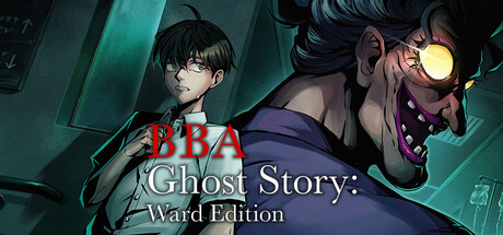
BBA Ghost Story: Ward Edition scored 68/100 on Steam Analyzer — Solid for a Horror capsule. Top priority fix: [genre_clarity] Clarify the 'BBA' abbreviation with a visible full title or expand the subtitle to include the complete game name for stronger genre/identity communication

Capsule scores by dimension

  • Genre Clarity: 7/10 — Horror chase premise reads clearly. The composition immediately communicates a pursuit horror scenario with a frightened young character on the left and a menacing pursuer with glowing goggles on the right, set against institutional teal-green hospital architecture. The visual hierarchy and character positioning clearly signal action-adventure horror chase mechanics. At tiny size, the silhouettes and color contrast still convey danger and pursuit, though fine details of the antagonist's expression become less readable.
  • Title Readability: 6/10 — Title legible at full, marginal at tiny. The main title 'BBA' and subtitle 'Ghost Story: Ward Edition' are rendered in clean white and light gray text with adequate contrast against the dark teal background. At small and tiny sizes, the subtitle text becomes difficult to parse, and the abbreviation 'BBA' lacks context that would aid memorability. The text placement is safe from edges but competes slightly with the strong character visuals for attention.
  • Contrast & Color: 8/10 — Strong teal palette with good separation. The cool institutional teal-green dominant color creates excellent value separation against the Steam dark background #1b2838, with warm orange-red accents on the protagonist's clothing providing pop. The glowing yellow goggles on the antagonist add another bright accent that guides focus. In grayscale stress test, silhouettes remain distinct and readable even at tiny sizes due to strong mid-tone to dark transitions.
  • Uniqueness & Polish: 7/10 — Polished execution, familiar horror tropes. The illustration quality is clean and well-rendered with good lighting separation, particularly the goggles and institutional geometry creating an eerie atmosphere. The visual storytelling clearly communicates a specific pursuit scenario rather than generic horror. However, the 'chase through institution by masked pursuer' concept is familiar within indie horror; the execution is solid but the core concept lacks a distinctive hook that stands out from peer titles like Lethal Company or DREDGE.
  • Brand Consistency: 6/10 — Competent but minimal identity signals. The institutional teal color and character designs appear consistent with the horror theme, but there are no distinctive iconography, recurring symbols, or signature visual motifs visible that would create brand recognition across marketing materials. The style is cohesive within this single image, with consistent rendering and lighting, but lacks memorable identity anchors like iconic character silhouettes or color palettes that rival titles (Hades II, Slay the Princess) establish immediately.
  • Composition: 7/10 — Clear hierarchy, good focal balance. The left-right composition places the vulnerable protagonist on the left and the threatening pursuer on the right, creating dynamic tension and clear spatial hierarchy. The architectural background elements frame without overwhelming. Text placement is safe from standard Steam cropping edges. At tiny size, the two-character focal point remains clear, though mid-ground hospital details risk becoming visual noise.

What works

  • Strong value contrast against dark background. The teal institutional palette and warm character accents create excellent separation from Steam's #1b2838 background, maintaining readability and visual pop even at small sizes.
  • Clear pursuit horror communication. Character positioning, expressions, and posture immediately convey the chase premise and emotional stakes without ambiguity about game type or core mechanic.
  • Clean illustration quality and rendering. The character designs, lighting, and architectural elements show intentional craft and professional execution rather than asset-flip or template appearance.

What hurts the capsule

  • Subtitle becomes illegible at tiny size. The 'Ghost Story: Ward Edition' text loses clarity below small capsule dimensions, requiring viewers to already know the title for context.
  • Minimal brand identity and distinctiveness. No iconic symbols, signature motifs, or unique visual hooks that would create recognizable brand recall compared to top-performing indie horror titles in the genre.
  • Familiar horror concept execution. While polished, the masked pursuer chasing through institutional setting concept closely mirrors existing popular titles without a clear unique selling point differentiator.
  • Unclear 'BBA' abbreviation lacks context. The three-letter acronym provides no semantic meaning and doesn't aid memorability or immediate game identification at any viewing size.

Priority fixes

  1. [genre_clarity] Clarify the 'BBA' abbreviation with a visible full title or expand the subtitle to include the complete game name for stronger genre/identity communication
  2. [uniqueness_polish] Introduce a distinctive visual hook or signature element (unique location detail, distinctive character design feature, or symbolic motif) that differentiates from generic chase-horror templates
  3. [title_readability] Increase subtitle font size or restructure text hierarchy so 'Ghost Story: Ward Edition' remains legible at small capsule sizes while maintaining visual balance
  4. [brand_consistency] Develop recognizable visual identity signals such as a consistent color signature, iconic character silhouette, or recurring symbol that can anchor brand recall across store assets

Store copy priority fixes

  1. [hook_strength] Rewrite the short description to lead with the emotional/narrative hook: 'Uncover the tragic story of a ghostly nurse trapped in an abandoned hospital—but first, you must survive her endless pursuit.' This establishes stakes and mystery, not just mechanics.
  2. [uniqueness] Add a sentence to the opening narrative section emphasizing what makes Baba different: 'Unlike other chase-horror games, the more you learn about Baba's past, the more her relentless pursuit becomes tragic rather than purely terrifying.' This positions the game's emotional core.
  3. [feature_communication] Expand the Multiple Endings and Replayable sections with concrete details: 'Discover one of three distinct endings based on how much of Baba's story you uncover. Each playthrough takes 30–60 minutes.' Specificity builds confidence.
  4. [audience_targeting] Add a sentence clarifying the intended player type: 'Perfect for horror fans who crave atmosphere and story alongside tension, and players who enjoy narrative-driven adventures with meaningful replayability.' This filters for the right audience.

Related guides

Steam app ID: 3373820 · Tags: Horror, Adventure, Indie, JRPG, Multiple Endings