Scoring genre clarity...
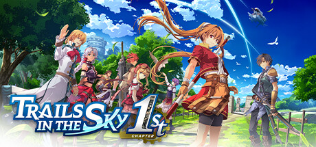
Trails in the Sky 1st Chapter capsule

Trails in the Sky 1st Chapter

Trails in the Sky 1st Chapter reimagines the first chapter of a beloved series, infusing it with enhanced visuals and refined gameplay. Join Estelle and Joshua, partners bound by fate, as they unravel dark conspiracies threatening the peace of the Liberl Kingdom.

$59.99Overwhelmingly Positive(265)
JRPGRPGAdventure
Nihon FalcomSep 19, 2025

Trails in the Sky 1st Chapter scores 78/100 — better than 92% of JRPG capsules (n=443).

Overwhelmingly Positive (265 reviews) · $59.99 · Released Sep 19, 2025 · By Nihon Falcom

Quick text summary

Trails in the Sky 1st Chapter scored 78/100 on Steam Analyzer — Good for a JRPG capsule. Top priority fix: [uniqueness_polish] Introduce a unique visual motif or distinctive art treatment—consider adding environmental hazard, magical effect, or iconic series symbol—that differentiates this capsule from generic JRPG ensemble poses and signals 'Trails' specifically.

Capsule scores by dimension

  • Genre Clarity: 8/10 — JRPG adventure clearly signaled. The capsule immediately communicates a classic JRPG through ensemble character poses, vibrant fantasy setting with pastoral landscape, and the iconic blue sky aesthetic. At TINY size, the grouped party composition and bright pastoral background remain legible enough to signal adventure RPG genre without ambiguity. The bright, optimistic color palette and character costumes reinforce the turn-based RPG expectation.
  • Title Readability: 8/10 — Title legible, logo strong hierarchy. The 'Trails in the Sky' logo uses bold blue lettering with white outline and a clear serif font positioned in the lower left quadrant against a bright sky background, maintaining excellent contrast. The '1st Chapter' tagline is smaller but still readable at SMALL size; at TINY size the main logo remains dominant and identifiable though fine details blur slightly. Strategic placement on the sky background ensures the title separates from character clutter effectively.
  • Contrast & Color: 9/10 — Vibrant palette pops strongly. Bright blues, warm oranges, greens, and character skin tones create exceptional value separation against the dark Steam background. The clear sky backdrop and vivid character details maintain strong silhouettes even at TINY size, with no muddy mid-tones or blending issues. In grayscale, the composition holds clear depth and edge definition between foreground characters and background landscape.
  • Uniqueness & Polish: 7/10 — Polished anime aesthetic, somewhat familiar. The artwork displays high production value with clean character rendering, detailed costume design, and professional illustration quality that feels premium and intentional. However, the bright cheerful party pose and pastoral setting are genre-standard tropes for classic JRPG remasters, lacking a bold distinctive hook or unique visual storytelling angle. The execution is excellent but the composition follows expected conventions rather than establishing a memorable visual identity.
  • Brand Consistency: 7/10 — Series identity present, execution solid. The ensemble character arrangement, blue and gold color motifs, and pastoral Liberl Kingdom setting align with series visual identity from promotional materials. The character designs show consistent anime styling and costume coherence across all visible party members. While internally cohesive and recognizable as a Trails game, the capsule does not feature a uniquely iconic symbol or signature motif that stands out as 'Trails-only' beyond general anime RPG conventions.
  • Composition: 8/10 — Balanced ensemble arrangement, clear focal depth. The party members form a natural diagonal line creating visual flow from left to right, with the two prominent central characters (Estelle and Joshua based on description) anchoring viewer attention. The layered landscape—foreground characters, midground trees, bright sky—creates clear depth and prevents visual flatness. Title placement in lower left respects safe margins and does not interfere with character silhouettes; the composition scales gracefully to SMALL and TINY sizes with maintained hierarchy.

What works

  • Strong color contrast against dark background. Vibrant blues, warm oranges, and character tones create excellent visual pop and silhouette clarity that survives even at TINY thumbnail size without value collapse.
  • Clear ensemble party hierarchy. Central character positioning and diagonal arrangement guide eye movement naturally while maintaining a focal point that reads instantly at all sizes.
  • Professional anime art quality. High-fidelity character rendering, detailed costumes, and polished illustration style communicate premium production value and competent craft execution.
  • Readable logo with strong outline. Blue and white title text with outline treatment maintains legibility even at reduced sizes with effective contrast against the sky background.

What hurts the capsule

  • Generic JRPG party pose convention. The cheerful ensemble standing in pastoral landscape is a familiar trope that does not establish a distinctive visual identity beyond standard anime RPG expectations.
  • Limited unique visual hook. The capsule communicates 'JRPG adventure' effectively but lacks a bold, memorable selling point or unique mechanic visual that would distinguish it from other remasters in the genre.
  • Bright sky may compress fine detail at TINY. While composition holds, the uniform bright blue background causes subtle character and foliage details to blur into mid-tone softness at very small viewing sizes.

Priority fixes

  1. [uniqueness_polish] Introduce a unique visual motif or distinctive art treatment—consider adding environmental hazard, magical effect, or iconic series symbol—that differentiates this capsule from generic JRPG ensemble poses and signals 'Trails' specifically.
  2. [composition] Add a subtle depth enhancement such as layered atmospheric perspective or strategic lighting accent to reinforce the midground landscape and prevent character-to-background visual merger at TINY size.
  3. [title_readability] Test '1st Chapter' tagline legibility at actual TINY size (120×45px) and increase stroke weight or contrast if it becomes unreadable; consider moving it slightly if it overlaps character silhouettes.

Store copy priority fixes

  1. [hook_strength] Rewrite the opening to lead with a gameplay verb and emotional stakes: 'As junior bracers climbing the ranks of Liberl's peacekeeping guild, Estelle and Joshua uncover a conspiracy that threatens their homeland—with a choice between turn-based and real-time combat.'
  2. [uniqueness] Add a sentence explicitly comparing this remake to the original or stating a standout feature: e.g., 'This remake reimagines the classic with modern 3D visuals, dual combat modes, and fully voiced dialogue—expanding the world fans loved.'
  3. [feature_communication] Include concrete gameplay details in the description: number of hours, party mechanics, or progression depth to give players a clearer mental model of what they will spend time doing beyond story.

Related guides

Steam app ID: 3375780 · Tags: JRPG, RPG, Adventure, Female Protagonist, Turn-Based Combat