Scoring genre clarity...

Kabuto Park capsule

Kabuto Park

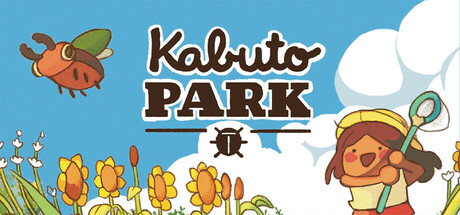
Enjoy summer in Kabuto Park! Catch the cutest bugs, train them and win the Summer Beetle Battles Championship in this tiny bug collection game! Upgrade your equipment to find rarer, stronger and shinier little friends.

$3.49Overwhelmingly Positive(190)
Creature CollectorCasualNature
DootMay 28, 2025

Kabuto Park scores 72/100 — better than 44% of Steam capsules we've analysed (n=22,658).

Overwhelmingly Positive (190 reviews) · $3.49 · Released May 28, 2025 · By Doot

Quick text summary

Kabuto Park scored 72/100 on Steam Analyzer — Good for a Steam capsule. Top priority fix: [uniqueness_polish] Remove or replace the '9 NEW LANGUAGES – OUT NOW' promotional banner from the main capsule image to preserve premium visual quality and improve composition balance at all sizes.

Capsule scores by dimension

  • Genre Clarity: 8/10 — Bug collecting casual sim clear. The cheerful child character holding a bug-catching net, the large cartoon beetle in the top left, and the bright summery flower field backdrop immediately communicate a bug-catching or nature collection game. At tiny size the net and beetle silhouette still hint at an insect-themed casual game. Genre subgenre of collection/simulation reads well, though the RPG/strategy layer is invisible from the art alone.
  • Title Readability: 7/10 — Title reads well at small size. The 'Kabuto Park' logo uses a rounded, playful hand-drawn font with good letter spacing and a dark outline that separates it from the bright sky background. At full size it is fully readable and charming. At tiny size 'Kabuto Park' remains legible due to the bold strokes, though finer details in the lettering soften. The bottom banner '9 NEW LANGUAGES – OUT NOW' becomes completely unreadable at tiny size and adds visual noise at small size.
  • Contrast & Color: 7/10 — Bright palette pops on dark Steam background. The warm yellows, greens, and white sky create strong contrast against Steam's #1b2838 dark background, making the capsule pop effectively in a browse grid. The child character and beetle both have clear dark outlines ensuring silhouette separation even in grayscale. The bottom yellow-green promotional banner slightly muddles the lower third but does not collapse the overall contrast story at small size.
  • Uniqueness & Polish: 7/10 — Charming art style, generic layout. The hand-drawn illustrated style is endearing and consistent with the top-performing casual indie peers like Little Kitty Big City and Minami Lane, giving it a polished and intentional feel. The composition is fairly standard — character right, mascot left, title center — which is competent but not particularly inventive or memorable among the benchmark titles. The promotional text banner cheapens the premium feel slightly by adding a sales message to the main capsule art.
  • Brand Consistency: 8/10 — Cohesive insect-themed summer identity. The warm summer palette, outlined cartoonish characters, beetle motif in the logo itself, and the cheerful child all form a coherent and recognizable visual identity. The small beetle icon embedded in the title text reinforces the bug theme as a brand signature. The art style feels consistent throughout and would likely match the in-game screenshots well, creating a trustworthy identity signal.
  • Composition: 6/10 — Functional but banner hurts balance. The layout places the title in the upper center, the mascot beetle upper left, and the character lower right, which creates a reasonable diagonal flow. However the bottom promotional banner ('9 NEW LANGUAGES – OUT NOW') disrupts the compositional balance and occupies prime lower real estate that Steam may crop differently across contexts. At small and tiny sizes the banner competes with the core visual and dilutes focus from the title and characters.

What works

  • Instant genre recognition. The bug-catching net and large beetle character communicate the insect collection theme immediately even at small browsing sizes.
  • Strong contrast against Steam dark background. The bright sky whites, warm yellows, and outlined characters pop cleanly against #1b2838 in a scroll grid.
  • Beetle logo motif as brand anchor. The small beetle icon embedded within the title text acts as a memorable identity signature that ties the brand together.
  • Clean readable title at small size. Bold rounded lettering with dark outlines keeps 'Kabuto Park' legible at small capsule dimensions.

What hurts the capsule

  • Promotional banner clutters the capsule. The '9 NEW LANGUAGES – OUT NOW' strip at the bottom is unreadable at tiny size and reduces perceived premium quality of the image.
  • Standard compositional template. Character right, mascot left, title center is a common layout that does not distinguish this capsule from many casual indie competitors.
  • Strategy and RPG depth invisible. The capsule communicates casual collection well but gives no visual hint of the training, battling, or strategy mechanics that could attract a wider audience.
  • Lower third compositional imbalance. The banner and flower field at the bottom create a heavy lower zone that competes with the character and draws the eye away from the title at small sizes.

Priority fixes

  1. [uniqueness_polish] Remove or replace the '9 NEW LANGUAGES – OUT NOW' promotional banner from the main capsule image to preserve premium visual quality and improve composition balance at all sizes.
  2. [genre_clarity] Add a subtle visual hint of the battle or strategy layer, such as two beetles in a facing-off pose or a trophy icon, to broaden perceived genre appeal beyond casual collection.
  3. [composition] Redistribute the lower third space by raising the character slightly and letting the flower field breathe, eliminating the banner crop risk on different Steam display contexts.
  4. [uniqueness_polish] Introduce a more distinctive compositional angle or lighting effect to differentiate from the standard mascot-left, character-right casual indie template seen across the benchmark titles.

Store copy priority fixes

  1. [hook_strength] Add an emotional hook or time-sensitive element to the short description, such as 'Experience a perfect summer afternoon' or 'Spend one magical month catching and battling bugs' to increase emotional resonance.
  2. [feature_communication] Reduce the 'Features' section text density by converting the paragraph blocks into 2-3 line bullet points or breaking into shorter subsections for faster comprehension under 30-second skim.
  3. [uniqueness] Explicitly compare the battle system to alternatives (e.g., 'sumo-style deck battles—not turn-based combat') in the short description to sharpen differentiation against other creature collectors.

Related guides

Steam app ID: 3376990