小明明的世界 scores 62/100 — better than 4% of RPG capsules (n=3,544).

Quick text summary

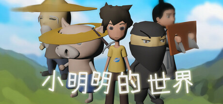
小明明的世界 scored 62/100 on Steam Analyzer — Solid for a RPG capsule. Top priority fix: [title_readability] Add a semi-transparent dark background bar behind the title text or increase character size and weight to ensure Chinese text remains legible at tiny thumbnail size

Capsule scores by dimension

  • Genre Clarity: 7/10 — Adventure RPG readable. Three stylized characters in a pastoral mountain setting clearly communicate an adventure or RPG theme through pose, clothing variety, and environmental context. At tiny size, the character lineup and outdoor setting remain recognizable as an adventure game, though specific genre subtype (real-time combat RPG vs turn-based) is not visually apparent from silhouettes alone.
  • Title Readability: 5/10 — Title legible full size only. White sans-serif Chinese characters '小明明的世界' are readable at full header size with decent contrast against the sky background, but collapse into illegible blur at tiny thumbnail size due to thin stroke weight and small point size relative to overall composition. The title placement centered at bottom works functionally but lacks strategic use of a controlled background region to ensure readability across all viewing scales.
  • Contrast & Color: 6/10 — Adequate value separation. The bright blue sky and green mountain background provide reasonable value separation from the three tan, dark, and brown-clothed characters in the midground. At tiny size, the silhouette of the character group remains distinguishable from the landscape, though the overall palette is relatively warm and mid-tonal without dramatic light-dark separation that would make it pop on the dark Steam background.
  • Uniqueness & Polish: 6/10 — Competent but generic presentation. The art style is clean and well-rendered with appealing character design and a pastoral scene, but the composition reads as a standard character lineup promotional shot rather than communicating a unique mechanical hook or story premise. The scene feels more like a character introduction than a visual storytelling moment that conveys what makes this RPG distinctive from other adventure titles.
  • Brand Consistency: 6/10 — Consistent style lacking signature. The capsule demonstrates internal cohesion with a unified art style, consistent 3D character rendering, and a coherent warm color palette, but lacks an iconic visual motif, character pose, or symbolic element that would become a memorable brand identifier. Without access to other store assets, the capsule reads as competent character art without establishing a distinctive visual identity unique to this title.
  • Composition: 7/10 — Clear focal group hierarchy. The three-character group forms a strong primary focal point in the center-right of the frame, with depth layering from the mountain background through the characters to the sky foreground. Title placement at bottom center is safe from edge cropping, and the composition reads clearly at small size, though the title's illegibility at tiny size and slightly scattered character positioning prevent a higher score.

What works

  • Clear character focal point. The three-character lineup creates an immediately recognizable central subject that reads well as a game protagonist group even at small capsule sizes.
  • Cohesive art direction. Consistent 3D rendering style, unified warm-earth color palette, and pastoral setting demonstrate professional execution with no clashing elements or cheap asset appearance.
  • Safe title composition. White text placement at bottom center avoids edge cropping and maintains safe margins across different aspect ratios.

What hurts the capsule

  • Title illegible at tiny size. Chinese characters become unreadable blur in thumbnail view due to thin stroke weight and insufficient contrast buffer around text.
  • Generic scene storytelling. The character lineup on a mountain reads as a standard promotional shot rather than visually communicating gameplay mechanics, story hook, or what makes this RPG unique.
  • Limited contrast pop. Warm earth-tone palette does not create strong value separation against the dark Steam background color, reducing discoverability in quick scroll.

Priority fixes

  1. [title_readability] Add a semi-transparent dark background bar behind the title text or increase character size and weight to ensure Chinese text remains legible at tiny thumbnail size
  2. [contrast_color] Increase brightness and saturation contrast by adding rim lighting to characters or deepening the sky blue to create stronger silhouette separation against #1b2838
  3. [uniqueness_polish] Recompose the scene to show a specific gameplay moment (e.g., dialogue choice, combat stance, exploration action) that communicates core mechanics rather than a static character introduction

Store copy priority fixes

  1. [hook_strength] Rewrite the opening to lead with a specific conflict or emotional hook: 'Play as Xiao Mingming, a young hero thrust into an unexpected battle to save his home from bandits—and uncover the mystery behind their invasion.' This replaces vague mechanical description with urgency.
  2. [feature_communication] Expand the detailed description by at least 200 words and add a clear breakdown: 'Combat System: [X], Dialogue Choices: [Y], Exploration: [Z], Character Progression: [W].' Include concrete examples of what players will encounter.
  3. [uniqueness] Identify and highlight what makes this game distinct from other indie fantasy RPGs—whether it's a branching narrative, a unique combat mechanic, or a specific cultural angle—and front-load it in the short description.
  4. [audience_targeting] Clarify target audience by adding a sentence like 'Perfect for fans of story-driven indie RPGs who enjoy a mix of exploration, real-time combat, and meaningful dialogue choices' to signal the player type.

Related guides

Steam app ID: 3382580 · Tags: RPG, Adventure, Dialogue Heavy, Fantasy, Combat