Scoring genre clarity...

Debt City capsule

Debt City

A retro open world life sim RPG. Explore a seedy sandbox city, and do anything you can to pay off a debt to a mob boss.

$1.993 user reviews
RPGSimulationLife Sim
Solohack3r StudiosFeb 25, 2025

Debt City scores 72/100 — better than 49% of RPG capsules (n=3,544).

3 user reviews · $1.99 · Released Feb 25, 2025 · By Solohack3r Studios

Quick text summary

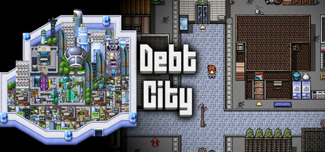
Debt City scored 72/100 on Steam Analyzer — Good for a RPG capsule. Top priority fix: [composition] Consolidate focus by enlarging and centering the isometric city, relegating the interior scene to a smaller supporting corner or removing it entirely to avoid visual split.

Capsule scores by dimension

  • Genre Clarity: 8/10 — Retro sandbox city sim reads clearly. The isometric pixel art cityscape on the left immediately signals a retro life sim or sandbox RPG, reinforced by the dense urban layout with visible storefronts, NPCs, and street-level detail. At tiny size, the distinctive isometric perspective and bustling city grid remain recognizable, though individual gameplay mechanics become abstract. The retro aesthetic aligns perfectly with the debt-driven sandbox narrative promised in the description.
  • Title Readability: 7/10 — Bold sans serif holds at small sizes. The title 'Debt City' uses a clean, bold sans-serif font positioned centrally with strong white-on-dark contrast against the background. At small and tiny sizes, the letterforms remain legible due to their weight and spacing, though the supporting diegetic scene to the right competes slightly for attention. The title placement is strategic but slightly center-heavy, which works functionally but lacks ideal compositional tension.
  • Contrast & Color: 8/10 — Strong value separation, cohesive palette. The capsule achieves excellent contrast through bright primary colors in the isometric city (blues, greens, magentas, yellows) against the dark background, and the white title pops clearly. The right-side interior scene uses muted grays and earth tones that recede effectively, creating depth layering. At tiny size, the city's bright neon-like colors and the white text remain visually distinct and scannable despite detail loss.
  • Uniqueness & Polish: 7/10 — Distinctive retro style, competent execution. The pixel art aesthetic and isometric city view differentiate it from photorealistic AAA competitors, and the craft appears intentional with consistent sprite work and color blocking. However, the composition feels more like a straightforward scene showcase rather than a unique visual hook that communicates the core 'debt repayment' premise or the seedy sandbox depth mentioned in the description. The polish is solid but the storytelling could be stronger.
  • Brand Consistency: 6/10 — Retro pixel style maintained, minimal identity. The isometric pixel art and color palette are internally consistent across the visible scenes, and the retro aesthetic will likely carry through to in-game visuals and other marketing materials. However, without distinctive character silhouettes, signature motifs, or a memorable color system unique to Debt City, the identity feels more like 'retro sim game' than 'Debt City specifically.' The visual language is coherent but not yet iconic.
  • Composition: 7/10 — Dual-scene layout, clear hierarchy, slight imbalance. The left isometric city serves as the primary focal point and anchor, while the right interior scene provides secondary context and visual variety. The white title occupies the center-right, drawing eye naturally. At small size, both scenes remain readable but compete slightly; at tiny size, the composition holds though the interior details blur together. The layout risks feeling split rather than unified, and the right scene's darker tones slightly reduce visual pop.

What works

  • Retro aesthetic stands out vs AAA competitors. The pixel art isometric view immediately differentiates Debt City from photorealistic AAA titles in the genre benchmark list, signaling indie charm and sandbox depth.
  • Excellent color and contrast at small sizes. Bright neon-like city colors and white title text remain scannable and visually distinct even at tiny thumbnail size against the dark Steam background.
  • Readable, bold typography. The sans-serif 'Debt City' title maintains legibility across all viewing sizes due to weight, spacing, and strong white-on-dark contrast.

What hurts the capsule

  • Composition split between two competing scenes. The left city and right interior scene both demand attention, creating visual tension rather than a unified focal hierarchy that guides the eye smoothly.
  • Weak brand identity and memory hook. No distinctive character, signature color, or iconic motif emerges that would make Debt City recognizable on sight; the retro style is generic within the sandbox sim category.
  • Core premise not visually communicated. The capsule shows a city and interior but does not visually convey the 'debt to a mob boss' narrative or the seedy sandbox urgency that differentiates the game's story.

Priority fixes

  1. [composition] Consolidate focus by enlarging and centering the isometric city, relegating the interior scene to a smaller supporting corner or removing it entirely to avoid visual split.
  2. [uniqueness_polish] Add a distinctive visual hook—such as a shadowy mob figure, a glowing debt counter, or a neon 'WANTED' motif—that communicates the core debt-driven premise and creates a memorable identity.
  3. [genre_clarity] If the interior is retained, add subtle UI or prop cues (e.g., a desk with 'IOUs', a safe, or money stacks) that reinforce the debt repayment mechanics and sandbox focus.
  4. [brand_consistency] Establish a signature color accent or recurring symbol (perhaps a crime syndicate emblem or monetary theme) that can anchor brand recognition across future marketing materials.

Store copy priority fixes

  1. [hook_strength] Replace the redundant opening paragraph in the detailed description with an emotional hook that emphasizes the stakes: something like 'You have 10 days and $10,000 to escape a mob boss's reach—or gamble everything on one last score.' This would strengthen the urgency without repeating the short description.
  2. [feature_communication] Expand the time system explanation with one concrete sentence: 'Each in-game day allows you 3–8 actions depending on difficulty; going over limits exhausts you and costs money in hospital bills, forcing tough daily choices.' This adds strategic clarity without bloating the copy.
  3. [uniqueness] Add one sentence after the 10-day premise that articulates what sets this apart from similar sandbox games: 'Unlike open-ended life sims, your debt deadline forces you to prioritize: pursue a lucrative crime career, grind legitimate jobs, or find hidden shortcuts—and your choice determines one of four endings.' This gives readers a memorable differentiator.
  4. [audience_targeting] Insert a brief accessibility note in the customization section: 'Choose your difficulty to control daily action limits, making the game playable whether you prefer deep strategy or relaxed exploration.' This explicitly signals both hardcore sandbox players and casual experience-seekers.

Related guides

Steam app ID: 3387370 · Tags: RPG, Simulation, Life Sim, Sandbox, Choose Your Own Adventure