Scoring genre clarity...

Squash and Spell : Kids Typing capsule

Squash and Spell : Kids Typing

A fun & friendly way for children to learn about letters, words, keyboards and writing!

$4.995 user reviews
TypingSpellingEducation
Crafty Pickle Games LimitedMay 28, 2025

Squash and Spell : Kids Typing scores 80/100 — better than 86% of Typing capsules (n=214).

5 user reviews · $4.99 · Released May 28, 2025 · By Crafty Pickle Games Limited

Quick text summary

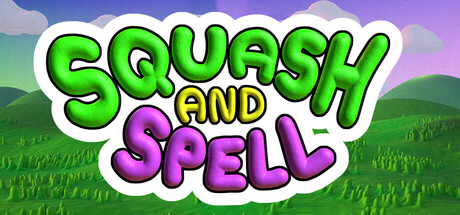
Squash and Spell : Kids Typing scored 80/100 on Steam Analyzer — Good for a Typing capsule. Top priority fix: [brand_consistency] Introduce a distinctive character mascot or icon element to the title area to create a memorable visual anchor and improve long-term brand recognition beyond the wordmark alone.

Capsule scores by dimension

  • Genre Clarity: 8/10 — Playful educational game for kids. The bright, cheerful pastoral setting with rolling green hills and sky clearly signals a child-friendly game, while the prominent "AND SPELL" text combined with keyboard learning context implies an educational typing game. At tiny size, the vibrant color palette and friendly cartoony aesthetic immediately read as family-safe content, though the specific genre mixes casual with educational rather than being a pure gameplay genre signal.
  • Title Readability: 9/10 — Bold, legible title at all sizes. The title uses thick, chunky letterforms with a white outline and bold green/purple fill that maintains excellent contrast and readability at full size, small capsule, and tiny thumbnail sizes. The two-line stacked layout is intentional and clean, with "SQUASH" in bright green and "SPELL" in vibrant purple, ensuring zero ambiguity even under quick scroll conditions. The outline stroke prevents letter collapse and keeps each character distinct at smallest viewing sizes.
  • Contrast & Color: 9/10 — Vibrant, high-value separation throughout. The bright green title and purple accent text create strong value contrast against the white outline and pastoral background, while the lush green landscape and blue-purple sky gradient provide excellent separation from dark Steam backgrounds. In grayscale, the composition maintains clear silhouette definition due to the thick white outline around all typography and the clean landscape depth, ensuring visibility at tiny sizes even when squinting.
  • Uniqueness & Polish: 7/10 — Charming, polished but genre-familiar. The art style is clean and well-executed with consistent rendering, playful typography treatment, and a cohesive pastoral theme that feels intentional rather than templated. However, the landscape and cloud elements follow familiar casual indie game conventions seen in titles like Palia and Moonstone Island, so while execution is solid, the visual concept itself is not particularly distinctive within the broader casual/educational game space.
  • Brand Consistency: 7/10 — Consistent palette and friendly tone. The bright green and purple color scheme, friendly cartoony art direction, and cheerful pastoral setting establish a recognizable visual identity appropriate for children's educational games. The style appears cohesive with the game's purpose, though without access to the 7 store screenshots, the icon or any character mascots that might serve as stronger brand anchors cannot be fully verified for consistency.
  • Composition: 8/10 — Clear hierarchy with balanced layout. The title dominates the center with strong visual weight, while the pastoral background provides supporting context without competing for attention—the composition uses a clear foreground (title), midground (clouds and horizon), and background (distant hills) that create natural depth. Safe margins are observed well; the title sits comfortably in the upper-center area with breathing room on all sides, and the composition remains effective at small and tiny sizes with no important elements touching edges or becoming cut off.

What works

  • Exceptional title legibility. The thick white outline, bold letterforms, and vibrant green/purple fill combination ensures the game name remains crystal-clear and readable even at 120×45 tiny thumbnail size without any letter collapse or ambiguity.
  • Strong color contrast and visual pop. Bright, saturated greens and purples paired with white outlines create excellent value separation that stands out dramatically against the dark Steam background, making the capsule immediately eye-catching in quick scroll scenarios.
  • Clean, intentional composition. Foreground, midground, and background layers are well-defined with clear hierarchy; the title occupies prime real estate without crowding, and supporting landscape elements frame rather than distract from the core message.

What hurts the capsule

  • Generic pastoral theme. While executed well, the rolling green hills and sky background follow familiar indie game conventions and don't establish a strong unique visual identity that distinguishes this title from similar casual games in the genre.
  • Limited character or mascot presence. The capsule relies entirely on typography and landscape, with no visible character, creature, or mascot that could serve as a memorable brand anchor for future recognition and brand consistency.

Priority fixes

  1. [brand_consistency] Introduce a distinctive character mascot or icon element to the title area to create a memorable visual anchor and improve long-term brand recognition beyond the wordmark alone.
  2. [uniqueness_polish] Consider adding a subtle gameplay-specific visual element (e.g., floating letters, keyboard keys, or a learning-focused motif) to the composition that hints at the educational typing mechanics and differentiates from generic pastoral indie games.

Store copy priority fixes

  1. [hook_strength] Replace 'A fun & friendly way for children to learn...' with a verb-led statement describing the core activity, such as 'Squash falling words and spell them out to build confidence with letters and keyboards' or similar action-focused hook.
  2. [uniqueness] Add a 1-2 sentence statement explaining what makes this game distinct—e.g., a unique art style, a specific learning method, age range, or a combination of features no competitor offers (e.g., 'the only typing game with integrated phonics toggle and freehand letter drawing for multi-sensory learning').
  3. [feature_communication] Rewrite the feature list as a short gameplay narrative showing progression: 'Start with the alphabet, advance to spelling words from the rainbow, then draw letters and write in the word processor mode' to help readers visualize a play session.
  4. [genre_clarity] Add a single sentence early in the detailed description that clearly states the core gameplay loop, e.g., 'Squash and Spell challenges children to identify and spell words correctly while learning keyboard control and letter formation.'

Related guides

Steam app ID: 3387970 · Tags: Typing, Spelling, Education, Word Game, Family Friendly