Quick text summary

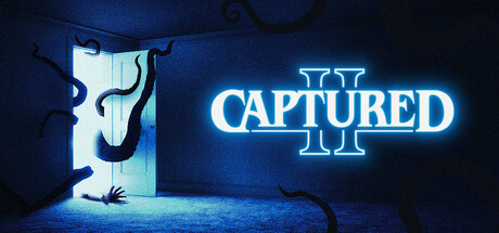
CAPTURED 2 scored 80/100 on Steam Analyzer — Good for a Horror capsule. Top priority fix: [genre_clarity] Add subtle camera viewfinder or targeting reticle element to reinforce the 'capture anomalies' mechanic as differentiator from generic horror

Capsule scores by dimension

  • Genre Clarity: 7/10 — Horror action with camera mechanic clear. The neon blue glow, distorted figure emerging from the door, and tentacle-like dark entities clearly signal horror/supernatural action. The camera mechanic is implied through the game's core loop visuals, though at tiny size the specific 'anomaly capture' gameplay premise becomes harder to distinguish. The aesthetic reads distinctly as survival horror rather than generic action.
  • Title Readability: 9/10 — Bold neon title stands out sharply. The bright cyan neon glow on 'CAPTURED II' creates excellent contrast against the dark blue-black background and remains fully legible at all sizes including tiny. The clean sans-serif letterforms and strategic placement in the upper-right quadrant ensure the title never competes with or gets lost in the background detail. Even at 120x45 the neon glow preserves readability and brand recognition.
  • Contrast & Color: 8/10 — Strong cyan neon pops against dark blue. The electric blue neon title has exceptional value separation and saturation against the deep #1b2838 background, creating an immediate visual hook. The dark silhouette of the figure and tentacles maintain clear edges through strong backlighting. At tiny size the neon glow remains the dominant focal point with excellent figure-to-background separation in grayscale.
  • Uniqueness & Polish: 8/10 — Distinctive neon horror aesthetic highly polished. The neon-soaked horror presentation with the distorted figure and impossibly twisted doorway demonstrates cohesive art direction and a signature visual style that signals premium craft. The lighting effects, glow bloom, and creature silhouette work together to communicate a unique story hook (trapped in shifting rooms with entities) rather than generic survival horror. Compared to benchmark titles, this sits solidly in the upper tier for visual distinctiveness and intentional design.
  • Brand Consistency: 8/10 — Neon blue becomes iconic series signature. The electric cyan neon treatment as a primary brand color is distinctive and would remain recognizable across marketing materials and future sequels. The distorted humanoid silhouette and door-portal motif create a strong visual identity tied directly to the core 'trapped room' premise. Internal consistency is high: the color palette, lighting approach, and surreal spatial distortion all reinforce a cohesive horror identity.
  • Composition: 8/10 — Clear focal hierarchy with balanced depth layers. The composition uses strong layering: dark portal door in left-center midground, distorted figure emerging from it as primary focus, floating entities in background, and neon title anchoring the upper right. This creates depth and guides the eye naturally without clutter. The title placement respects safe margins and the composition holds coherence at small and tiny sizes with no critical information lost at edges.

What works

  • Neon title legibility exceptional at all sizes. The bright cyan glow and clean letterforms remain readable even at 120x45 tiny size with no collapse in clarity.
  • Strong visual hierarchy and focal point. The distorted emerging figure immediately reads as the primary subject with the neon title as secondary anchor, creating natural eye flow.
  • Premium horror aesthetic with intentional craft. Lighting effects, silhouette clarity, and neon glow demonstrate professional execution that signals quality and distinctiveness in the genre.
  • Excellent contrast separation against dark background. The cyan glow and figure silhouettes maintain clear value separation in grayscale, ensuring discoverability in quick scroll.

What hurts the capsule

  • Genre mechanic camera element not explicit. While horror action reads clearly, the specific 'anomaly capture via camera' core mechanic is not directly communicated visually.
  • Tentacle entities lack sharp definition at tiny size. The floating dark tendrils become less distinct at 120x45, reading more as blur than identifiable threats.

Priority fixes

  1. [genre_clarity] Add subtle camera viewfinder or targeting reticle element to reinforce the 'capture anomalies' mechanic as differentiator from generic horror
  2. [composition] Increase silhouette definition of floating entities with slight brightening or outline to ensure they remain distinct at tiny sizes

Store copy priority fixes

  1. [feature_communication] Clarify how the camera capture mechanic directly aids survival or entity avoidance—e.g., 'Capturing anomalies reveals entity patterns, allowing you to predict and avoid their next move' to integrate the two core systems.
  2. [feature_communication] Add 1–2 specific entity examples with mechanics in the SURVIVE ENTITIES section—e.g., 'One entity moves only when unseen; another hunts by sound' to make variety concrete and exciting.
  3. [audience_targeting] Insert a sentence signaling difficulty/pacing expectations—e.g., 'Designed for players who enjoy methodical exploration and puzzle-solving under pressure' to clarify the target skill and play style.
  4. [genre_clarity] In the feature list, explicitly state whether anomalies are optional puzzles or mandatory to progress, as this clarifies whether it's an escape room, survival horror, or hybrid experience.

Related guides

Steam app ID: 3390880 · Tags: Horror, Psychological Horror, Exploration, Adventure, Story Rich