Scoring genre clarity...

a Difficult game about Wheelchair capsule

a Difficult game about Wheelchair

Overcome the obstacle course while sitting in a wheelchair, using unique controls.

$2.998 user reviews
SimulationPrecision PlatformerPhysics
SATEKI GAMESAug 3, 2025

a Difficult game about Wheelchair scores 72/100 — better than 44% of Steam capsules we've analysed (n=22,658).

8 user reviews · $2.99 · Released Aug 3, 2025 · By SATEKI GAMES

Quick text summary

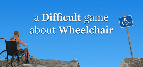
a Difficult game about Wheelchair scored 72/100 on Steam Analyzer — Good for a Steam capsule. Top priority fix: [composition] Bring the accessibility sign closer to the character or overlap elements to unify the focal point and prevent split attention at tiny size.

Capsule scores by dimension

  • Genre Clarity: 8/10 — Obstacle sim concept crystal clear. The center-left character in a wheelchair on rocky terrain immediately communicates the core gameplay premise. The accessibility sign on the right reinforces the wheelchair theme with dry humor. At tiny size the wheelchair silhouette and rocky terrain still read as a challenge-based simulation, though the fine rocky detail collapses.
  • Title Readability: 7/10 — Clean text readable at small size. The mixed-weight serif/sans title uses bold on 'Difficult' and 'Wheelchair' to create emphasis hierarchy, set against a clean bright blue sky background with strong contrast. At small size the two-line layout holds up reasonably well. At tiny size the lowercase words like 'a' and 'game' and 'about' become very small and the full title collapses to an indistinct block, though the key bold words may still be parsed.
  • Contrast & Color: 7/10 — Sky contrast works, terrain mid-tones fade. The bright cyan-blue sky creates strong contrast against the Steam dark background and makes the overall capsule pop well in a scroll. The character's skin tone and the sandy rocky terrain share similar mid-tone warm values, causing some silhouette bleed at tiny size in grayscale. The white/dark title text against sky has excellent value separation.
  • Uniqueness & Polish: 7/10 — Clever concept, modest production value. The dry humor concept of a shirtless man in a wheelchair on rocky terrain next to an accessibility sign is immediately distinctive and memorable in the genre. The 3D render quality is competent but not exceptional, with a slightly generic lighting setup and no strong artistic stylization. Compared to benchmark titles like DAVE THE DIVER or Buckshot Roulette the craft feels functional rather than premium, but the concept hook carries significant weight.
  • Brand Consistency: 7/10 — Strong identity around wheelchair motif. The accessibility sign icon serves as a consistent brand symbol alongside the wheelchair character, forming a recognizable visual identity. The light blue sky palette and deadpan 3D realism style create a cohesive tone that matches the game's dry humor positioning. The title typography uses a deliberate mixed-capitalization style that reinforces the brand voice consistently.
  • Composition: 7/10 — Good subject placement, balanced layout. The character and wheelchair occupy the left-center area creating a clear focal point, with the rocky foreground providing depth and grounding. The title text sits in the open sky area to the right providing clean separation from the subject, and the accessibility sign on the far right adds a secondary visual anchor. At small and tiny sizes the composition remains readable but the gap between the character on the left and the sign on the right creates a slightly split focal point that weakens cohesion.

What works

  • Instantly communicates concept. The wheelchair character on rocky terrain immediately tells the player exactly what the game is about with zero ambiguity.
  • Title placement on clean sky. Setting the title text against the uncluttered blue sky ensures strong contrast and readability at small sizes.
  • Memorable dry humor hook. The accessibility sign next to a challenging rocky obstacle course delivers a comedic USP that stands out in the genre.
  • Strong color pop against Steam background. The bright blue sky creates excellent value contrast against Steam's dark #1b2838 background, making the capsule immediately visible in a scroll.

What hurts the capsule

  • Split focal points at tiny size. The character on the left and the accessibility sign on the right create two competing anchors that divide attention when the image shrinks.
  • Character silhouette blends into terrain. The skin tone and rocky ground share similar warm mid-tones causing the figure to partially merge with the terrain in grayscale or at tiny size.
  • Full title collapses at tiny size. The smaller words 'a', 'game', and 'about' become illegible at thumbnail scale, leaving only the bold words partially readable.
  • Generic 3D lighting feels unpolished. The flat outdoor lighting on the character lacks the stylized or premium rendering quality seen in top benchmark capsules in the simulation genre.

Priority fixes

  1. [composition] Bring the accessibility sign closer to the character or overlap elements to unify the focal point and prevent split attention at tiny size.
  2. [title_readability] Increase the font size of the smaller title words or condense the layout so the full title remains parseable at 120x45 pixels.
  3. [contrast_color] Add a darker shadow or rim light to the character's back to separate the figure silhouette from the rocky terrain in grayscale.
  4. [uniqueness_polish] Apply a subtle stylistic treatment to the 3D render such as stronger directional lighting or a slight color grade to elevate perceived production quality.

Store copy priority fixes

  1. [feature_communication] Expand the detailed description to 150+ words covering: (1) How the wheelchair control system works mechanistically, (2) What types of obstacles the player encounters, (3) The progression/level design structure, (4) Whether there is a time limit, scoring, or narrative framing.
  2. [hook_strength] Rewrite the short description to lead with emotional or thematic appeal: 'Navigate an unforgiving obstacle course from a wheelchair and discover what it truly means to adapt and persist' rather than the mechanical description alone.
  3. [uniqueness] Add 2-3 sentences explaining why wheelchair perspective is thematically or mechanically central, not just cosmetic—e.g., does it change how you interact with the environment, comment on accessibility, or create novel control challenges?
  4. [audience_targeting] Include an explicit audience signal such as 'For fans of precision platformers and Getting Over It who want a fresh mechanical twist' or 'For players seeking an experimental take on difficult games.'

Related guides

Steam app ID: 3406090