Scoring genre clarity...

Steam & Stones capsule

Steam & Stones

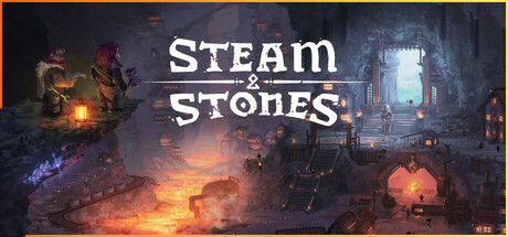
Every big dwarven city started as a modest settlement under the mountain. Team up with your friends, harness the power of water, lava and steam and build a thriving dwarven city powered by automation. Craft stuff, tech up, make a profit.Contains traces of ale.

Colony SimSimulationAutomation
AnvilWorksTo be announced

Steam & Stones scores 72/100 — better than 44% of Steam capsules we've analysed (n=22,658).

Released To be announced · By AnvilWorks

Quick text summary

Steam & Stones scored 72/100 on Steam Analyzer — Good for a Steam capsule. Top priority fix: [composition] Reduce the left-side character vignette in size or brightness so the center lava cityscape becomes the undisputed single focal point at small and tiny sizes.

Capsule scores by dimension

  • Genre Clarity: 7/10 — Dwarven city builder implied. The isometric underground settlement with glowing lava channels, stone architecture, and dwarf-like characters on the left strongly suggests a fantasy city-builder or settlement management game. The steam/lava/automation aesthetic communicates the tech-up mechanic reasonably well at full size. At tiny size the isometric cityscape silhouette still reads as a strategy or builder genre, though the specific dwarven theme becomes harder to parse.
  • Title Readability: 8/10 — Clean serif title reads well. The title 'Steam & Stones' uses a large, clean serif/display font with good contrast against the dark cave background behind it, positioned centrally in the upper-middle area. At small size the title is still legible due to the controlled dark backdrop behind the lettering. At tiny size (120x45) the words compress but the two large words remain distinguishable, though the ampersand becomes very small.
  • Contrast & Color: 7/10 — Warm lava glow pops well. The warm orange and amber lava glow in the lower center creates strong value contrast against the cool dark cave walls and the Steam dark background (#1b2838), giving good edge separation at a glance. The left side characters are somewhat dark and merge with the cave shadows at tiny size. In grayscale the lava light source still creates a clear focal brightness that separates subject from background.
  • Uniqueness & Polish: 7/10 — Polished dwarven aesthetic, somewhat familiar. The illustration quality is solid with detailed isometric architecture, glowing lava channels, and atmospheric cave lighting that feels intentional and crafted rather than generic asset-flip. However, the dwarven underground city-builder visual space is occupied by comparable titles like Dwarf Fortress or similar, and the capsule doesn't introduce a particularly unique hook or standout visual element. It reads as competent and polished but not genre-defining at a glance.
  • Brand Consistency: 7/10 — Cohesive fantasy-industrial identity. The warm lava palette, stone textures, and dwarven silhouettes form a coherent internal visual language that would translate well to screenshots and UI. The title font has a fitting fantasy-industrial character that matches the setting. The 'steam and lava' color theme provides a recognizable signature palette that could carry across marketing materials, though no single iconic character or symbol anchors the brand as a memorable mascot.
  • Composition: 7/10 — Clear hierarchy with centered glow. The composition uses a strong center focal point with the glowing lava-lit city leading the eye inward, with the title positioned in the upper-center against a darker controlled background zone. The left-side dwarf characters add narrative context but feel slightly disconnected from the main scene at small sizes. At tiny size the composition compresses reasonably well with the bright lava center remaining the dominant element, though the left characters become indistinct blobs that add noise rather than clarity.

What works

  • Lava glow creates instant visual anchor. The warm amber lava channels in the center provide a high-contrast focal point that pops immediately against the Steam dark background at any size.
  • Title placement on controlled dark zone. Positioning 'Steam & Stones' against the darker cave ceiling area ensures clean letterform contrast without competing with noisy texture behind it.
  • Isometric cityscape communicates genre quickly. The overhead dwarven settlement layout is a familiar strategy/builder shorthand that lets players identify the genre type within a second at small size.
  • Atmospheric illustration quality feels premium. The detailed cave environment with layered lighting and architectural depth signals a polished indie title rather than a cheap or rushed production.

What hurts the capsule

  • Left-side characters merge into shadow at tiny size. The dwarf figures on the left are underlit and blend with the dark cave wall, contributing nothing to genre or brand recognition at 120x45.
  • No single iconic hero or mascot to anchor brand. The scene is environment-focused with no prominent character face or symbol that could become a recognizable identity marker across store pages.
  • Composition feels slightly split in attention. The left character vignette and the right architectural doorway pull the eye away from the center city, creating three competing focal zones rather than one clear hierarchy.
  • Genre subtype not fully communicated at tiny size. While the builder genre reads at small, the automation and steam-power mechanic that differentiates this title from generic dwarven builders is invisible at tiny thumbnail scale.

Priority fixes

  1. [composition] Reduce the left-side character vignette in size or brightness so the center lava cityscape becomes the undisputed single focal point at small and tiny sizes.
  2. [genre_clarity] Add a subtle automation or steam-pipe visual element (gears, pipes, steam vents) closer to the center to differentiate from generic fantasy builders at tiny size.
  3. [brand_consistency] Introduce one iconic dwarf character face or a recognizable symbol (cog, anvil, steam icon) near the title that could serve as a brand anchor across future marketing.
  4. [contrast_color] Lighten or add a subtle rim light to the left-side dwarf characters so they read as distinct silhouettes rather than dark blobs in grayscale and at tiny size.

Store copy priority fixes

  1. [hook_strength] Add a sentence to the short description explicitly calling out the unique mechanic (e.g., 'Command trains and torque-based contraptions to power your industries') before or alongside the team-up framing.
  2. [audience_targeting] Add a clarifying statement in the detailed description like 'Play solo or with up to X friends online' to address both audience segments and reduce ambiguity around single-player viability.
  3. [uniqueness] Insert a 1-2 sentence differentiator early in the detailed description that contrasts this game with other colony/automation sims (e.g., 'Unlike other colony builders, Steam & Stones combines [specific mechanic] with [specific mechanic] for a physics-driven building experience').
  4. [feature_communication] Move the 'Steam & Stones is still in active development!' notice to the top of the Features section or the short description to set expectations clearly before players engage with gameplay details.

Related guides

Steam app ID: 3420230