Scoring genre clarity...

Ward Off Evil capsule

Ward Off Evil

Ward Off Evil is an open world strategy RPG set in an apocalyptic sword & sorcery world. Create your character, rally an army, and roam the wastes as you battle to avert, or bring about, the end of the Cycle.

RPGStrategySandbox
Terminal ZeroComing soon

Ward Off Evil scores 68/100 — better than 22% of RPG capsules (n=3,703).

Released Coming soon · By Terminal Zero

Quick text summary

Ward Off Evil scored 68/100 on Steam Analyzer — Solid for a RPG capsule. Top priority fix: [contrast_color] Increase value separation between clustered characters and background by introducing a subtle dark vignette or contrast layer around the character group to lift them at tiny sizes.

Capsule scores by dimension

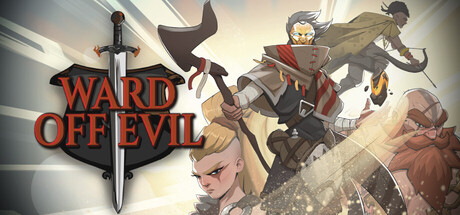
  • Genre Clarity: 7/10 — Fantasy RPG setting clear. The sword icon, character silhouettes in armor, and apocalyptic wasteland setting clearly communicate a sword & sorcery RPG. Multiple armed characters and tactical positioning hint at strategy elements. At tiny size the sword and character grouping remain recognizable, though genre specifics blur into generic fantasy.
  • Title Readability: 8/10 — Bold red title stands firm. WARD OFF EVIL in bold red serif font positioned top-left with a sword shield emblem reads clearly at full, small, and tiny sizes. The high contrast red against light background ensures legibility even at 120×45 pixels. Letterforms remain intact at compression without noticeable collapse.
  • Contrast & Color: 7/10 — Strong foreground separation. Red title and golden/brown character tones separate well against the light beige-gray background and darker sky elements. Character silhouettes have defined edges and readable outlines at small size. In grayscale, mid-tone characters lose some definition against the midtone background, creating mild muddy separation in the center cluster.
  • Uniqueness & Polish: 6/10 — Competent but familiar execution. The composition assembles recognizable RPG archetypes (warrior, rogue, mage, support) in a practiced heroic group pose against a fantasy wasteland. The art is clean and professional but follows standard genre template expectations without a distinctive visual hook or memorable unique selling point that differentiates it from BG3 or Dragon's Dogma 2 at quick glance.
  • Brand Consistency: 6/10 — Coherent but not iconic. Art style is internally consistent with unified rendering, warm earth tones, and cohesive character design language across the visible cast. The sword and shield emblem suggest identity continuity. However, no signature motif, color palette, or character emerges as distinctly memorable or recognizable across multiple exposures compared to top-tier peers.
  • Composition: 7/10 — Balanced group hierarchy. Four-character cluster anchors the center with the armored tank and archer at focal weight, supporting mage and rogue providing depth. Sword emblem top-left establishes secondary anchor. At tiny size the group reads as unified mass, though individual character definition becomes compressed and supporting details blur into the ensemble.

What works

  • High-contrast title placement. Red serif text with sword emblem reads clearly at all sizes without degradation.
  • Clear character hierarchy. Four distinct archetypes arranged with visual weight toward the center create immediate party roster recognition.
  • Genre-appropriate iconography. Sword, armor, robes, and wasteland setting instantly signal fantasy RPG to the target audience.

What hurts the capsule

  • Generic group pose. Standard heroic quartet arrangement lacks a distinctive visual hook or unexpected composition that sets it apart from comparable RPG capsules.
  • Muddled character separation. Center cluster of characters blend together at small/tiny sizes due to overlapping silhouettes and similar mid-tone values, reducing individual readability.
  • No iconic brand signature. While cohesive, the palette and characters feel interchangeable with other apocalyptic fantasy RPGs, offering no memorable visual marker for repeat recognition.

Priority fixes

  1. [contrast_color] Increase value separation between clustered characters and background by introducing a subtle dark vignette or contrast layer around the character group to lift them at tiny sizes.
  2. [uniqueness_polish] Introduce a signature visual element unique to Ward Off Evil—such as a distinctive color accent, UI motif, or character pose—that differentiates it from Baldur's Gate 3 and Dragon's Dogma 2.
  3. [composition] Crop or adjust the character cluster to reduce central overlap and increase silhouette clarity at small/tiny sizes by creating more breathing room between figures.

Store copy priority fixes

  1. [feature_communication] In the Relics paragraph, add a concrete example of a Relic effect and clarify whether they are looted, purchased, or earned through specific actions to demystify this core system.
  2. [hook_strength] Reorder the short description to lead with the binary moral choice ("avert or bring about the end of the Cycle") before "create your character" to lead with the thematic hook that makes this game feel different.
  3. [feature_communication] Expand the ritual mechanics sentence to explain the cost trade-off (e.g., 'Summon Elementals at the cost of sanity or faction standing') so players understand the strategic risk-reward.
  4. [uniqueness] Add one sentence to the Features intro or conclusion that clearly differentiates this game's tactical system or world from other Tactical RPGs (e.g., 'Unlike traditional TRPGs, your moral alignment directly reshapes available units and faction support').

Related guides

Steam app ID: 3422000 · Tags: RPG, Strategy, Sandbox, Turn-Based Strategy, CRPG