Scoring genre clarity...

ATOM RPG 2 capsule

ATOM RPG 2

A New Open-World Era of ATOM Begins! 1,225 km² of the Caspian Wastes! Open-world survival game with a story-rich CRPG soul, co-op or alone, vehicles, sandbox, crafting, and strange encounters.

Open WorldPost-apocalypticAction RPG
AtomTeamTo be announced

ATOM RPG 2 scores 67/100 — better than 14% of Open World capsules (n=1,551).

Released To be announced · By AtomTeam

Quick text summary

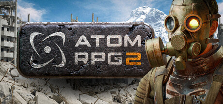
ATOM RPG 2 scored 67/100 on Steam Analyzer — Solid for a Open World capsule. Top priority fix: [contrast_color] Add a subtle dark vignette or drop shadow along the bottom edge to create value separation between the capsule and Steam's dark background, and increase the rim lighting on the character silhouette to improve grayscale edge definition.

Capsule scores by dimension

  • Genre Clarity: 7/10 — Post-apocalyptic RPG clearly implied. The gas-masked survivor figure, ruined concrete cityscape, and prominent 'RPG 2' text in the logo collectively signal post-apocalyptic RPG territory immediately. At small size the gas mask character and rubble background still read as a survival or RPG theme, though the CRPG tactical subgenre is not distinguished from action RPG. At tiny size the genre cues compress well enough to imply post-apocalyptic setting, though fine details of the logo badge are lost.
  • Title Readability: 7/10 — Logo readable at small, tight at tiny. The 'ATOM RPG 2' text sits inside a metallic riveted badge with good internal contrast — white letters on a dark steel plate — making it readable at full and small sizes. At tiny size (120x45) the badge shrinks significantly and the letterforms compress, but 'ATOM RPG 2' remains marginally parseable due to the clean sans-serif font and the high-contrast dark badge background. The atomic symbol icon on the left of the badge is a nice logo anchor but becomes an indistinct blob at tiny size.
  • Contrast & Color: 6/10 — Adequate but muted mid-tone palette. The overall palette is desaturated grays and browns with a cold blue sky, which sits close in value to Steam's dark #1b2838 background — the bottom rubble zone especially blends into the dark UI. The warm golden glow of the gas mask lens provides the strongest contrast point and draws the eye, but the character silhouette against the cloudy sky background lacks strong edge definition. In a grayscale mental test, the character and background merge in the mid-tones, reducing silhouette clarity at small and tiny sizes.
  • Uniqueness & Polish: 6/10 — Competent but genre-familiar execution. The gas-masked survivor in ruins is a well-worn post-apocalyptic visual trope that does not strongly differentiate ATOM RPG 2 from Metro, Fallout, or other post-apoc games. The craft is solid — the character render is detailed and the metallic badge logo has personality — but there is no distinctive visual storytelling hook that communicates the CRPG tactical choice-driven nature of the game. It reads as competent and genre-appropriate without feeling premium or memorable against top-tier benchmarks like Warhammer 40K: Rogue Trader.
  • Brand Consistency: 7/10 — Cohesive post-Soviet apocalyptic identity. The atomic symbol, riveted metal badge, and post-Soviet ruin aesthetic form a recognizable identity that is internally consistent and matches the game's Cold War gone hot premise. The warm amber gas mask lens against cold gray ruins is a recurring tonal signature that should carry through screenshots. The capsule has a clear signature motif in the logo badge that could be recognized as a sequel to the first ATOM RPG, rewarding returning fans.
  • Composition: 7/10 — Character right, logo center-left, balanced. The character occupies the right half and leans into frame creating directional energy, while the logo badge anchors the upper-center-left creating a workable two-element hierarchy. The ruined cityscape fills the background without competing strongly with the foreground subject. At small size the composition holds — the logo and character remain the two clear reads — but the bottom rubble area becomes dead weight and the composition feels bottom-heavy with no clear foreground-midground-background layering to add depth.

What works

  • Iconic gas mask lens highlight. The warm amber glow of the single gas mask lens is the strongest contrast point and creates an immediately memorable focal anchor even at small sizes.
  • Genre-reinforcing logo design. The riveted metal badge with atomic symbol communicates the post-apocalyptic RPG theme at a glance and doubles as a recognizable brand mark.
  • Clear two-element hierarchy. Logo left and character right creates an unambiguous reading order that holds at small capsule dimensions without clutter.
  • Post-Soviet ruin atmosphere. The concrete debris and distant snow-capped mountain background establish a distinctive Cold War apocalypse setting that differentiates it from American-flavored post-apoc games.

What hurts the capsule

  • Muted palette blends into Steam dark UI. The gray-brown rubble at the bottom edge has almost no value separation from Steam's #1b2838 dark background, causing the capsule to feel like it floats without grounding.
  • Generic post-apoc survivor trope. A lone gas-masked figure in ruins is overused across the subgenre and does not communicate the tactical CRPG or choice-driven narrative USP of the game.
  • Character silhouette weak in grayscale. The character merges with the cloudy mid-tone sky in a grayscale pass, reducing recognition speed during quick scroll browsing.
  • Atomic logo icon unreadable at tiny size. The small atomic orbit symbol on the left of the badge badge collapses into noise at 120x45, losing a key brand identifier.

Priority fixes

  1. [contrast_color] Add a subtle dark vignette or drop shadow along the bottom edge to create value separation between the capsule and Steam's dark background, and increase the rim lighting on the character silhouette to improve grayscale edge definition.
  2. [uniqueness_polish] Introduce a visual cue that hints at the tactical CRPG or choice-driven nature — such as a partial overhead map, dice, or branching path motif — integrated into the background or badge to differentiate from generic post-apoc shooters.
  3. [title_readability] Slightly enlarge the ATOM RPG 2 badge and increase the letter-spacing of the text to improve legibility at tiny size, ensuring the title remains parseable at 120x45.
  4. [genre_clarity] Shift the character pose or add a secondary element (worn notebook, map, or tactical overlay) to better signal CRPG over action-survival, reducing genre ambiguity for new audiences.

Store copy priority fixes

  1. [hook_strength] Rewrite the opening to lead with player agency or core tension: 'Survive the Caspian Wastes and reshape a dying civilization—alone or with friends in a 1,225 km² open world.' This foregrounds what the player *does* rather than the game's status.
  2. [uniqueness] Add a specific differentiator in the short or opening paragraph: 'Only ATOM RPG 2 combines...' or 'The first post-apocalyptic RPG to blend...' to clarify what sets this apart from competitors like Fallout, Encased, or similar titles.
  3. [feature_communication] Consolidate and vary the Gameplay bullet points to eliminate 'Explore' repetition; group related activities and use more specific verbs (Uncover anomalies, Engage in tactical battles, Command vehicles, Negotiate with factions).
  4. [tone_match] Remove or rephrase the parenthetical 'yes, we went there' to match the world's darker tone and avoid breaking immersion with developer commentary.

Related guides

Steam app ID: 3429280 · Tags: Open World, Post-apocalyptic, Action RPG, Exploration, Survival