Scoring genre clarity...

The Gretlow Tapes capsule

The Gretlow Tapes

Armed with nothing but your camera, investigate the abandoned Gretlow House in this short, atmospheric horror game. Uncover a chilling mystery through a realistic found-footage lens.

$9.99Very Positive(111)
HorrorPsychological HorrorAtmospheric
Aegon GamesOct 7, 2025

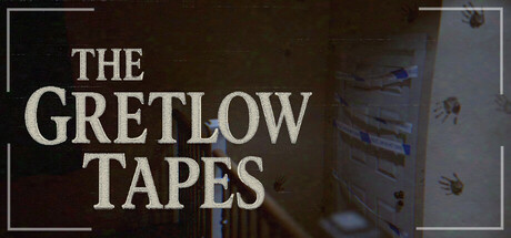
The Gretlow Tapes scores 72/100 — better than 51% of Horror capsules (n=3,119).

Very Positive (111 reviews) · $9.99 · Released Oct 7, 2025 · By Aegon Games

Quick text summary

The Gretlow Tapes scored 72/100 on Steam Analyzer — Good for a Horror capsule. Top priority fix: [uniqueness_polish] Introduce a subtle signature visual element—such as a recurring object, symbol, or distinctive color grading choice—that signals brand identity beyond the VHS theme alone

Capsule scores by dimension

  • Genre Clarity: 7/10 — Horror atmosphere clear, found-footage angle readable. The VHS-tape aesthetic and degraded image quality immediately signal horror and found-footage gameplay. Visible distortion, dust particles, and the decrepit interior space communicate investigative horror well. At TINY size the visual noise and tape artifacts remain readable as horror cues, though the specific camera-based mechanic is less explicit without context.
  • Title Readability: 8/10 — Strong serif typography, excellent contrast and placement. THE GRETLOW TAPES uses a clean, tall serif font in off-white against a dark brown VHS-degraded background with a subtle border frame. The text maintains excellent legibility at SMALL and TINY sizes due to generous letter spacing and high contrast value separation. At full size the elegant framing adds polish; the title does not collapse or blur at reduced sizes.
  • Contrast & Color: 8/10 — High value separation, moody but readable palette. Off-white title text creates strong contrast against the dark brown-toned VHS footage background, with blue distortion artifacts adding subtle color interest. The grayscale test shows clear silhouette separation between text and background, and the warm-dark palette does not muddy at SMALL sizes. Dark tones dominate but do not blend with the Steam dark theme background; the border frame adds a lighting separation.
  • Uniqueness & Polish: 7/10 — VHS aesthetic distinct, modest execution polish. The found-footage VHS-tape visual language is thematic and sets it apart from generic horror, communicating the core camera mechanic without words. Tape artifacts, dust, and color degradation feel intentional and craft-aware, fitting the short indie horror positioning. However, the visual execution is relatively straightforward and does not rise to the polished visual storytelling of top-tier peers like DREDGE or The Invincible.
  • Brand Consistency: 6/10 — Thematic cohesion present, minimal iconic identity. The VHS tape theme is internally consistent—degraded colors, distortion, and frame borders all reinforce found-footage horror identity. However, without seeing additional brand assets or store screenshots, there is no clear signature character, symbol, or color palette that would make this immediately recognizable on repeat viewing. The aesthetic is thematically coherent but generic within the found-footage subgenre.
  • Composition: 7/10 — Balanced title focus, clear hierarchy at all sizes. The title occupies the upper-left and center regions with a clear border frame, establishing strong focal hierarchy. The abandoned interior visible through the degraded tape provides supporting context without competing for attention. Safe margins are maintained and the design remains readable at TINY size; however, the composition is relatively static and does not leverage depth layering or visual storytelling as dynamically as top-tier indie capsules.

What works

  • Title legibility maintained at tiny size. Serif typography with generous spacing and high contrast ensures THE GRETLOW TAPES reads clearly even at 120x45 pixels without blur or collapse.
  • Thematic VHS aesthetic communicates core mechanic. Found-footage visual language with tape artifacts, distortion, and degraded colors instantly signals investigative horror and camera-based gameplay.
  • Strong value contrast against Steam background. Off-white text pops clearly against dark brown tones and does not blend into the dark theme background despite moody palette choices.

What hurts the capsule

  • Limited visual distinctiveness within indie horror space. VHS aesthetic is thematically appropriate but relatively common in found-footage horror, lacking a signature visual hook or memorable character presence.
  • Minimal brand identity signals for repeat recognition. The capsule establishes atmosphere but contains no iconic symbol, character, or distinctive color motif that would trigger brand recall across multiple viewings.
  • Static composition lacks dynamic visual storytelling. The design relies on theme application rather than layered depth or unexpected visual narrative that would elevate it toward top-tier polish.

Priority fixes

  1. [uniqueness_polish] Introduce a subtle signature visual element—such as a recurring object, symbol, or distinctive color grading choice—that signals brand identity beyond the VHS theme alone
  2. [composition] Add layered foreground detail or foreground silhouette to create visual depth and draw focus, particularly visible at SMALL and TINY sizes
  3. [brand_consistency] Reference store screenshots to ensure capsule color grading and artifact style align with in-game found-footage aesthetics for cohesive brand presence

Store copy priority fixes

  1. [feature_communication] Expand the camera mechanic: clarify what 'interact with memories' means in concrete terms (e.g., 'photograph specific objects to unlock past events,' 'capture anomalies that reveal the truth'). Show players what they're actually *doing* with the camera.
  2. [uniqueness] Add a sentence distinguishing Gretlow's narrative: what makes this ghost story different from other hauntings? Is it the 2000 setting, the specific urban legend, or a twist on the 'final girl' trope?
  3. [audience_targeting] Mention accessibility features directly in the detailed description: 'Designed for players sensitive to motion or time pressure—no timed sequences, comfort camera options included.' This signals inclusivity to hesitant players.
  4. [feature_communication] Clarify the photo album's role: is it a progress tracker, a puzzle system, or a story delivery mechanism? Briefly explain how evidence gathering impacts the ending or narrative.

Related guides

Steam app ID: 3433230 · Tags: Horror, Psychological Horror, Atmospheric, Realistic, Supernatural