Quick text summary
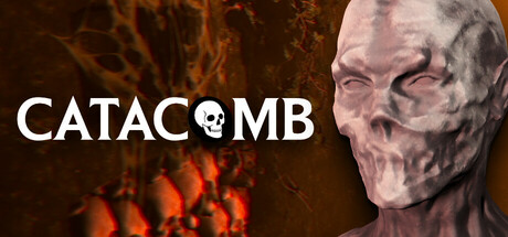
CATACOMB scored 77/100 on Steam Analyzer — Good for a Horror capsule. Top priority fix: [composition] Strengthen flame gradient direction and intensity to create a clear visual flow from lower-left toward the skull focal point, reducing scattered texture feel and improving compositional unity.
Capsule scores by dimension
- Genre Clarity: 8/10 — Horror atmosphere with underground setting clear. The skull imagery, orange flame/fire effect, and claustrophobic cave environment immediately signal horror and underground exploration. At TINY size, the skull and warm fire palette remain legible enough to suggest supernatural danger in confined spaces. The monochromatic skull contrasts well against the fiery background, making genre intent clear even at reduced viewing sizes.
- Title Readability: 9/10 — Strong white title with clear hierarchy. CATACOMB is rendered in clean white sans-serif with a skull integrated as the O, creating a memorable typographic hook that reads perfectly at FULL, SMALL, and TINY sizes. The white letterforms have excellent contrast against the dark brown and orange background, and the integrated skull icon reinforces the title without compromising legibility. Strategic placement in the upper-left to center area keeps text away from busy flame textures.
- Contrast & Color: 8/10 — Strong value separation with warm accent. White title text pops sharply against the dark brown and orange background, with clear silhouette separation maintained even at TINY size. The gray-white skull head on the right provides a bright focal point that reads distinctly in grayscale, while the orange flame effect adds saturation contrast in the lower-left. The overall palette avoids muddy mid-tones and maintains strong edges, though the transition between skull and darker background could be slightly sharper.
- Uniqueness & Polish: 7/10 — Distinctive skull-in-title concept, competent execution. The integrated skull glyph replacing the O in CATACOMB is a clever visual hook that elevates the design beyond generic horror templates. The lighting and texture on the skull model show solid 3D rendering work, and the overall composition feels intentional rather than random. However, the cave/fire background is relatively conventional for horror games, and the design lacks a signature visual motif that would make it immediately memorable compared to top-tier indie horror releases like DREDGE.
- Brand Consistency: 7/10 — Cohesive horror aesthetic, recognizable skull icon. The skull integrated into the title creates an internal brand marker that could be recognizable across marketing materials and store pages. The gray-white skull model, fiery background palette, and typography work together with internal cohesion and suggest a consistent art direction. Without access to the full set of 9 screenshots, it appears the skull and warm fire/cave aesthetic would provide consistent visual identity, though the design relies heavily on skull imagery which is common in horror.
- Composition: 7/10 — Clear focal point, minor background clutter. The skull head on the right serves as a strong focal point that anchors attention, while the title in white on the left creates a balanced two-pole composition. At SMALL and TINY sizes, the hierarchy reads clearly with the skull and white text as primary elements and the flame texture as supporting background. The composition is resilient to cropping, though the flame effect in the lower-left is somewhat scattered and doesn't strongly guide the eye; a tighter flame gradient or more directional lighting could strengthen focus.
What works
- Memorable skull-O typographic integration. The integrated skull glyph in the title creates a distinctive visual hook that reinforces genre while maintaining excellent readability across all sizes.
- Excellent contrast and legibility. White title text and light skull model separate cleanly from the dark warm background, reading sharply even at TINY viewing size with no legibility collapse.
- Appropriate horror genre signaling. Skull imagery, underground cave setting, and orange fire palette immediately communicate supernatural horror and claustrophobic danger without confusion.
What hurts the capsule
- Scattered flame texture lacks directional focus. The orange fire effect in the lower-left is somewhat diffuse and does not strongly guide eye movement or create a cohesive compositional flow.
- Generic cave and fire background concept. While well-executed, the fiery underground aesthetic is relatively conventional for horror games and does not convey unique mechanical or narrative identity beyond atmosphere.
- Limited visual storytelling about core mechanic. The capsule communicates horror atmosphere but does not visually suggest the body cam mechanic or relentless AI stalker that define the gameplay loop.
Priority fixes
- [composition] Strengthen flame gradient direction and intensity to create a clear visual flow from lower-left toward the skull focal point, reducing scattered texture feel and improving compositional unity.
- [uniqueness_polish] Incorporate subtle body cam frame or HUD element into the design to visually communicate the first-person perspective mechanic and differentiate from generic horror.
- [genre_clarity] Add a motion or directional cue (e.g., creature shadow, movement lines) to suggest the AI stalker threat and convey action/pursuit gameplay beyond static atmosphere.
Store copy priority fixes
- [feature_communication] Expand the puzzle section with a concrete example: 'Solve environmental puzzles—finding forgotten keys, deciphering inscriptions—to unlock sealed chambers and progress deeper.' This demonstrates what interaction actually feels like.
- [hook_strength] Strengthen the monster threat in the short description by replacing 'relentless AI-driven monster' with a specific mechanic: 'an AI creature that stalks you through the dark, growing closer each time you waste light or make noise' to elevate curiosity and stakes.
- [tone_match] Remove or reframe the 'All for the price of a coffee!' line to match the psychological horror tone—e.g., 'Experience the full dread for just $4.99' or delete it entirely in favor of atmospheric language.
- [audience_targeting] Add a sentence after the playtime: 'Perfect for players who want an intense, focused horror experience without open-world bloat' to explicitly signal the intended player type.
Related guides
Steam app ID: 3452770 · Tags: Horror, Atmospheric, Psychological Horror, Walking Simulator, Realistic