Scoring genre clarity...

Escaping Wonderland capsule

Escaping Wonderland

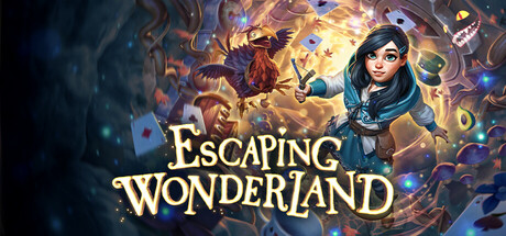
Tumble topsy-turvy down the rabbit hole into the fantastical frolic of Escaping Wonderland, where whimsy waltzes with wonder and riddles run riot! Join the ever-curious Molly on a brand-new adventure through the beloved world of Alice in Wonderland.

$9.99Positive(31)
Immersive SimPuzzle PlatformerPuzzle
Cortopia StudiosJun 18, 2025

Escaping Wonderland scores 68/100 — better than 19% of Steam capsules we've analysed (n=22,658).

Positive (31 reviews) · $9.99 · Released Jun 18, 2025 · By Cortopia Studios

Quick text summary

Escaping Wonderland scored 68/100 on Steam Analyzer — Solid for a Steam capsule. Top priority fix: [title_readability] Add a slightly thicker dark outline or a subtle semi-transparent backing shadow behind the title text to ensure 'Escaping Wonderland' remains crisp and readable at 120x45 thumbnail size.

Capsule scores by dimension

  • Genre Clarity: 7/10 — Whimsical adventure, clear theme. The Alice in Wonderland visual language — playing cards, swirling magical vortex, a curious young girl protagonist, and a fantasy bird creature — immediately communicates a whimsical adventure or casual hidden-object style game. At tiny size the swirling chaos and central female character still suggest a story-driven casual adventure, though the genre could blur between puzzle, hidden object, or narrative adventure. The thematic cues are strong but the specific gameplay type requires context.
  • Title Readability: 7/10 — Readable at full, stressed at tiny. The gold serif title 'Escaping Wonderland' uses a decorative storybook font with good size and a subtle drop shadow against a warm mid-tone background region, reading clearly at full and small sizes. At tiny size around 120x45, the letterforms begin to compress and the decorative serifs on 'Escaping' lose crispness, though 'Wonderland' in larger lettering remains partially parseable. The placement over the lighter central area of the swirl helps contrast, but a stronger outline or darker backing would improve tiny-size legibility.
  • Contrast & Color: 7/10 — Warm palette pops, some midtone muddiness. The warm amber and gold swirl at center creates reasonable separation from Steam's dark #1b2838 background, and the bright teal accents on the protagonist's jacket add a useful pop of cool contrast. In grayscale the central character silhouette reads distinctly against the glowing vortex behind her, though the dark cave framing on the left and bottom edges blends somewhat with Steam's dark UI chrome. At small size the warm glowing core keeps the image from disappearing, but the crow/raven creature in the upper left merges into the busy background.
  • Uniqueness & Polish: 6/10 — Competent but genre-familiar execution. The illustration style is clean and professionally rendered with good character design — Molly is expressive and distinctive with her teal jacket and dark hair. However, the Alice in Wonderland theme is heavily mined territory and the swirling vortex of cards and magical chaos is a very familiar visual trope for casual adventure and hidden-object games, offering little that distinguishes this from dozens of similar capsules. The overall craft is solid but does not surprise or innovate visually against benchmarks like Balatro or Slay the Princess which use distinctive art direction as a selling point.
  • Brand Consistency: 7/10 — Cohesive storybook identity, familiar palette. The warm gold-amber palette, storybook illustration style, and the protagonist Molly form a consistent internal identity that would likely echo through screenshots and UI. The decorative gold serif title font matches the whimsical fairy-tale tone of the art. The recognizable Alice in Wonderland iconography — cards, magical creatures, swirling wonder — creates an immediately understood brand context, though it leans heavily on the source IP's existing identity rather than forging a fully original one.
  • Composition: 7/10 — Clear focal point, busy background. The protagonist Molly is positioned at right-center foreground, creating a clear primary focal point, with the glowing vortex and bird creature providing dynamic background energy. The title sits in the lower-center on a relatively controlled warm surface area, avoiding the noisiest parts of the background. At small size the character and title both remain the dominant reads, though the busy swirling card and leaf particle field creates some competition for attention and the dark cave border at left and bottom eats into usable space. The overall composition is functional but a slightly cleaner background separation would improve crop resilience at tiny sizes.

What works

  • Strong protagonist focal point. Molly's teal jacket and expressive face create a clear, warm human anchor that reads distinctly even at small sizes against the swirling warm background.
  • Thematic legibility. Playing cards, magical vortex, and fantasy creature instantly signal Alice in Wonderland territory, communicating tone and setting within a fraction of a second.
  • Title placement on controlled surface. The gold title sits over the brightest, warmest region of the image, giving it reasonable contrast without requiring a separate backing plate.
  • Warm color palette pops on Steam dark UI. The amber and gold central glow creates natural separation from Steam's #1b2838 background, keeping the capsule visible during quick scroll.

What hurts the capsule

  • Busy particle field hurts tiny-size clarity. The swirling cards, leaves, and magical sparks in the background compete with the character and title at tiny sizes, creating visual noise that slows parsing.
  • Dark cave border merges with Steam chrome. The dark framing on the left and bottom edges blends into Steam's dark background, reducing the perceived boundary and impact of the capsule.
  • Title loses crispness at tiny size. The decorative serif letterforms on 'Escaping' compress and blur at 120x45, reducing confidence in readability during fast scroll.
  • Visually generic for the subgenre. The swirling vortex of cards and Wonderland iconography is a well-worn visual trope in casual adventure capsules, offering limited differentiation from competitor titles.

Priority fixes

  1. [title_readability] Add a slightly thicker dark outline or a subtle semi-transparent backing shadow behind the title text to ensure 'Escaping Wonderland' remains crisp and readable at 120x45 thumbnail size.
  2. [contrast_color] Darken or vignette the dark cave border areas on the left and bottom so the capsule has a defined edge that separates it clearly from Steam's #1b2838 background.
  3. [uniqueness_polish] Reduce the density of floating particle elements (cards, leaves, sparks) in the mid-background to let the character and title breathe and stand out more distinctly against genre peers.
  4. [composition] Increase the brightness or add a subtle rim light around the bird creature in the upper left to prevent it from merging into the background chaos, adding depth and supporting the primary focal point.

Store copy priority fixes

  1. [hook_strength] Add a sentence to the short description that explicitly states this is a VR-only puzzle-adventure game and lead with a core action verb (e.g., 'Solve twisted riddles and navigate impossible spaces in VR as Molly...').
  2. [feature_communication] Replace vague adjectives with concrete mechanics: instead of 'perplexing puzzles,' specify 'first-person environmental puzzles where you manipulate objects and perspective to progress' and clarify how many puzzles or play hours to expect.
  3. [uniqueness] Insert a 1-2 sentence statement that differentiates this entry: explain what is new in Molly's story (e.g., memory recovery mechanic, new locations, specific puzzle types) that sets it apart from the original or other Wonderland adaptations.
  4. [audience_targeting] Move the VR requirement and 'Family Sharing' eligibility into the short description or immediately after to set clear expectations for solo, family, or casual VR players upfront.

Related guides

Steam app ID: 3471390