The Light and the Shadow scores 65/100 — better than 12% of RPG capsules (n=3,544).

Quick text summary

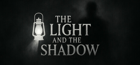
The Light and the Shadow scored 65/100 on Steam Analyzer — Solid for a RPG capsule. Top priority fix: [genre_clarity] Introduce a visible character silhouette or mystical creature element to clearly signal action-adventure gameplay and distinguish from puzzle or narrative-only genres.

Capsule scores by dimension

  • Genre Clarity: 6/10 — Fantasy adventure with unclear scope. The lantern and shadow imagery suggest a dark fantasy or mystery game, but the visual is too atmospheric and abstract to clearly communicate action-adventure gameplay at tiny size. The silhouette and lighting evoke mood rather than gameplay type, making it difficult to distinguish from horror, puzzle, or narrative-driven games without the title context.
  • Title Readability: 7/10 — Clear serif text with good spacing. The title 'THE LIGHT AND THE SHADOW' uses clean, evenly spaced serif typography centered on a dark background, maintaining legibility at full and small sizes. However, at tiny thumbnail size (120x45), the lower lines lose definition and the full message becomes challenging to parse, though the distinctive shape remains recognizable.
  • Contrast & Color: 8/10 — Strong light-dark contrast with focal warmth. The pale cream/white text and lantern stand in sharp contrast against the dark charcoal background, creating clear separation that reads well at all sizes. The warm glow of the lantern provides a focal point of warmth that prevents the overall composition from feeling too cold, and the grayscale silhouette test confirms strong value differentiation.
  • Uniqueness & Polish: 6/10 — Atmospheric but conceptually familiar. The lantern-as-focal-point and light-versus-shadow imagery is elegantly executed with professional typography and lighting, but the concept itself reads as a fairly common aesthetic for indie fantasy games (compare to genre benchmarks like Senua's Saga or Chants of Sennaar which use equally moody but more distinctive visual hooks). The execution is clean, but the core idea lacks a memorable unique selling point.
  • Brand Consistency: 5/10 — No recognizable identity markers present. The capsule relies entirely on atmospheric lighting and typography with no visible character, creature, symbol, or distinctive palette that could serve as an identity cue in future marketing materials. Without reference to the five store screenshots mentioned, there is no internal brand signal that would make this recognizable as 'The Light and the Shadow' versus any other moody fantasy title.
  • Composition: 7/10 — Centered focal point with effective hierarchy. The lantern is positioned as a clear primary focal element in the upper-left quadrant, with title text anchored below in the safe zone, creating a vertical reading flow. The composition holds together at small and tiny sizes, though the shadow figure in the background becomes indistinct at thumbnail scale, slightly reducing the sense of narrative depth that works well at full size.

What works

  • Strong value contrast. Cream text and warm lantern glow separate cleanly from dark background, ensuring readability across all viewing sizes including tiny thumbnails.
  • Professional typography. The serif title font is evenly spaced, centered, and maintains legibility at full and small sizes without decorative loss.
  • Clear focal hierarchy. The lantern naturally draws the eye first, followed by the title text, creating an intuitive visual reading order.

What hurts the capsule

  • Lack of character or creature presence. No visible protagonist (Fany) or mystical creature silhouette to signal the action-adventure and character-driven nature described in the game synopsis.
  • Generic atmospheric aesthetic. The moody lantern-and-shadow concept is visually competent but does not differentiate from dozens of similar indie fantasy titles in the genre benchmark list.
  • Background shadow loses definition at tiny size. The silhouette figure in the background becomes nearly invisible at thumbnail scale, reducing the narrative visual storytelling that works at full resolution.
  • No memorable brand identity signals. The capsule lacks any iconic symbol, motif, or distinctive palette that would make it instantly recognizable as this specific game rather than a template approach.

Priority fixes

  1. [genre_clarity] Introduce a visible character silhouette or mystical creature element to clearly signal action-adventure gameplay and distinguish from puzzle or narrative-only genres.
  2. [brand_consistency] Add a distinctive visual motif (unique creature design, magical effect, or symbolic object) that becomes recognizable as the game's core identity across marketing materials.
  3. [uniqueness_polish] Layer a secondary visual element that communicates a unique gameplay mechanic or world feature beyond the generic light-versus-shadow metaphor to compete with benchmark titles.

Store copy priority fixes

  1. [hook_strength] Rewrite the short description to lead with a concrete gameplay hook ('Precision platforming with combat') or unique setting detail rather than generic 'magical journey' language.
  2. [uniqueness] Add one sentence explaining what distinguishes this platformer: e.g., 'the fairy companion grants unique abilities,' 'puzzle-platformer hybrid,' or 'non-violent combat focus' if true.
  3. [feature_communication] Clarify the gem collection mechanic: explain whether gems unlock shortcuts, buy upgrades, count toward completion, or serve another function.
  4. [audience_targeting] Add an explicit audience signal early in the detailed description, such as 'perfect for family play,' 'designed for speedrunners,' or 'best for players seeking a 2-hour focused experience.'

Related guides

Steam app ID: 3473840 · Tags: RPG, Adventure, Action, Casual, Strategy