Scoring genre clarity...
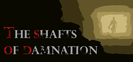
As an investigative reporter, you uncover the horrifying secrets of an abandoned island. Descend into the dark shafts to unveil the truth behind inhumane experiments, confront mutated horrors, and collect evidence to piece together the chilling story.
$2.99No user reviews
HorrorAtmosphericFirst-Person
Ondřej KrausJun 23, 2025