Scoring genre clarity...

Blood Accord capsule

Blood Accord

A horror visual novel exploring the dark sides of friendship and the dangerous paths taken to save it.

Visual NovelPsychological HorrorStory Rich
shards, house.opposite, RUzura InteractiveComing soon

Blood Accord scores 77/100 — better than 77% of Steam capsules we've analysed (n=22,658).

Released Coming soon · By shards

Quick text summary

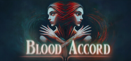
Blood Accord scored 77/100 on Steam Analyzer — Good for a Steam capsule. Top priority fix: [uniqueness_polish] Consider adding a subtle environmental or mechanical detail (e.g., a symbolic object, unique UI element, or setting hint) to increase distinctiveness beyond dual-face composition.

Capsule scores by dimension

  • Genre Clarity: 8/10 — Dark horror visual novel clearly communicated. The symmetrical dual-face imagery with sharp red hair and pale skin immediately signals psychological horror and dark themes. At tiny size, the striking red-and-white color palette and eerie mirror composition remain legible and genre-appropriate. The overall aesthetic strongly suggests a narrative-driven horror experience rather than action or puzzle gameplay.
  • Title Readability: 8/10 — Title readable across all sizes with strong contrast. BLOOD ACCORD uses a clean sans-serif font in cream/off-white positioned on a dark teal background band, creating excellent value separation. The text remains readable at small and tiny sizes due to the letter spacing and central placement on a controlled background. The symmetrical layout reinforces the title positioning and prevents collapse at smaller scales.
  • Contrast & Color: 8/10 — Strong value separation and silhouette clarity. The red hair, pale faces, and cream title pop distinctly against the dark teal-to-black gradient background at all scales. Even at tiny size, the high contrast between the foreground characters and background atmosphere maintains silhouette clarity without muddy mid-tones. The grayscale test confirms strong value separation between subject and environment.
  • Uniqueness & Polish: 7/10 — Distinctive psychological horror aesthetic. The mirrored dual-face composition with sharp red hair creates a memorable and distinctive visual hook that signals psychological duality and danger. The lighting, particle effects, and color palette feel intentional and polished rather than templated, though the core composition echoes familiar horror visual novel conventions. The execution is clean and premium-feeling without breaking new ground in the genre.
  • Brand Consistency: 7/10 — Cohesive dark palette with recognizable motifs. The red-white-teal color scheme, symmetrical composition, and dual-face motif create a memorable identity cue that could signal this game in future materials. The rendering style is internally consistent with a cohesive art direction focused on psychological horror aesthetics. The palette and symmetry feel like potential brand anchors, though without access to the store screenshots, consistency across materials cannot be fully verified.
  • Composition: 8/10 — Strong focal hierarchy and balanced layering. The dual faces form a clear primary focal point in the center, with background atmosphere and title text supporting rather than competing for attention. The depth layering—background mist, midground characters, foreground title—creates visual hierarchy that reads cleanly at all sizes. Safe margins are observed and the composition remains resilient to Steam cropping without losing key elements.

What works

  • Striking dual-face focal point. The mirrored composition immediately draws the eye and communicates psychological themes even at tiny thumbnail size.
  • Excellent title contrast and placement. Cream text on teal band maintains legibility at all sizes with no readability collapse at small or tiny scales.
  • Genre clarity through visual language. Red hair, pale skin, sharp symmetry, and dark palette unambiguously signal psychological horror visual novel without genre confusion.

What hurts the capsule

  • Conceptually familiar dual-face trope. The mirrored composition, while well-executed, relies on a common psychological horror visual archetype that may feel derivative in the context of premium peers.
  • Limited environmental context. The capsule focuses entirely on character aesthetics with minimal environmental storytelling that could hint at unique setting or mechanics.

Priority fixes

  1. [uniqueness_polish] Consider adding a subtle environmental or mechanical detail (e.g., a symbolic object, unique UI element, or setting hint) to increase distinctiveness beyond dual-face composition.
  2. [composition] Verify that no important character details or atmospheric elements are clipped by Steam's standard crop zones across all capsule sizes.

Store copy priority fixes

  1. [hook_strength] Rewrite the short description to lead with the interactive mystery mechanic: 'Uncover a friend's dark secrets by exploring her computer, messages, and past as psychological horror unfolds around you.' This foregrounds gameplay and maintains tension without relying on the dream-reality twist.
  2. [feature_communication] Expand the 'Interactive Experience' section with 2-3 concrete examples: 'Read fragmented journal entries, decode cryptic messages from friends, and piece together memories that contradict the waking world.'
  3. [uniqueness] Add a sentence positioning the game's specific hook: 'Unlike traditional visual novels, Blood Accord lets you actively investigate Yana's digital life, turning detective work into the engine of horror discovery.'
  4. [audience_targeting] Insert a brief audience callout: 'For players who love intimate, character-driven horror and choice-driven narratives like Kentucky Route Zero or Oxenfree with darker themes.'

Related guides

Steam app ID: 3484040