Scoring genre clarity...

Aftershock capsule

Aftershock

When your own mind becomes the enemy, can you protect the one who matters most?

Psychological HorrorHorrorThriller
SeaPrimFebruary 2027

Aftershock scores 63/100 — better than 9% of Psychological Horror capsules (n=2,245).

Released February 2027 · By SeaPrim

Quick text summary

Aftershock scored 63/100 on Steam Analyzer — Solid for a Psychological Horror capsule. Top priority fix: [genre_clarity] Add visual storytelling cues such as subtle scar detail, military garment element, or hardened expression that communicates the combat veteran and trauma narrative without heavy-handed iconography

Capsule scores by dimension

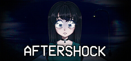
  • Genre Clarity: 5/10 — Ambiguous genre signals mixed messaging. The anime-styled character in casual clothing against a red geometric background reads more as visual novel or narrative adventure rather than combat RPG. At tiny size, the character silhouette and dark red gradient offer no clear gameplay type hint—no weapons, UI elements, or environmental context that signal the combat veteran backstory or hardship theme described. The visual presentation contradicts the game's core narrative about a traumatized soldier.
  • Title Readability: 8/10 — Clear sans-serif title solid at all sizes. AFTERSHOCK displays in clean white sans-serif lettering on the left side with strong contrast against the dark red background. The title remains fully readable at small and tiny sizes due to thick letterforms and strategic placement away from the character. At tiny size, the word compresses but remains legible without strain.
  • Contrast & Color: 7/10 — Strong value separation with minor saturation issues. The white title pops clearly against the dark crimson background, creating solid contrast at all viewing sizes. The character illustration has good separation from the background through warm skin tones and green clothing against red. However, the red geometric shapes in the background create visual noise that slightly muddles the midtone region; in grayscale the background texture becomes busy rather than cleanly supporting the focal point.
  • Uniqueness & Polish: 5/10 — Polished character but generic narrative setup. The anime character illustration is well-rendered with clean linework, natural hair flow, and realistic shading on the face and clothing. However, the presentation lacks any distinctive visual hook related to the combat veteran or psychological struggle theme—it reads as a standard character portrait rather than communicating solitude, trauma, or hardship. The red geometric background pattern is decorative but doesn't reinforce any unique selling point about the game's core experience.
  • Brand Consistency: 6/10 — Consistent art direction but no iconic identity. The capsule maintains internal coherence through unified anime art style, warm color palette, and clean typography treatment. However, without access to the five store screenshots, there is no strong visual motif, recurring symbol, or signature palette element visible here that would make Aftershock immediately recognizable in future marketing. The character feels like a generic protagonist rather than an iconic brand identity anchor.
  • Composition: 7/10 — Clear focal hierarchy with balanced layout. The character occupies the right two-thirds of the frame with strong eye contact and a direct pose, while the title anchors the left third in white text, creating natural left-to-right reading flow. The composition maintains good focal clarity at small size, though at tiny size the character's facial details blur slightly. Safe margins are respected and the design does not rely on edge-critical elements that would suffer from Steam cropping.

What works

  • Readable title at all sizes. White sans-serif AFTERSHOCK maintains full legibility from full header down to tiny thumbnail due to thick letterforms and clean background isolation.
  • Polished character illustration quality. The anime character render shows skilled linework, natural hair movement, realistic facial shading, and coherent clothing detail that elevates perceived quality.
  • Strong value contrast for quick recognition. White title and warm character tones separate clearly from the dark red background, ensuring the capsule pops in quick Steam scroll.

What hurts the capsule

  • Genre disconnect from narrative premise. The casual anime character and neutral pose do not visually communicate combat veteran theme, psychological struggle, or survival hardship central to the game description.
  • Generic decorative background pattern. The red geometric shapes feel like template ornamentation rather than storytelling elements, adding visual noise without reinforcing game identity or unique selling point.
  • Lack of iconic brand anchor. No distinctive character design, recurring visual motif, or signature color treatment present that would make the game's brand instantly recognizable across future marketing materials.

Priority fixes

  1. [genre_clarity] Add visual storytelling cues such as subtle scar detail, military garment element, or hardened expression that communicates the combat veteran and trauma narrative without heavy-handed iconography
  2. [uniqueness_polish] Replace generic geometric background with environment or symbolic imagery that hints at solitude, psychological struggle, or the core emotional conflict of the game
  3. [brand_consistency] Develop a signature visual motif or palette refinement (such as specific color accent or recurring design symbol) that appears consistently across store screenshots and marketing to build recognizable identity

Store copy priority fixes

  1. [hook_strength] Rewrite the short description to lead with 'Haunted by military trauma, a combat veteran must confront the boundary between past and present—where memories of war bleed into reality' to immediately signal psychological horror.
  2. [feature_communication] Add a concrete description of core interaction: 'Explore your character's home and past, make difficult moral choices, and experience branching paths that reshape reality based on your decisions.'
  3. [uniqueness] Add a specific differentiator such as 'distorted reality shifts and moral stakes that directly impact an innocent character's fate' to clarify what sets this game apart.
  4. [audience_targeting] Explicitly name the intended audience in the short description: 'For players seeking story-driven psychological experiences with meaningful consequences' to filter self-selection.

Related guides

Steam app ID: 3486500 · Tags: Psychological Horror, Horror, Thriller, Story Rich, Atmospheric