Quick text summary

Arachnoid scored 68/100 on Steam Analyzer — Solid for a Horror capsule. Top priority fix: [composition] Reframe shot to maximize horizontal usage in landscape—crop closer on spider and house, or reposition to create visual weight distribution that reads better at 231x87 small size.

Capsule scores by dimension

  • Genre Clarity: 7/10 — Horror premise clear, spider threat implied. The giant spider emerging from a suburban house clearly communicates horror and body-horror dread. At SMALL and TINY sizes, the spider silhouette remains readable as a threat, and the domestic setting with an unnatural intrusion establishes the genre premise effectively. The VHS aesthetic hint is lost at tiny size, but the core horror-action hook reads.
  • Title Readability: 8/10 — Clean white sans-serif, strong legibility. The title 'Arachnoid' is rendered in bold white sans-serif font with excellent contrast against the sky background. At TINY size (120x45), the letterforms remain distinct and readable due to heavy weight and clean outline. The placement across the upper third avoids the spider's body, keeping text clear and separated.
  • Contrast & Color: 8/10 — Bright subject against blue sky backdrop. The white house and dark spider silhouette pop strongly against the blue sky and Steam's dark background. White title text at maximum contrast value reads well even when squinting. The clear value separation between subject and background ensures legibility at all sizes without muddy mid-tones.
  • Uniqueness & Polish: 6/10 — Effective concept, standard execution. The giant spider-infested house is a compelling horror hook with strong visual storytelling about infestation and domestic violation. However, the execution is relatively straightforward photography of a practical effect without stylistic signature, distinctive color grading, or layered visual language that distinguishes it from competent indie horror marketing. The concept carries the appeal more than the craft.
  • Brand Consistency: 5/10 — Single dramatic moment, limited iconic signature. The capsule shows one striking image—spider on house—but without supporting visual identity cues that would make Arachnoid recognizable across promotional materials. The VHS aesthetic mentioned in the description is not visually present here, and there are no recurring color palettes, UI motifs, or character design elements visible that would build a cohesive brand identity across store assets.
  • Composition: 7/10 — Clear focal point, safe title placement. The spider climbing the house center creates a strong focal point that reads clearly at TINY size due to dark silhouette against light background. Title placement in the upper region avoids the spider, maintaining safe margins. However, the composition is vertically centered with significant empty sky above, which doesn't optimize the horizontal 231x87 small capsule shape—the composition is designed for wider formats.

What works

  • Strong horror silhouette. The dark spider's distinctive shape against the bright house reads immediately as a threat and communicates the game's core premise even at tiny sizes.
  • Excellent title contrast and weight. White bold sans-serif 'Arachnoid' maintains perfect legibility across all viewing sizes and has been intentionally placed away from visual clutter.
  • Domestic violation concept. The juxtaposition of an ordinary suburban house with unnatural infestation creates immediate visual storytelling about the core horror hook.

What hurts the capsule

  • Composition optimized for portrait, not landscape. The vertically-centered house and empty sky waste horizontal space in the small 231x87 capsule format, reducing visual impact during quick scrolls.
  • No visible brand identity or VHS aesthetic. The description promises 'immersive VHS style' but the capsule is clean photorealism with no graininess, color shift, or style cues that establish visual signature or thematic consistency.
  • Generic photography feel. The practical effect photography lacks stylistic treatment, color grading, or distinctive art direction that would elevate it above a concept test or making-of image.
  • No gameplay communication. The capsule shows the threat but not the player's tools or agency—shotgun defense, house repair, or exploration gameplay are not hinted at visually.

Priority fixes

  1. [composition] Reframe shot to maximize horizontal usage in landscape—crop closer on spider and house, or reposition to create visual weight distribution that reads better at 231x87 small size.
  2. [uniqueness_polish] Apply VHS degradation, color shift, and graininess mentioned in description to establish visual signature and thematic consistency across all marketing materials.
  3. [brand_consistency] Develop iconic color palette or UI motif visible in this capsule and reproducible across screenshots—establish recognizable visual language beyond a single dramatic moment.
  4. [composition] Consider adding subtle gameplay hint (silhouette of shotgun, repair tools, or first-person view framing) to communicate player agency and action components alongside horror.

Store copy priority fixes

  1. [hook_strength] Replace '
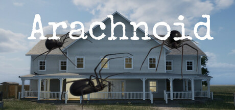
Arachnoid is a first person horror game about moving into a house' with a verb-driven hook like 'You moved into your dream home. Now the walls crawl with giant spiders, and you must hunt them before they hunt you.' to lead with conflict and agency.
  2. [uniqueness] Add 1-2 sentences explaining what makes the spider threat or infestation mechanic distinct from other creature-horror games, or how the VHS aesthetic impacts the horror experience beyond visuals.
  3. [feature_communication] Include one concrete example of a puzzle type or quest objective to help players visualize the moment-to-moment gameplay beyond combat.
  4. [audience_targeting] Specify expected playtime, difficulty options, or note whether this is designed for horror-veteran players or newcomers to the genre.

Related guides

Steam app ID: 3490530 · Tags: Horror, Survival Horror, Psychological Horror, Shooter, 1980s