Scoring genre clarity...
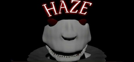
Trapped in an unfamiliar place surrounded by dangerous unknown creatures, solve puzzles, find hidden objects, and most importantly DON'T GET CAUGHT. Maybe there is a way out, and maybe even a reason for why you are here...
$4.993 user reviews
HorrorActionAdventure
APCFeb 23, 2025