The Haunting Of Stabbey Road scores 72/100 — better than 51% of Horror capsules (n=3,118).

Quick text summary

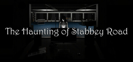
The Haunting Of Stabbey Road scored 72/100 on Steam Analyzer — Good for a Horror capsule. Top priority fix: [uniqueness_polish] Introduce a subtle color accent—warm amber or cold blue lighting—to create a distinctive visual hook that differentiates the capsule from generic haunted building imagery.

Capsule scores by dimension

  • Genre Clarity: 7/10 — Horror atmosphere clearly signaled. The dark, shadowy interior of what appears to be an abandoned recording studio with visible decay and ominous silhouettes effectively communicates a psychological horror or mystery game. The dimly lit space with architectural detail (visible window frames, overhead structure) creates an unsettling mood that reads as indie horror even at tiny size, though the specific gameplay loop (exploration, puzzle, narrative) remains slightly ambiguous.
  • Title Readability: 8/10 — Title legible across all sizes. The serif typeface 'The Haunting of Stabbey Road' is positioned prominently in the lower-middle area with clean white text on dark background, maintaining readability at full, small, and tiny sizes. The text spacing and font weight prevent collapse at reduction, though the decorative serif style edges toward period-piece gothic rather than modern clarity—a stylistic choice that works contextually but sacrifices absolute legibility.
  • Contrast & Color: 8/10 — Strong value separation achieved. The white serif title pops distinctly against the very dark background, and the grayscale interior maintains clear silhouettes of the studio structure with overhead lighting creating defined edges and depth separation. The monochromatic dark palette is purposeful for horror mood, but the high contrast between text and background ensures the capsule doesn't disappear on Steam's dark theme at small scroll sizes.
  • Uniqueness & Polish: 7/10 — Focused horror aesthetic, restrained. The choice to feature a period-accurate recording studio interior rather than jump-scare imagery or melodramatic effects shows compositional restraint and suggests narrative-driven horror. The photography-like realism of the environment and the serif typeface choice convey indie craft, though the concept (haunted building interior) is familiar within horror game marketing; the execution is polished but not distinctly memorable compared to high-performing indie capsules that use striking visual motifs or color hooks.
  • Brand Consistency: 6/10 — Cohesive but not iconic. The dark monochromatic aesthetic, serif typography, and gritty studio setting are internally consistent and suggest a recognizable brand identity focused on grounded horror atmosphere. However, without exposure to the six available store screenshots, there are no distinctive visual symbols, character motifs, or signature color accents visible that would make this capsule instantly recognizable in a crowded store—it relies on mood rather than iconic imagery.
  • Composition: 7/10 — Clean hierarchy, centered title placement. The studio interior occupies the top two-thirds as the focal point, with the title anchored in the lower third, creating clear visual hierarchy and safe margins for Steam cropping. The composition resists clutter and the eye naturally reads the environment first, then the title, though at tiny size the architectural detail becomes abstract noise—the strong title contrast compensates and keeps the focal point readable.

What works

  • Title contrast and legibility. White serif text maintains clarity across full, small, and tiny sizes against the dark background without requiring outline or shadow support.
  • Mood-driven genre communication. The abandoned studio interior with dim lighting immediately signals psychological horror or mystery without relying on jump-scare imagery or clichéd genre markers.
  • Restrained composition. No visual clutter or competing focal points; the interior and title work as a cohesive whole with intentional depth separation and safe margins.

What hurts the capsule

  • Generic horror setting. Haunted building interiors are a familiar trope in indie horror; the capsule does not establish a unique visual hook that distinguishes it from dozens of similar titles at small size.
  • Limited color identity. The monochromatic dark palette communicates mood but provides no memorable color signature or accent that would make the game recognizable on repeat exposure.
  • Architectural detail loss at tiny size. The studio's window frames and overhead structure, which provide period authenticity at full size, dissolve into abstract gray shapes when reduced to thumbnail scale, reducing visual specificity.

Priority fixes

  1. [uniqueness_polish] Introduce a subtle color accent—warm amber or cold blue lighting—to create a distinctive visual hook that differentiates the capsule from generic haunted building imagery.
  2. [genre_clarity] Add a subtle environmental detail (e.g., vinyl record, mixing console button, microphone silhouette) in the foreground to hint at the recording studio setting and reinforce gameplay context.
  3. [brand_consistency] Develop a signature visual motif or iconographic element (symbol, artifact, or lighting style) visible here and in store screenshots to establish instant brand recognition.

Store copy priority fixes

  1. [hook_strength] Rewrite the short description to lead with the unique mechanic: 'Master distorted audio tracks to uncover paranormal secrets hidden in a cursed recording studio.' This immediately signals the audio-horror hybrid and raises curiosity.
  2. [audience_targeting] Add one sentence clarifying the intended player: 'For fans of audio-based puzzles and slow-burn supernatural horror' or similar, to pre-filter the audience and set expectations.
  3. [feature_communication] Explain the anomaly-mastering link: 'Each track holds clues—by adjusting EQ and compression to reveal hidden frequencies, you'll uncover what went wrong at Stabbey Road.' This bridges mechanics and narrative.
  4. [tone_match] Integrate horror voice into the technical explanation: Replace 'Turn the knobs of the equalizer' with 'Wrestle with distorted, corrupted audio—manipulate the equalizer and compressor to isolate the studio's screams embedded in the masters.' This maintains horror tone while explaining the mechanic.

Related guides

Steam app ID: 3501900 · Tags: Horror, Indie, Singleplayer, 3D, Multiple Endings