Scoring genre clarity...

Gambonanza capsule

Gambonanza

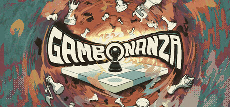
Gambonanza is a tactical roguelike that sets chess pieces on a tiny board. Forget traditional chess and embrace the chaos of breaking the balance! Spend your money on rule-bending upgrades, board tiles and pieces. Experiment with illegal combinations and face off against iconic bosses!

$9.74Mostly Positive(140)
Roguelike DeckbuilderChessTurn-Based Strategy
BlukuléléMay 1, 2026

Gambonanza scores 68/100 — better than 13% of Roguelike Deckbuilder capsules (n=337).

Mostly Positive (140 reviews) · $9.74 · Released May 1, 2026 · By Blukulélé

Quick text summary

Gambonanza scored 68/100 on Steam Analyzer — Solid for a Roguelike Deckbuilder capsule. Top priority fix: [contrast_color] Darken the outer background edges toward deep brown or near-black to create stronger vignette contrast and help the capsule pop against Steam's #1b2838 dark background.

Capsule scores by dimension

  • Genre Clarity: 7/10 — Chess roguelike reads clearly. The central chessboard with scattered chess pieces flying outward strongly implies chess or board game strategy, and the chaotic swirl of pieces hints at roguelike unpredictability. At tiny size the chessboard remains recognizable as a flat grid surface, keeping the board game genre signal intact. The roguelike/chaotic energy is harder to parse at tiny size but the chess iconography anchors the genre well.
  • Title Readability: 7/10 — Bold logo reads at small size. The GAMBONANZA logotype uses thick, bold letterforms with a strong white fill and black outline that contrast well against the warm orange-brown background. At full size it reads clearly and the bubbly retro style suits the casual tone. At tiny size the lettering compresses but remains legible due to the heavy stroke weight, though fine interior details of the letters are lost.
  • Contrast & Color: 6/10 — Warm palette blends at tiny size. The warm orange and rust tones dominate the background, which creates reasonable separation from the lighter chessboard in the center but struggles against Steam's dark #1b2838 background as the overall image reads as a warm mid-tone blob. The white chess pieces scattered in the background partially blend into the light orange swirl, reducing silhouette clarity. In grayscale the chessboard retains decent separation but the outer chaos loses distinction.
  • Uniqueness & Polish: 7/10 — Distinctive hand-drawn chaotic energy. The hand-drawn illustrative style with swirling vortex composition and scattered chess pieces communicates a unique personality that sets it apart from typical strategy capsules. The retro bubbly typography paired with the chaotic tornado of pieces feels intentional and matches the rule-breaking chess premise well. Compared to genre benchmarks like Balatro it lacks that extra layer of graphic punch, but it has a recognizable handcrafted identity.
  • Brand Consistency: 7/10 — Cohesive illustrative chess identity. The warm earthy palette, hand-drawn illustration style, and bold outlined typography form a consistent visual identity that feels unified internally. The chess motif is carried through clearly with pieces, board, and the pawn prominently placed on the board as a focal point. The retro-casual art direction is distinctive enough to create a recognizable signature style that would carry across screenshots.
  • Composition: 7/10 — Centered board with radial chaos. The composition uses a clear radial structure with the chessboard as the central focal point and chess pieces spiraling outward, creating good depth layering from foreground board to background swirl. The title sits cleanly in the upper-center area on a relatively controlled mid-tone zone, avoiding the noisiest parts of the background. At small size the chessboard and title remain the two dominant readable elements, though the scattered pieces in the outer ring become visual noise at tiny size rather than useful supporting detail.

What works

  • Bold legible logotype. The thick outlined GAMBONANZA lettering holds up at small sizes due to high stroke weight and strong internal contrast.
  • Chess genre instantly readable. The central chessboard and scattered chess pieces communicate board game strategy clearly even at thumbnail size.
  • Distinctive illustrative style. The hand-drawn swirling vortex composition gives the capsule a memorable chaotic personality that stands out in a strategy genre list.
  • Coherent internal art direction. Warm earthy palette, retro typography, and illustrated chaos are visually consistent and reinforce the game's rule-breaking premise.

What hurts the capsule

  • Warm palette blends into itself. The orange-rust background and similarly toned swirling texture reduce silhouette separation for the outer flying chess pieces, especially at tiny size.
  • Low pop against Steam dark background. The overall warm mid-tone value range does not create strong edge contrast against #1b2838, making the capsule feel less punchy in a dark-background scroll.
  • Outer chaos becomes noise at tiny size. The scattered pieces in the outer swirl lose meaning at tiny size and add visual clutter rather than supporting the focal message.
  • No strong light-dark contrast anchor. Compared to benchmarks like Balatro the image lacks a high-contrast hero element that would make it pop in a crowded genre shelf at small size.

Priority fixes

  1. [contrast_color] Darken the outer background edges toward deep brown or near-black to create stronger vignette contrast and help the capsule pop against Steam's #1b2838 dark background.
  2. [contrast_color] Increase the brightness and contrast of the central chessboard so it acts as a clear high-value focal anchor that separates from the mid-tone swirl at tiny size.
  3. [composition] Reduce the density of scattered outer chess pieces to simplify the composition and eliminate visual noise that competes with the title and central board at small sizes.
  4. [title_readability] Add a subtle drop shadow or darkened backing zone beneath the GAMBONANZA logo to ensure it reads clearly if the background is lightened or if viewing conditions vary.

Store copy priority fixes

  1. [feature_communication] Add a specific example of board crumble mechanics and move limits to clarify the time-pressure element introduced in the opening.
  2. [uniqueness] Include at least one direct comparison or contrast phrase (e.g., 'unlike traditional chess' or 'combines deckbuilding with chess') to strengthen differentiation.
  3. [hook_strength] Remove the verbatim repetition of the short description at the start of the detailed description and replace it with an expanded opening that adds new context or intrigue.

Related guides

Steam app ID: 3509230 · Tags: Roguelike Deckbuilder, Chess, Turn-Based Strategy, Replay Value, Arcade