Scoring genre clarity...

Sock Dating Simulator capsule

Sock Dating Simulator

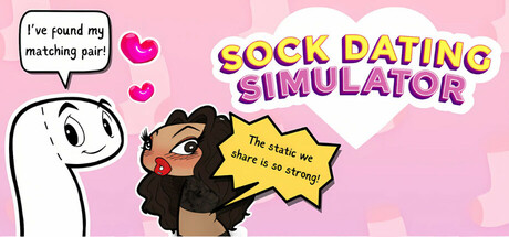
A visual novel where you get turned into a sock, talk to (seduce!) up to 7 socks, go on dates, get married (divorced?), customize your sock, and explore the "woolderful world" of Sockhalla! Find your matching pair, or "solemate", to reopen the portal, turn back into a human, and go back home!

Dating SimVisual NovelSimulation
Hannagie Productions Inc., Bishop GamesTo be announced

Sock Dating Simulator scores 68/100 — better than 34% of Dating Sim capsules (n=280).

Released To be announced · By Hannagie Productions Inc.

Quick text summary

Sock Dating Simulator scored 68/100 on Steam Analyzer — Solid for a Dating Sim capsule. Top priority fix: [genre_clarity] Add visual sock character design or sock-specific iconography to the character art to instantly communicate the unique 'sock dating' premise and differentiate from generic dating sims.

Capsule scores by dimension

  • Genre Clarity: 7/10 — Dating sim romance clear, gameplay less obvious. The pink background, heart icons, and dialogue bubble with 'I've found my matching pair' immediately signal a dating or romance game. The character art style and tagline 'The stake we share is so strong' reinforce narrative-driven relationship gameplay. However, at tiny size, the sock-specific premise and RPG/simulation mechanics become ambiguous—it reads as generic romance rather than a unique sock-themed adventure with customization and choice systems.
  • Title Readability: 8/10 — Bold two-tier title reads well across sizes. SOCK DATING SIMULATOR uses bright yellow-pink gradient text with strong outlines that maintain legibility from full header down to small capsule size. The two-line stacking (SOCK DATING on top, SIMULATOR below) creates clear hierarchy and avoids cramping. At tiny size the text remains readable, though some color saturation detail is lost; the outline structure keeps it decipherable even at 120×45px.
  • Contrast & Color: 7/10 — Warm palette pops but mid-tones lack separation. The bright pink background and yellow-pink title text create strong value contrast against Steam's dark #1b2838 background. The white character outline and heart icons provide additional separation points. However, the brown character skin tone and beige/tan sock elements sit in muddy mid-tone territory that reduces silhouette clarity at tiny size; a grayscale squint test shows the character shape loses some edge definition against the pink.
  • Uniqueness & Polish: 6/10 — Charming concept undermined by generic execution. The sock dating premise is genuinely creative and the hand-drawn character art with simple stick figure hold personality. However, the overall layout feels template-like with standard dialogue bubble, floating hearts, and centered character placement that mirrors common dating sim designs. The capsule communicates the game's humor and charm well, but lacks the polish and distinctive visual hook that would elevate it to standout quality—it reads as competent indie charm rather than premium craft.
  • Brand Consistency: 6/10 — Playful tone consistent, visual identity unclear. The warm pink color, hand-drawn aesthetic, and humorous dialogue establish a consistent lighthearted brand voice. The character art style appears recognizable and fits the casual indie vibe. However, there are no strong iconic visual motifs, signature symbols, or color palette cues that would make this capsule instantly recognizable as 'Sock Dating Simulator' on a crowded Steam shelf—it could easily swap characters or themes and maintain the same visual template.
  • Composition: 7/10 — Clear focal point with minor spacing imbalance. The brown character occupies the visual center-left, drawing immediate attention, while the title anchors the top-right with strong yellow contrast. Hearts and dialogue bubble support the character focus without overwhelming it. At small size, the composition reads cleanly with good hierarchy. However, the right side of the design feels slightly empty with dead space that could be better utilized, and the character sits slightly off-center which creates mild tension rather than dynamic balance.

What works

  • Strong title contrast and readability. Yellow-pink outlined text maintains legibility across all sizes from full header to 120×45px thumbnail with clear two-line hierarchy.
  • Playful personality shines through. Hand-drawn character, dialogue bubble, and heart elements communicate charm and humor that aligns well with the dating sim concept.
  • Clear romantic dating game signaling. Pink palette, hearts, dialogue box, and tagline immediately communicate a dating/relationship-focused experience.

What hurts the capsule

  • Generic template layout. Centered character with floating hearts and dialogue bubble mirrors standard dating sim designs without distinctive visual storytelling or unique hook.
  • Weak silhouette at tiny size. Brown character tone blends into warm pink background in mid-tone range; grayscale contrast test shows character loses edge definition at 120×45px.
  • Sock premise visual underexplored. The character appears human rather than sock-themed, missing an opportunity to visually reinforce the game's unique 'sock dating' concept that sets it apart from generic romance sims.
  • Unused right-side real estate. Composition leaves right half underutilized with empty pink space that could strengthen balance or add supporting visual narrative.

Priority fixes

  1. [genre_clarity] Add visual sock character design or sock-specific iconography to the character art to instantly communicate the unique 'sock dating' premise and differentiate from generic dating sims.
  2. [contrast_color] Increase character silhouette contrast by darkening the brown tone or adding a darker outline to maintain edge definition at tiny thumbnail size.
  3. [uniqueness_polish] Develop a distinctive visual motif or signature symbol (e.g., a sock icon, thread pattern, or repeated design element) that reinforces brand identity and makes the capsule recognizable across marketing materials.
  4. [composition] Rebalance composition by moving or scaling elements to activate the right side of the design, creating dynamic asymmetry or visual storytelling that improves from its current template feel.

Store copy priority fixes

  1. [hook_strength] Rewrite the short description opening to lead with the Isekai laundry portal concept instead of generic choice language: 'Sucked into a portal during laundry day, you arrive in Sockhalla—a world of sentient socks. Date them, customize yourself, and find your missing sock (your solemate) in this absurd visual novel satire.'
  2. [feature_communication] Add 1–2 concrete examples to the mini-games mention (e.g., 'Play rhythm games, memory puzzles, or sock-matching mini-games for cash') to fill the feature gap.
  3. [audience_targeting] Insert a single sentence clarifying the balance of narrative vs. systems (e.g., 'This is a choice-driven, story-first experience with light RPG elements'—or its opposite if applicable).

Related guides

Steam app ID: 3512190 · Tags: Dating Sim, Visual Novel, Simulation, Indie, Character Customization