Scoring genre clarity...

Up or Down? capsule

Up or Down?

Listen up, bellhop! Only bring in healthy hotel guests up to the chopper. Avoid all sick or else...

Visual NovelHorrorChoices Matter
Eye Blink TwiceComing soon

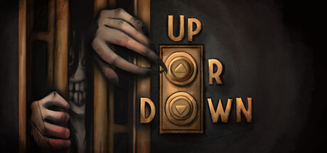
Up or Down? scores 63/100 — better than 6% of Steam capsules we've analysed (n=22,658).

Released Coming soon · By Eye Blink Twice

Quick text summary

Up or Down? scored 63/100 on Steam Analyzer — Solid for a Steam capsule. Top priority fix: [genre_clarity] Add a subtle visual mechanic cue such as a guest silhouette, elevator floor indicator, or health icon to the composition to hint at the decision-based bellhop gameplay rather than pure horror.

Capsule scores by dimension

  • Genre Clarity: 5/10 — Horror tone unclear genre mix. The creepy figure gripping bars through a dimly lit doorway strongly implies horror or thriller, which clashes with the actual elevator/bellhop adventure mechanic. At tiny size the golden elevator button panel logo is too small to communicate gameplay context, leaving only the unsettling face as the dominant read. The genre lands somewhere between horror escape and puzzle adventure, which creates mixed messaging.
  • Title Readability: 7/10 — Logo reads well at small size. The 'Up or Down' title is split creatively across a stylized golden elevator button panel, which is distinctive and legible at full and small sizes. At tiny size the text remains readable due to the high-contrast gold panel against the darker background, though the decorative split layout requires a moment of parsing. The elevator button motif reinforces the game concept once recognized.
  • Contrast & Color: 6/10 — Warm gold pops, figure fades. The golden elevator panel creates a strong warm accent against the muted brown and grey tones, giving the image one clear high-contrast anchor. However the creepy figure on the left blends into the dark wooden bars and shadowy background, losing silhouette definition at tiny size. In grayscale the left half of the image collapses into undifferentiated mid-dark tones, weakening overall pop against the Steam dark background.
  • Uniqueness & Polish: 7/10 — Distinct elevator panel concept. The elevator button panel used as a logo is a clever and memorable visual hook that ties directly to the game mechanic. The painterly horror style is well-executed with consistent texture and a moody atmosphere. However the generic 'creepy face at bars' trope is familiar from many horror games and reduces the overall distinctiveness compared to top benchmarks like Buckshot Roulette or Slay the Princess which have sharper conceptual identity.
  • Brand Consistency: 7/10 — Cohesive dark painterly identity. The warm sepia and shadow palette, painterly rendering style, and retro hotel aesthetic form a coherent visual identity. The elevator button motif is a strong recurring brand symbol that could anchor recognition across store assets. The tonal combination of dark comedy horror and vintage hotel setting feels internally consistent and purposeful.
  • Composition: 6/10 — Split composition crowds left side. The image is split between the creepy figure on the left and the logo panel on the right, creating a roughly equal two-element layout with no clear single focal point hierarchy. At small and tiny sizes the left figure competes with the right logo for attention rather than supporting it. The logo panel is well-placed but the figure bleeds too close to the left edge, and there is minimal depth layering to guide the eye naturally.

What works

  • Distinctive elevator button logo. The split title across a gold elevator panel is immediately recognizable and ties directly to the game's core mechanic, standing out from generic text logos.
  • Cohesive warm sepia palette. The muted warm browns, shadowed darks, and gold accents create a unified retro-horror hotel atmosphere that feels intentional and polished.
  • Title remains legible at small size. The high-contrast gold panel keeps the title readable even at 231x87, which is a meaningful advantage in Steam browsing.

What hurts the capsule

  • Figure loses silhouette at tiny size. The creepy face and hands gripping the bars merge into the dark wooden background at tiny size, losing the visual detail that gives the image tension.
  • Genre signal is misleading. The dominant horror face imagery implies a pure horror game rather than a dark-comedy bellhop adventure, potentially attracting the wrong audience.
  • No clear single focal point. The two-part composition gives equal visual weight to the figure and the logo, creating competing focal points that slow parsing under quick scroll.
  • Left side bleeds to edge. The figure hugs the left edge with little safe margin, risking awkward crop in certain Steam capsule display contexts.

Priority fixes

  1. [genre_clarity] Add a subtle visual mechanic cue such as a guest silhouette, elevator floor indicator, or health icon to the composition to hint at the decision-based bellhop gameplay rather than pure horror.
  2. [contrast_color] Increase the value contrast on the figure by brightening the face or adding a rim light so the left-side subject separates from the dark bars at tiny size.
  3. [composition] Shift the figure slightly right and reduce its scale to establish a clear foreground-to-logo hierarchy, making the golden elevator panel the primary focal anchor.
  4. [brand_consistency] Ensure the elevator button panel motif and retro hotel aesthetic are carried consistently across all store screenshots to build a recognizable brand identity.

Store copy priority fixes

  1. [feature_communication] Expand the feature list to include specific mechanics: add '50+ different story outcomes based on your choices' and explain what the simulation elements (news, symptom tracking) mean for gameplay.
  2. [uniqueness] Add a sentence distinguishing this game from other choice-driven horror games: e.g., 'The only visual novel where you play an unwitting frontline of disease control' or highlight the outbreak simulation mechanics.
  3. [audience_targeting] Clarify the tone blend early in detailed description: add 'A darkly comedic moral nightmare' or 'Where mundane hotel duties become a question of life and death' to signal the intended audience.
  4. [genre_clarity] Mention 'point & click' interaction if applicable, or confirm that the game is dialogue-driven rather than puzzle-based.

Related guides

Steam app ID: 3533080