Scoring genre clarity...

Mini Worlds Dioramas capsule

Mini Worlds Dioramas

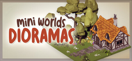
A peaceful sandbox for building tiny worlds. Mini Worlds Dioramas is your digital Zen garden—no goals, no stress, just pure creativity. Mix and match cozy props from different genres to craft your own calming dioramas.

$4.99Mostly Positive(10)
CasualSandboxBuilding
PaidotriboApr 3, 2026

Mini Worlds Dioramas scores 77/100 — better than 75% of Casual capsules (n=10,153).

Mostly Positive (10 reviews) · $4.99 · Released Apr 3, 2026 · By Paidotribo

Quick text summary

Mini Worlds Dioramas scored 77/100 on Steam Analyzer — Good for a Casual capsule. Top priority fix: [brand_consistency] Develop a signature visual motif—such as a recognizable character, distinctive UI element, or unique diorama style accent—that could appear consistently across future marketing materials and become synonymous with the game.

Capsule scores by dimension

  • Genre Clarity: 8/10 — Clear cozy creative sandbox vibe. The isometric diorama scene with a cottage, tree, and crafted landscape immediately signals a peaceful building/decoration game. At tiny size, the distinctive miniature aesthetic and warm color palette still read as a relaxing creative experience, though the specific 'sandbox diorama' mechanic becomes less obvious at smallest sizes.
  • Title Readability: 8/10 — Bold readable title, minor tagline loss. The main title 'DIORAMAS' in bold red-orange reads clearly at all sizes, and 'mini worlds' above provides context. At tiny size the full title remains legible due to strong contrast and size hierarchy, though the overall composition remains cohesive even when compressed.
  • Contrast & Color: 8/10 — Strong warm palette with good separation. The orange-toned cottage, red title text, and olive-green tree create excellent value separation against the light beige background and Steam's dark interface. The silhouettes remain clear even at tiny size, and the warm color scheme pops naturally against the dark Steam background.
  • Uniqueness & Polish: 7/10 — Charming craft with modest distinction. The hand-crafted isometric illustration style and cozy cottagecore aesthetic feel polished and intentional, communicating the game's zen-building identity well. However, similar pastoral/diorama aesthetics appear in competing titles like Tiny Glade, so while execution is clean, the core visual hook is not entirely unique in the current indie landscape.
  • Brand Consistency: 7/10 — Cohesive pastoral style, limited icon. The warm earth tones, isometric perspective, and cottage-focused imagery create internal consistency that aligns with a cozy creative game. The presentation feels recognizably 'Mini Worlds' based on the pastoral diorama focus, though without a strong iconic character or symbol, long-term brand recall relies on the style alone.
  • Composition: 8/10 — Balanced focal point with good hierarchy. The cottage sits as a clear primary focal point center-right, with the tree framing left and title anchoring top-left. The composition uses foreground (grass), midground (cottage), and background (tree) layering effectively, and remains well-composed even at small sizes without elements being cut off by Steam's typical cropping.

What works

  • Instantly communicates genre and mood. The isometric cottage scene immediately signals a peaceful creative building game, aligned with the zen sandbox positioning.
  • Strong legible title with warm hierarchy. Bold red 'DIORAMAS' text contrasts sharply against the light background and remains readable at all compression levels.
  • Cohesive warm color palette. Orange, red, olive, and cream tones work harmoniously and pop effectively against Steam's dark interface without feeling oversaturated.
  • Clean polished illustration quality. Hand-crafted aesthetic feels intentional and premium compared to generic asset-store visuals common in indie games.

What hurts the capsule

  • Visual hook not distinctive vs. competitors. The pastoral diorama aesthetic resembles top performers like Tiny Glade, limiting differentiation in a crowded cozy-game market.
  • No strong iconic symbol or character. The capsule relies entirely on the cottage scene for recognition; there is no memorable motif players would associate with Mini Worlds Dioramas across future marketing.
  • Limited brand identity system. The capsule feels more like a one-off charming scene than a scalable brand identity that could anchor storefront header images or community recognition.

Priority fixes

  1. [brand_consistency] Develop a signature visual motif—such as a recognizable character, distinctive UI element, or unique diorama style accent—that could appear consistently across future marketing materials and become synonymous with the game.
  2. [uniqueness_polish] Differentiate the core visual hook by introducing a unique mechanic cue (e.g., a layering system indicator, genre-mixing elements on display, or a signature craft tool) that sets this apart from generic pastoral dioramas.
  3. [composition] Consider adding a subtle secondary focal point or interactive hint (such as a placed object or construction element) that hints at the creative freedom and 'mix and match' core mechanic.

Store copy priority fixes

  1. [uniqueness] Add a differentiator statement such as 'Combine props from 5+ distinct genres—create a medieval tower next to a sci-fi spaceship—in ways no other diorama builder allows' to clarify what makes this game stand out.
  2. [feature_communication] Specify the total number of props, buildings, or themed kits available (e.g., 'over 500 props' or '5 full themed kits') to communicate depth of creative possibility.
  3. [audience_targeting] Add a sentence addressing creative/artistic players: 'Perfect for artists, designers, and storytellers who want a distraction-free space to experiment with composition and mood.'

Related guides

Steam app ID: 3536950 · Tags: Casual, Sandbox, Building, Design & Illustration, Cozy