Scoring genre clarity...

Scary Tales: Horror School capsule

Scary Tales: Horror School

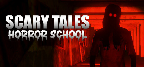
Scary Tales: Horror School is a first-person survival horror game with three intense chapters—escape a haunted school, rescue a missing son from a chainsaw-wielding butcher, and soon, confront ancient black magic. Can you survive the nightmare?

$1.997 user reviews
HorrorSingleplayerOld School
SuperShell GamesMar 27, 2025

Scary Tales: Horror School scores 70/100 — better than 36% of Horror capsules (n=3,118).

7 user reviews · $1.99 · Released Mar 27, 2025 · By SuperShell Games

Quick text summary

Scary Tales: Horror School scored 70/100 on Steam Analyzer — Good for a Horror capsule. Top priority fix: [uniqueness_polish] Integrate a distinctive visual element—such as a signature character design, unique school setting detail, or thematic symbol—that differentiates this from generic institutional horror imagery.

Capsule scores by dimension

  • Genre Clarity: 8/10 — Strong horror survival signals. The red-tinted silhouette of a menacing figure backlit by institutional architecture clearly communicates survival horror. At tiny size, the glowing red neon lines and dark humanoid form instantly read as horror game imagery, though the specific 'school' setting is less obvious without title context. Genre expectations for first-person horror are met effectively.
  • Title Readability: 7/10 — Readable but secondary emphasis. The white sans-serif title 'SCARY TALES' has strong contrast against the dark background and remains legible at small and tiny sizes due to generous letter spacing and weight. However, the smaller tagline 'HORROR SCHOOL' in outline font loses crispness at tiny size and feels less anchored. At full size both read clearly, but the hierarchy slightly favors the primary title over genre context.
  • Contrast & Color: 8/10 — High value separation, warm accent focus. The red-orange neon glow creates striking separation from the dark background (#1b2838), with the silhouette rendered in deep shadow for clear visual separation. White title text pops decisively against both dark and warm zones. The grayscale read maintains strong contrast, though the shadowed figure detail becomes less distinct at tiny sizes.
  • Uniqueness & Polish: 6/10 — Competent but familiar horror trope. The backlit menacing figure in institutional red neon follows a well-established survival horror visual formula seen across genre peers. While technically clean with intentional lighting and color choices, it lacks a distinctive hook or memorable visual identity that separates it from generic horror game capsules. The execution is solid but the concept feels derivative.
  • Brand Consistency: 6/10 — No distinctive brand identity cues. The capsule presents an archetype scene rather than a brand-specific visual signature or memorable motif. Without reference to the 9 store screenshots, there are no recognizable character traits, iconography, or unique aesthetic elements that would signal this specific game across marketing materials. The red neon and institutional setting are generic horror markers, not unique brand identity.
  • Composition: 7/10 — Clear focal point, safe margins. The central silhouette serves as the primary focal point with the red architectural background supporting rather than competing. The title is strategically placed in the upper left with adequate breathing room from edges, remaining safe from Steam cropping. The composition holds at small and tiny sizes, though the background detail becomes compressed and loses impact at thumbnail scale.

What works

  • Strong color contrast. Red-orange neon glow creates decisive value separation against the dark Steam background and white title text pops cleanly.
  • Readable title placement. The primary title sits in a controlled upper-left region with sufficient contrast and spacing to remain legible at tiny size.
  • Clear genre communication. The backlit menacing figure and institutional red environment immediately signal survival horror to genre-familiar viewers.

What hurts the capsule

  • Generic horror formula. The backlit silhouette in institutional neon closely mirrors common horror game visual tropes and lacks distinctive brand identity.
  • Secondary tagline legibility. The outlined 'HORROR SCHOOL' text weakens and loses clarity at tiny size due to thin letterforms and outline rendering.
  • No memorable visual hook. The capsule communicates genre competently but offers no distinctive character, symbol, or aesthetic that would create brand recall.

Priority fixes

  1. [uniqueness_polish] Integrate a distinctive visual element—such as a signature character design, unique school setting detail, or thematic symbol—that differentiates this from generic institutional horror imagery.
  2. [brand_consistency] Establish and reinforce a recognizable iconographic element or signature palette from the game's core narrative (the butcher, the black magic, or a key horror concept) that appears consistently across marketing.
  3. [title_readability] Increase the weight or add a subtle glow to the 'HORROR SCHOOL' tagline to maintain legibility at tiny size without losing its supporting role.

Store copy priority fixes

  1. [hook_strength] Rewrite the short description opening to lead with a visceral action verb or threat instead of the title—e.g., 'Trapped in a haunted school with three ways out—if you can solve the nightmares before they solve you.'
  2. [uniqueness] Add one sentence explicitly contrasting this game from other horror titles, such as 'Procedurally-generated horror ensures no two escapes are identical' or 'Your choices shape three entirely different endings.'
  3. [feature_communication] Replace vague adjectives ('mind-bending,' 'relentless') with one concrete example per chapter—e.g., 'Decode a three-digit code to save your son' or 'Scavenge limited ammo and choose to fight, sneak, or run.'

Related guides

Steam app ID: 3548950 · Tags: Horror, Singleplayer, Old School, Adventure, Procedural Generation