Scoring genre clarity...

Gig Crawler capsule

Gig Crawler

1–4 player extraction roguelite with procedural dungeons, shared loot, and deep build crafting.

ActionMultiplayerCo-op
Slimy StudioComing soon

Gig Crawler scores 72/100 — better than 45% of Action capsules (n=8,734).

Released Coming soon · By Slimy Studio

Quick text summary

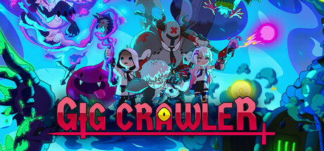
Gig Crawler scored 72/100 on Steam Analyzer — Good for a Action capsule. Top priority fix: [brand_consistency] Introduce a distinctive iconic character or symbol (e.g., a unique robot mascot or procedural dungeon motif) that becomes the signature of 'Gig Crawler' marketing and branding.

Capsule scores by dimension

  • Genre Clarity: 7/10 — Action-focused multiplayer dungeon crawler. The capsule communicates action and chaos through dynamic character poses, vibrant neon effects, and a stylized sci-fi/cyber aesthetic that clearly signal an energetic, multiplayer-oriented game. At tiny size, the bright magenta and cyan colors and clustered characters still read as 'action party game,' though specific roguelite mechanics are not immediately obvious from visuals alone. The visual language skews toward arcade action rather than deep RPG mechanics.
  • Title Readability: 8/10 — Bold, readable magenta title text. The title 'GIG CRAWLER' is rendered in large, bright magenta letterforms with strong outline/shadow definition against the neon blue background, maintaining legibility at small size. At tiny thumbnail size (120x45), the title still reads clearly thanks to high value contrast and bold weight, though some fine detail in the outline is lost. The strategic placement below the character cluster keeps it anchored on a relatively controlled region rather than competing with busy particle effects.
  • Contrast & Color: 8/10 — Vibrant neon palette pops cleanly. Bright cyan, magenta, green, and yellow neon tones create excellent value separation against the dark Steam background (#1b2838), with characters and effects reading as distinct silhouettes even at small sizes. The grayscale stress test shows strong luminosity separation: bright neon elements remain visible and the dark characters maintain clear edges. However, the busy particle and effect field in the background creates some mid-tone mudiness that slightly reduces pristine clarity at ultra-small sizes.
  • Uniqueness & Polish: 7/10 — Polished neon aesthetic, somewhat familiar style. The capsule demonstrates clean craft with intentional color grading, coherent lighting on character models, and a distinctive cyberpunk/neon visual hook that communicates a premium indie production. The character designs and pose variety show effort in visual storytelling, but the neon-saturated cyberspace aesthetic is a common trope in modern indie games and does not feel particularly distinctive against genre peers like DREDGE or Lethal Company. The execution is solid and memorable, but the core concept reads as a known archetype rather than a novel hook.
  • Brand Consistency: 6/10 — Consistent neon style, limited iconic motifs. The capsule demonstrates internal cohesion through a unified neon color palette, consistent character rendering style, and a recognizable cyber-punk art direction that would carry across marketing materials. However, there are no immediately iconic character, symbol, or motif elements that would make this capsule uniquely identifiable as 'Gig Crawler' versus a generic multiplayer dungeon crawler. The visual identity is competent and thematic but lacks a signature element that builds lasting brand recall.
  • Composition: 7/10 — Clear focal point, balanced layering. The composition uses effective depth layering with neon background effects, mid-ground character cluster, and foreground title text that guides the eye hierarchically. The central character grouping creates a clear primary focal point that holds even at tiny size, with supporting effects framing rather than competing. At small size the layout remains coherent, though the dense particle field and multiple competing character silhouettes create mild visual clutter that prevents a more refined score; some dead space around edges could have been used more intentionally.

What works

  • Title legibility across sizes. Bright magenta 'GIG CRAWLER' text with strong outline contrast remains readable even at 120x45 thumbnail size thanks to bold weight and high value separation from background.
  • Vibrant neon contrast. Cyan, magenta, and green neon tones create excellent pop against the dark Steam background and maintain silhouette clarity in grayscale, supporting quick recognition in scroll.
  • Confident character composition. Multiple posed characters with varied poses and silhouettes create visual interest and communicate multiplayer/party gameplay without feeling scattered or unbalanced.

What hurts the capsule

  • Generic cyberpunk aesthetic. The neon-saturated cyberspace visual language is familiar territory in indie gaming and does not establish a distinctive brand identity versus similar genre peers.
  • Lack of iconic brand motif. No memorable symbol, character silhouette, or signature visual hook that would make 'Gig Crawler' instantly recognizable separate from its visual style alone.
  • Background particle clutter. Dense neon particle effects and swirling elements in the background create mid-tone mudiness and mild visual competition with the character focal point, reducing refinement at small sizes.

Priority fixes

  1. [brand_consistency] Introduce a distinctive iconic character or symbol (e.g., a unique robot mascot or procedural dungeon motif) that becomes the signature of 'Gig Crawler' marketing and branding.
  2. [uniqueness_polish] Strengthen the core mechanic communication by adding a subtle UI element or visual cue that hints at the extraction roguelite or procedural dungeon feature, differentiating from generic multiplayer action games.
  3. [composition] Reduce background particle density or add subtle directional guides to create a clearer visual hierarchy and reduce competition between the character focal point and atmospheric effects.

Store copy priority fixes

  1. [hook_strength] Rewrite the short description to lead with a narrative hook or unique emotional angle (e.g., 'Rob corporate black sites with friends in this extraction roguelite—but corporate sends monsters after you.') rather than a feature list.
  2. [uniqueness] Add a paragraph or subsection explaining what makes Gig Crawler distinct from other extraction roguelites—e.g., a unique system or design philosophy specific to this title.
  3. [feature_communication] Expand the explanation of the extraction mechanic and how it differs from standard roguelikes (e.g., do players lose loot on death? How does 'shared rewards' persist?)
  4. [genre_clarity] Clarify early in the detailed description whether this is PvE-only or includes PvP, as 'indirect competition' is ambiguous and tags mention 'Multiplayer' without specifying mode.

Related guides

Steam app ID: 3563000 · Tags: Action, Multiplayer, Co-op, RPG, Singleplayer