Scoring genre clarity...
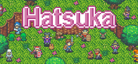
Aria, a cherished companion and lover, lost her life during an adventure. To fulfill her wish, the protagonist sets out to help the villagers and gather Hatsuka flowers. Enjoy enchanting pixel art, strategic battles, and a heartfelt story that captures the nostalgia of classic JRPGs!
$7.246 user reviews
RPGTurn-Based TacticsAdventure
MKstudioApr 23, 2025