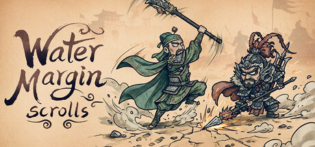
Water Margin Scrolls scores 77/100 — better than 84% of Party-Based RPG capsules (n=367).

Quick text summary

Water Margin Scrolls scored 77/100 on Steam Analyzer — Good for a Party-Based RPG capsule. Top priority fix: [brand_consistency] Introduce a recognizable iconic symbol (emblem, seal, or character mark) consistently placeable across all marketing materials for long-term brand recall.

Capsule scores by dimension

  • Genre Clarity: 7/10 — Classic fantasy squad RPG signaled clearly. The watercolor illustration style, martial character poses, and dynamic action composition immediately suggest a classic fantasy strategy game with collectible heroes. At tiny size, the two distinct character silhouettes and combat-ready stances remain legible enough to imply squad-based gameplay, though the specific Water Margin setting becomes less obvious at smallest scales.
  • Title Readability: 8/10 — Title legible with strong stylistic font. The 'Water Margin Scrolls' text uses a hand-drawn serif style positioned in the upper left with adequate contrast against the warm beige background. The title remains readable at small size due to letter spacing and weight, though at tiny size the decorative font loses some clarity but remains recognizable as text.
  • Contrast & Color: 8/10 — Warm palette pops against dark background. The warm tan and cream color palette with strong dark brown outlines creates excellent value separation against Steam's dark #1b2838 background. Character silhouettes are crisp and defined; the saturated green cape and blue armor accents provide color contrast that reads well even at thumbnail size.
  • Uniqueness & Polish: 8/10 — Distinctive hand-drawn watercolor aesthetic. The watercolor illustration style with visible brushwork and ink details feels premium and intentional, distinguishing it from generic fantasy templates. The art communicates a literary/classic adventure tone specific to Water Margin, and the dynamic composition with splash effects and movement conveys squad action gameplay without feeling mass-produced.
  • Brand Consistency: 7/10 — Cohesive artistic style, limited iconography. The hand-drawn watercolor rendering is internally consistent with clean inking and warm earth tones throughout. While the characters wear distinctive armor suggesting the historical setting, the capsule lacks a singular iconic symbol or motif that would create immediate brand recall on future encounters.
  • Composition: 8/10 — Strong focal hierarchy with balanced subjects. Two characters positioned off-center create dynamic tension and clear depth layering—foreground action figure on left, secondary character on right with background elements. The title sits safely in upper left; composition remains legible at small/tiny sizes with no critical elements at dangerous edges, and the movement lines guide attention without cluttering.

What works

  • Distinctive watercolor art direction. Hand-drawn illustration with visible brushwork and ink detailing creates a premium, intentional look that stands out against generic fantasy templates.
  • Clear character silhouettes and contrast. Dark outlines and saturated color accents (green cape, blue armor) maintain silhouette integrity and readability even at thumbnail size against dark Steam backgrounds.
  • Dynamic composition with implied action. Movement lines, splash effects, and off-center character placement communicate squad-based combat gameplay and create visual interest at all viewing sizes.
  • Safe typography placement. Title positioned in upper left corner on controlled background with adequate spacing, avoiding overlap with character details or edge crop zones.

What hurts the capsule

  • Setting specificity lost at tiny size. While the hand-drawn style and characters suggest fantasy, the specific Water Margin literary source becomes unclear at thumbnail scale, reading as generic fantasy instead.
  • Limited brand identity anchors. No recurring iconic symbol, character, or logo mark that would build recognition across multiple capsules or store pages for brand recall.
  • Decorative font at smallest scales. The hand-drawn serif title font loses some legibility at tiny size, with letterforms blending slightly due to fine detail in the stylistic strokes.

Priority fixes

  1. [brand_consistency] Introduce a recognizable iconic symbol (emblem, seal, or character mark) consistently placeable across all marketing materials for long-term brand recall.
  2. [genre_clarity] Add subtle strategic UI cues (hex grid, stat icons, or squad formation hint) to clarify squad-building and turn-based strategy mechanics at thumbnail scale.
  3. [title_readability] Add a thin contrasting outline or shadow to the title font to improve legibility at tiny sizes while maintaining the watercolor aesthetic.
  4. [composition] Consider a simplified secondary capsule variant with closer crop on main character and larger title for store list views where the full illustration gets compressed.

Store copy priority fixes

  1. [hook_strength] Rewrite the short description to lead with a core differentiator—e.g., 'Lead legendary Water Margin heroes into automated squad battles, recruit rare allies, and outsmart rivals through team composition and synergy' to create urgency and specificity.
  2. [feature_communication] Clarify the auto-battle vs. positioning dynamic in the Auto Battles bullet—e.g., 'Auto Battles—design your squad positioning and synergies pre-battle, then watch your strategy unfold' to resolve mechanical contradiction.
  3. [uniqueness] Add a sentence to the opening explaining what Water Margin heroes bring that competitors don't—e.g., a sentence about iconic character abilities, authentic martial arts legacy, or unique faction synergies that justify the IP choice.
  4. [tone_match] Remove or rewrite the 'Add to Wishlist' promotional closing to integrate launch messaging naturally into the gameplay narrative rather than as a jarring CTA.

Related guides

Steam app ID: 3583540 · Tags: Party-Based RPG, Loot, Creature Collector, Turn-Based Combat, Trading Card Game