Scoring genre clarity...

Hero's Hand capsule

Hero's Hand

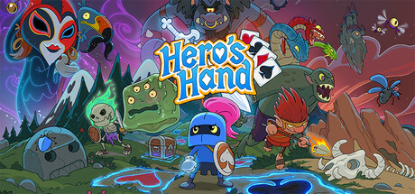
Embark on the ultimate Poker-Based Roguelike RPG Adventure! Hero’s Hand packs a strategic punch! Become the Knight of Spades & save the land of Cardunia! The game features hand drawn animation, humorous fantasy monsters, & addictive turn-based poker combat that keeps you coming back for more!

RogueliteRPGDungeon Crawler
Villain GamesComing soon

Hero's Hand scores 70/100 — better than 30% of Steam capsules we've analysed (n=22,658).

Released Coming soon · By Villain Games

Quick text summary

Hero's Hand scored 70/100 on Steam Analyzer — Good for a Steam capsule. Top priority fix: [composition] Reduce the ensemble to 2-3 characters maximum and push supporting monsters to background silhouettes so the blue knight reads as a clear sole hero at tiny size.

Capsule scores by dimension

  • Genre Clarity: 7/10 — Card RPG roguelike readable. The playing card suits visible in the title logo and the sword through the card motif clearly signal a card-based game. The fantasy monsters, knight character, and RPG-style loot chest reinforce an adventure RPG context well. At tiny size the card suits in the logo and the fantasy cast of characters still hint at card-based RPG, though the poker-roguelike subgenre nuance is lost.
  • Title Readability: 7/10 — Logo clear at medium, tiny borderline. The 'Hero's Hand' title sits centrally with a clean white outlined font and a sword integrated into the apostrophe, giving it good contrast against the lighter sky area behind it. At small size the text is still legible as two distinct words. At tiny size (120x45) the title becomes quite small but the white lettering with outline still holds together marginally, though the decorative sword detail collapses entirely.
  • Contrast & Color: 7/10 — Bright palette pops on dark Steam bg. The saturated greens, blues, and warm oranges contrast well against Steam's dark #1b2838 background, particularly the glowing blue ground trail and the bright red-haired hero on the right. The blue knight in the foreground center has strong silhouette clarity. In grayscale the mid-section becomes somewhat muddy where the green troll and green background foliage merge, reducing separation in that zone.
  • Uniqueness & Polish: 7/10 — Charming hand-drawn style, slightly busy. The hand-drawn animation style is distinctive and communicates a warm, humorous personality that stands apart from typical pixel-art roguelikes or dark card games like Slay the Spire. The card suit integration into the logo is a smart branding hook. However, the scene is quite cluttered with many characters competing for attention simultaneously, which dilutes the premium feel and makes it read closer to a busy indie asset pack than a curated hero shot.
  • Brand Consistency: 8/10 — Cohesive hand-drawn identity, memorable. The hand-drawn cartoon style is consistent across all characters and environments visible, with a unified outline weight and color palette of saturated greens, blues, and warm oranges. The blue knight as a central mascot and the card-suit motif woven into the logo provide recognizable identity anchors that would carry across store assets. The playful monster cast reinforces a consistent tonal identity of light-hearted adventure.
  • Composition: 6/10 — Busy ensemble with weak focal hierarchy. The composition spreads attention across a large ensemble cast of roughly eight to ten characters without a single dominant focal point, which creates a chaotic read at small sizes. The blue knight in the foreground center and the title text above it form a loose primary axis, but the red-haired hero on the right and the large masked figure on the left pull the eye in competing directions. At tiny size the scene collapses into an indistinct colorful crowd with no clear hero or focal anchor.

What works

  • Card motif integration in logo. The playing card suits woven into the 'Hero's Hand' title immediately signal the card-game mechanic without requiring any supporting text.
  • Distinctive hand-drawn art style. The consistent cartoon outline style differentiates it from pixel-art or dark-fantasy competitors in the roguelike card game space.
  • Strong color contrast on Steam dark background. The bright saturated palette and glowing blue foreground elements pop clearly against #1b2838 during a quick scroll.
  • Memorable blue knight mascot. The blue armored knight provides a recognizable character anchor that could become a consistent brand identity marker across store assets.

What hurts the capsule

  • Overcrowded ensemble cast. Too many characters of similar visual weight compete for attention simultaneously, making it difficult to identify a primary hero at small and tiny sizes.
  • Focal point collapses at tiny size. At 120x45 the scene reads as an indistinct colorful mass with no single element drawing the eye first.
  • Green midground blending. The green troll and green foliage background merge in grayscale, reducing depth separation in the center-left of the composition.
  • Decorative logo details lost at tiny size. The sword-through-apostrophe detail and card suit accents in the logo collapse completely at tiny size, weakening the card-game genre signal.

Priority fixes

  1. [composition] Reduce the ensemble to 2-3 characters maximum and push supporting monsters to background silhouettes so the blue knight reads as a clear sole hero at tiny size.
  2. [genre_clarity] Add a visible playing card element (a large card face or fanned hand) as a foreground prop near the hero to reinforce the poker mechanic at tiny size when the logo detail is lost.
  3. [title_readability] Increase the title font size slightly and add a subtle dark vignette or soft shadow behind the 'Hero's Hand' text to ensure legibility against the varied background at small size.
  4. [contrast_color] Separate the green troll from the green foliage background by darkening the background trees or adding a rim light on the troll to improve silhouette clarity in grayscale.

Store copy priority fixes

  1. [hook_strength] Replace 'ultimate' and 'wildest' with specific, concrete descriptors of what makes the poker-poker fusion unique—e.g., 'Turn your poker hand into a spirit weapon to battle over-the-top monsters' would be more compelling than generic intensity.
  2. [feature_communication] Clarify the relic cost mechanic explicitly—specify whether relics cost health, gold, or remove a card slot, so players immediately understand the risk-reward system.
  3. [audience_targeting] Add a sentence about typical run length and difficulty accessibility—e.g., 'Perfect for 20-minute roguelike sessions' or 'Adjustable difficulty for casual and hardcore players' would help self-select the right audience.
  4. [uniqueness] Include a brief comparison or reason-to-choose statement—e.g., 'Unlike traditional roguelikes, every combat encounter is a poker hand you build turn by turn' would reinforce differentiation.

Related guides

Steam app ID: 3590630