Scoring genre clarity...

Defiant Ascent capsule

Defiant Ascent

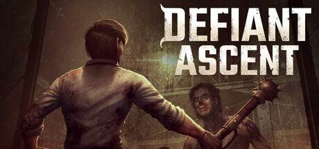
You wake up as the last survivor trapped in the depths of a military bunker infested with zombies. As the only one immune, after too much time alone, you decide to explore and fight one last time to reach the surface. If there is still a world to return to.

Side ScrollerCraftingSurvival
Mentis InteractiveComing soon

Defiant Ascent scores 63/100 — better than 6% of Steam capsules we've analysed (n=22,658).

Released Coming soon · By Mentis Interactive

Quick text summary

Defiant Ascent scored 63/100 on Steam Analyzer — Solid for a Steam capsule. Top priority fix: [contrast_color] Introduce a high-contrast rim light or environmental light source such as a harsh blue or amber beam that separates the protagonist silhouette cleanly from the background, improving readability at tiny size.

Capsule scores by dimension

  • Genre Clarity: 7/10 — Zombie survival combat clear. The center composition shows a protagonist facing a bloodied zombie wielding a mace-like weapon in a dark, industrial setting, which immediately communicates survival horror or zombie combat. At small size the two-figure confrontation still reads as melee combat against an undead enemy. However the listed genre tags of Adventure, Indie, Simulation feel slightly misaligned with the aggressive zombie-fighter visual, which skews expectations toward action survival rather than simulation.
  • Title Readability: 7/10 — Bold title reads at most sizes. The title DEFIANT ASCENT uses a chunky, distressed serif font in white placed in the upper right against a relatively dark background, giving decent contrast. At full size it reads clearly with good letter spacing. At tiny thumbnail size the two-word stacked layout compresses and the distressed texture on the letters causes slight legibility loss, though the words remain broadly parseable due to the large bold letterforms.
  • Contrast & Color: 6/10 — Mid-tone scene limits separation. The overall palette is dominated by dark greens, browns, and grays which sit close in value to Steam's dark background of #1b2838, reducing pop in quick scroll. The zombie figure in the foreground has some contrast from lighter skin tones, and the protagonist's white shirt creates a minor focal anchor. In grayscale the two figures blend somewhat into the murky background, and at tiny size the silhouette separation between subject and environment becomes muddy.
  • Uniqueness & Polish: 5/10 — Generic zombie encounter scene. The over-the-shoulder protagonist facing a zombie is a well-worn visual trope in the survival horror genre and does not present a distinctive hook or unique selling point that differentiates this from dozens of similar games. The craft is competent with reasonable lighting and character detail, but the composition and concept feel template-like. Compared to top-tier genre benchmarks like Pacific Drive or DAVE THE DIVER which use bold visual ideas, this reads as a safe, generic execution.
  • Brand Consistency: 6/10 — Coherent dark survival tone. The dark, desaturated color palette, distressed title font, and gritty military-bunker aesthetic form a consistent internal identity that aligns with zombie survival theming. The distressed lettering style matches the worn environment visible in the scene. However there is no particularly iconic character design, symbol, or signature motif that would make this capsule recognizable in a lineup or memorable after scrolling past.
  • Composition: 7/10 — Clear two-figure focal confrontation. The composition uses a strong foreground-background dynamic with the protagonist's back anchoring the lower center and the zombie filling the midground, creating an immediate sense of confrontation and depth. The title is placed in the upper right area of relatively clear negative space which avoids clashing with the action. At small and tiny sizes the two-figure arrangement still communicates a face-off, though the background clutter of the industrial setting adds visual noise that competes slightly with the subject silhouettes.

What works

  • Immediate zombie confrontation read. The two-figure melee setup communicates danger and combat within under one second of viewing at normal capsule size.
  • Title placement in clear space. DEFIANT ASCENT sits in upper right negative space away from the busy figure cluster, preventing logo-art collision.
  • Distressed font matches tone. The chunky weathered serif letterforms reinforce the gritty survival horror atmosphere consistently.
  • Protagonist white shirt creates anchor. The lighter shirt on the back-facing hero provides a small but useful brightness anchor that helps separate the character from the dark background.

What hurts the capsule

  • Muddy dark palette blends into Steam background. The dominant dark green and gray tones sit too close in value to #1b2838, reducing thumbnail visibility during quick scroll.
  • Generic zombie encounter trope. The over-the-shoulder zombie face-off is one of the most common visual templates in the genre, offering no memorable differentiator.
  • Silhouettes collapse at tiny size. At 120x45 the two figures merge into an indistinct dark mass against an equally dark environment, losing clear subject separation.
  • No iconic identity element. There is no signature symbol, character design, or recurring motif that would allow a player to recognize this capsule again after scrolling past.

Priority fixes

  1. [contrast_color] Introduce a high-contrast rim light or environmental light source such as a harsh blue or amber beam that separates the protagonist silhouette cleanly from the background, improving readability at tiny size.
  2. [uniqueness_polish] Replace the generic zombie encounter framing with a more distinctive visual hook tied to the bunker isolation concept, such as a lone figure at a hatch with light flooding in, to differentiate from the saturated zombie genre.
  3. [title_readability] Add a subtle dark vignette or shadow fill behind the DEFIANT ASCENT text to reinforce contrast at small and tiny sizes where the distressed texture degrades legibility.
  4. [genre_clarity] Consider a background element such as a bunker staircase or surface light at the top of the frame to reinforce the ascent narrative and clarify the game's unique premise.

Store copy priority fixes

  1. [uniqueness] Add a specific, concrete differentiator in the short description or opening paragraph—e.g., 'The only roguelike where [specific mechanic X] combines with [specific setting Y] in ways that change every run,' or highlight what the immunity mechanic or bunker setting enables that other games don't.
  2. [feature_communication] Replace 'turn-based combat system where every decision could mean the difference between life and death' with concrete tactical verbs—e.g., 'turn-based duels where positioning, weapon durability, and enemy patterns force you to plan three moves ahead,' to show rather than tell.
  3. [audience_targeting] Expand the perk unlock system description from a single sentence into a 2–3 sentence explanation of how it creates multiple playstyles and progression hooks for roguelike veterans, to explicitly signal this is built for repeat plays and mastery.
  4. [hook_strength] Strengthen the closing of the short description—replace 'If there is still a world to return to' with a more visceral hook that emphasizes player agency or unique peril, such as 'but the bunker is collapsing, and you're running out of time,' to heighten urgency.

Related guides

Steam app ID: 3590740