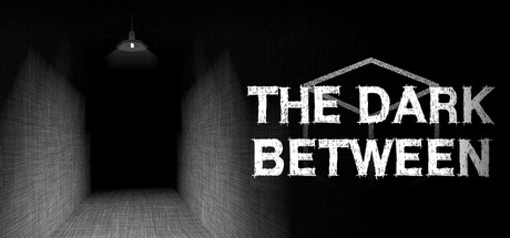
The Dark Between scores 80/100 — better than 95% of Horror capsules (n=3,118).

Quick text summary

The Dark Between scored 80/100 on Steam Analyzer — Good for a Horror capsule. Top priority fix: [genre_clarity] Add a subtle entity, shadow figure, or surreal element within the tunnel to hint at the supernatural 'between life and death' premise and differentiate from generic maze horror.

Capsule scores by dimension

  • Genre Clarity: 8/10 — Strong horror maze atmosphere. The perspective tunnel with brick walls, hanging light, and deep shadow clearly signals first-person horror exploration. At tiny size, the architectural framing and stark monochrome palette immediately communicate a claustrophobic, eerie premise consistent with the game's surreal maze focus. The retro aesthetic is reinforced by the geometric grid texture and minimal lighting.
  • Title Readability: 9/10 — Excellent contrast and hierarchy. THE DARK BETWEEN is rendered in clean, bold white sans-serif with strong outline separation against the dark background. At both full and tiny sizes, the title maintains perfect legibility with clear letter forms and strong hierarchy; the multi-line layout (THE DARK / BETWEEN) optimizes the capsule width. The text placement on the right side avoids competing with the visual tunnel composition.
  • Contrast & Color: 9/10 — Stark monochrome contrast. Pure white typography and tunnel highlights create maximum separation against the #1b2838 Steam background and deep black maze interior. The grayscale test shows excellent silhouette clarity: the brick walls, hanging lamp, and title all read distinctly with no muddy mid-tones. The high-value tunnel opening creates a focal point that draws the eye even at tiny thumbnail size.
  • Uniqueness & Polish: 7/10 — Solid indie horror execution. The retro first-person perspective and grid-textured brick tunnel create a memorable visual hook tied directly to the game's core mechanic (navigating surreal mazes). Craft is clean with consistent monochrome treatment and purposeful lighting, though the concept (dark maze corridor) is relatively familiar within indie horror. The execution feels intentional and premium rather than generic, but the visual does not communicate the unique 'soul reassembly' gameplay element.
  • Brand Consistency: 7/10 — Coherent monochrome identity. The capsule establishes a consistent visual identity through strict monochrome rendering, geometric grid textures, and architectural framing that signals the game's retro first-person roots. Without access to full store context, the stark black-white palette and maze motif are memorable and distinctive enough to anchor brand recognition. The aesthetic aligns with indie horror conventions (see Dredge, COCOON) but feels like a distinct voice within that space.
  • Composition: 8/10 — Clear focal point, safe layout. The tunnel converges toward a bright center vanishing point, creating natural depth and focal hierarchy that reads instantly at any size. Title placement on the right avoids overlap with the architectural composition and respects safe margins for Steam cropping. The symmetrical tunnel framing balances the asymmetrical text placement, resulting in a cohesive layout that does not feel cluttered or scattered.

What works

  • Title legibility at all sizes. Bold white sans-serif maintains perfect readability from full header down to tiny thumbnail, with strategic placement that avoids visual competition.
  • Strong atmospheric focal point. The converging perspective tunnel creates immediate depth and draws the eye naturally, reinforcing the maze-exploration core mechanic.
  • High contrast against Steam background. Monochrome palette and strong value separation ensure the capsule stands out during quick scroll and maintains clarity in grayscale.
  • Coherent retro aesthetic. Grid textures, geometric tunnel, and monochrome treatment work together to signal the game's first-person horror DNA without visual confusion.

What hurts the capsule

  • Limited visual differentiation. Dark maze corridor is a familiar indie horror trope, and the capsule does not visually communicate the unique 'soul reassembly' mechanic or surreal element.
  • No character or creature presence. The empty tunnel lacks a focal character, enemy silhouette, or entity that could add distinctiveness and make the game more memorable at thumbnail size.
  • Minimal color language. Pure monochrome limits the opportunity to establish a distinctive brand palette that could be instantly recognized across marketing materials.

Priority fixes

  1. [genre_clarity] Add a subtle entity, shadow figure, or surreal element within the tunnel to hint at the supernatural 'between life and death' premise and differentiate from generic maze horror.
  2. [uniqueness_polish] Introduce a signature visual element (colored accent, glow, or symbolic motif) that hints at the soul-reassembly mechanic and strengthens brand identity.
  3. [brand_consistency] Establish a consistent secondary color or glow treatment (e.g., ethereal blue or sickly green highlight) that appears in game screenshots to create a recognizable brand signature.

Store copy priority fixes

  1. [hook_strength] Replace 'BETWEEN LIFE AND DEATH' with an active verb-driven hook such as 'Escape from surreal mazes by hunting down soul fragments before entities from beyond death claim you.' This leads with action and threat instead of a static statement.
  2. [feature_communication] Rewrite the Pac-Man gameplay feature to explain the concrete player action—e.g., 'Evade supernatural entities in maze-like environments using the recovered artifact as a weapon or shield, reversing the pursuer-prey dynamic of the classic formula.'
  3. [audience_targeting] Add a sentence specifying intended audience difficulty or playstyle, such as 'Designed for players who crave atmospheric horror over jump scares' or 'Challenge-focused for retro enthusiasts who loved early PlayStation survival horror.'
  4. [tone_match] Revise the feature descriptions to maintain the atmospheric voice of the opening—replace 'Immerse yourself in a nostalgic' with 'Step into a haunting low-poly nightmare inspired by classic PlayStation horrors' to sustain mood throughout.

Related guides

Steam app ID: 3610570 · Tags: Horror, Action-Adventure, Singleplayer, First-Person, Mystery